The Case for Architecture in Aquariums
PUBLISHED: NOV. 15, 2023
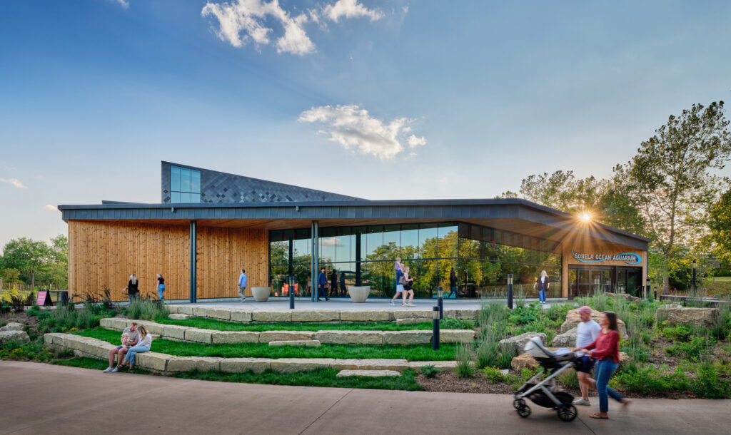
Kansas City, Missouri, is nearly as far from the ocean as you can get. As my plane descended through an unceasing patchwork of crop squares, the feeling of being completely landlocked set in. I was traveling to Kansas City from EHDD’s San Francisco office, which, in contrast, couldn’t be closer to the ocean. The office sits on San Francisco’s Pier 1, where waves lap against pilons and the shrieks of gulls can be heard in every meeting room. As the design principal for the Sobela Aquarium at the Kansas City Zoo, I had been tasked with bringing this ocean with me, all the way to the Midwest.
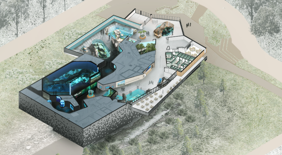
The Sobela Aquarium is more than an addition to the zoo—it’s a transformation. Spanning 72,000 square feet, the aquarium offers an indoor, all-season attraction. It catapulted the zoo’s population from 1,700 to over 10,000, and necessitated a complete rebranding of the facility. But the project’s ambition extended further: The facility aimed to ignite a passion for ocean life in its visitors, to inspire a commitment to preserving our natural environment.
Graphic by Yining Ma
In my 15 years at EHDD, I’ve worked on many aquarium projects—from campus planning and concept design efforts to renovations (my first being a historic renovation at the Toledo Zoo) to ground-up projects (such as the one I write about today). And to understand the built landscape these projects fit into, I have visited many, many more. This is what I’ve discovered: Although aquariums are a project type loved by visitors, many have been failed by the design community.
Too much of the aquarium experience can be described as a dark room populated with little blue windows. Or, a common alternative: thematic décor more focused on entertainment than visitor enrichment. While some aquarium buildings are formally expressive, it’s all too rare for the exterior expression to inform the visitor experience.
Does this matter? Is holistic design important to the visitor? To the institution? I would argue yes.
Our clients, like the Kansas City Zoo, want to have a lasting impact on their visitors. They want to move beyond education, to create an experience that will anchor a visitor’s empathy for marine life long after they leave. Of course, the core of this experience is the direct impact of the marine exhibits. But we know that memory is encoded through a more complex sensory experience.
There-in lies the challenge: How can designers use the space to enrich the exhibit experience? To engage all the senses? To encode memories? To bring a true ocean experience to places far from its shores?
Bringing the world’s oceans to Kansas City
In 2018, during the Sobela Aquarium’s predesign phase, we confronted these challenges head-on. Collaborating closely with Space Haus, our exhibit design partners, we assessed the zoo’s initial collection, which included a few staff favorites and a batch of greatest hits: sharks, rays, turtles, tropical fish, octopus, and jellyfish.
The collection represented a broad survey of marine species. To achieve a cohesive visitor experience, we identified a storyline of “marine currents,” an interpretive framework we had yet to see in any peer institution. This storyline lent structure to the global collection, creating an interpretive backbone that highlighted the interconnected nature of our ecosystems. Importantly, the framework informed a progression of spatial and sensory experience—the missing 20% in most institutions. The things that visitors don’t notice that they’re noticing. A visual connection to the outdoors, expansion and contraction of space. Different qualities of light. Temperature and humidity. The feeling of physical descent.
Five years later, I was visiting the Sobela Aquarium just days before it would open to the public. It was time to see if it worked.
Surface
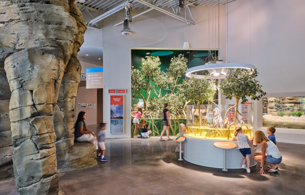
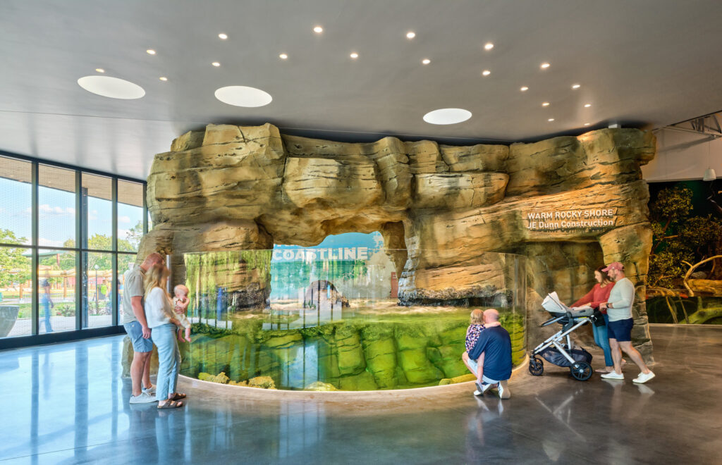
As I stepped inside the Sobela Aquarium, the first thing I noticed was the soundscape. It was alive: Tamarins trilled, toucans croaked, and a crash tank mimicked the arrhythmic crashing of waves against the shore. The space was warm, not just the temperature, but the stream of natural light glinting on the rockwork. The humidity pricked my skin, and the faint smell of salt drifted from the salt marsh habitat. I was immediately immersed in the exhibits, in a way that felt inviting, not jarring. Meandering between several pools with waist-high water, I found myself descending.
Shallows
The water levels shifted, from waist level to just above my head, and the physical descent down a ramp reinforced the sense that I was wading deeper into the ocean. As the scale of space and exhibit size increased, I started to feel small. The soundscape became less chaotic; the calls of birds and monkeys faded, replaced by more muffled aquatic sounds. Water warmed my hand as I dipped it into the touch tank. The light was dappled, streaming through a perforated screen from the clerestories above. A sea turtle lazed by at eye level, quickly overtaken by a reef fish racing through the vibrant tropics dropped into the heart of Kansas City.
Submersion
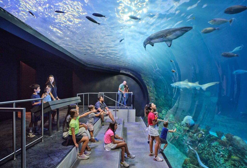
Slipping through a slender threshold into a darker space, I immediately noticed light dancing on the floor. I looked up, and a school of pilchard swirled above. It was quieter here. The carpeted floor dampened the sound of footfall, and large concrete walls sapped the warmth of the earlier galleries. I rounded the corner, coming face to face with a Napolean Wrasse. Based on his expression, I was more impressed with him than he was with me. I took a step back and saw him in his full context: a boundless ocean with a vibrant community of life. Stepping down into a tiered viewing area, I followed the cold gaze of a shark as it glided overhead. I felt the weight of thousands of gallons of water above me.
Depths
The next space felt like a reset. It was different, somewhat alien and a little disconnected. As I crossed a gateway of gravity-defying jellies, the space opened to an amorphous volume. A soft glow of light above offered a feeling that my normal life was up there somewhere. But down here, I was quick to discover spider crabs, giant isopods, and other oddities of the deep ocean.
Ascent
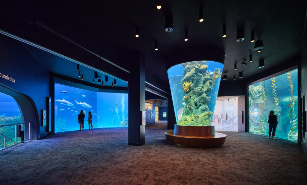
In the next space, things felt lighter. The volume of the space expanded. Light streamed in through a large kelp window and a conical eel tank sprang weightlessly from the center of the room. A soft bounce of daylight beckoned ahead.
Emerge
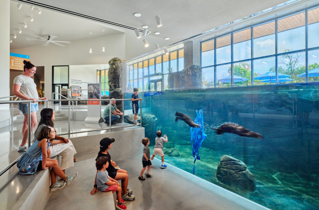
Rounding the corner, the otters took center stage, summersaulting over and under the water’s surface, occasionally hopping up “on shore” to glimpse the trees beyond. The ever-changing sky as the backdrop for these charismatic fellows anchored the feeling that we had resurfaced. Ascending a ramp that approached the final exhibit—a cold water touch tank—the ceiling peeled open to a north-facing clerestory that offered a cool brightness to the gallery below.
Creating resonance one design choice at a time
As the visitor path brought me full circle, back to the entryway, I was struck by the experience. All visitors to the aquarium will notice the animals, and many will notice their habitats. Few will consciously recognize the impact the quality of space has on their connection to these key features. But it is this layering of the experience—the hundreds of small design choices made over the course of the project—that can make a visitor’s experience so rich, varied, and engaging. This is the intangible element that creates memories and elevates an experience from enjoyable to resonant.