Let there be “Light”
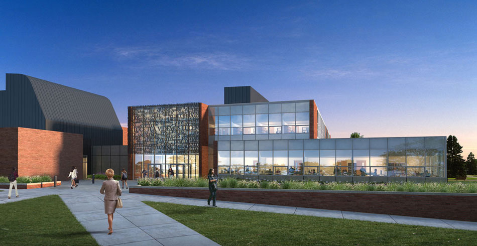
Situated next to Valparaiso University’s monumental Christopher Center for Library & Information Resources (EHDD project built in 2004), the smaller, recently completed College of Arts & Sciences Building longed for a presence to stand its ground. The modest addition does not architecturally upstage its brawnier older sibling, even though the two buildings share entrance frontage and a physical connection. Instead the new architecture graciously respects the signature massing of the Christopher Center by using clean volumes and similar materials. Where it shines, though, is through its veil.
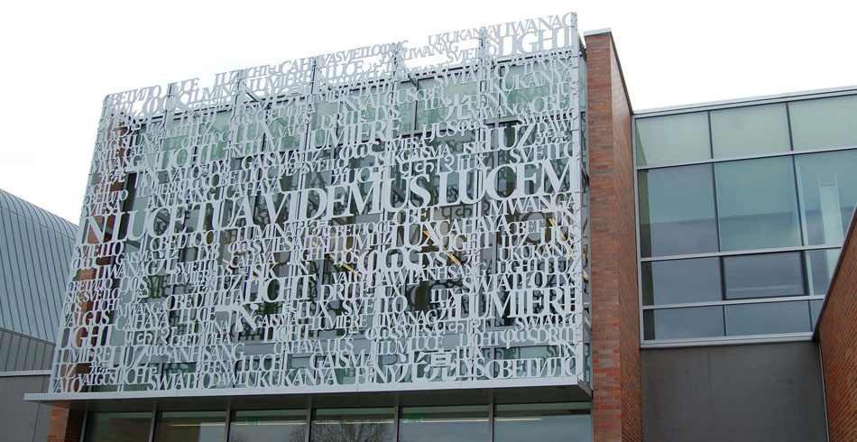
That veil, which hangs above the building’s entryway, is a tapestry of words that are waterjet cut out of aluminum plate. The words form a half-inch thick screen covering a portion of the second story façade. The screen spans thirty feet in width and rises the full height of the window wall above the building’s front doors. It is painted light gray so that during the day its color matches that of the mullions and trim. At night it becomes silhouetted by the interior light of the Faculty Commons Room behind.
Designing an entrance veil was not intentional. The screen was an inadvertent result of a solar mitigation study for the opposite side of the building. An earlier design scheme proposed a sizeable exterior sunshading system to wrap the building’s southern exposure. That screen was ultimately value-engineered out of the project, but its concept (a pattern produced by tessellating the letters V-U) left a bright impression. The desire for a design element that acknowledged the inhabitants of the College of Arts & Sciences Building remained.
After iterations of various graphic patterns passed over the drawing board, focus landed on the University’s Latin motto: In luce tua videmus lucem. Translated into English this reads: In thy light, we see light. The Foreign Languages Department, tenants of the new building, warmly embraced a tapestry of words based on the Latin phrase. The screen is an amalgamation of translations for the word “light” in thirty languages which represent the home countries of every student on campus. The nine languages taught in the building are shown larger, while the remaining translations help to compose a field condition. At the center of the screen lies the Latin motto itself.
The screen survived its way through project cost cuts because the building’s users bought off on the concept early on. That is not to say its construction dodged technical challenges; it did not. Nevertheless, all parties remained fervent in their efforts to execute the original idea. Now installed, the screen graphic has started appearing elsewhere around campus: on admissions brochures, Family Weekend coloring books, and even t-shirts. The building’s identity is now known.
Matt Soisson
Designer, LEED® AP