Pacific Visions – A Story of Brand and Architecture as One

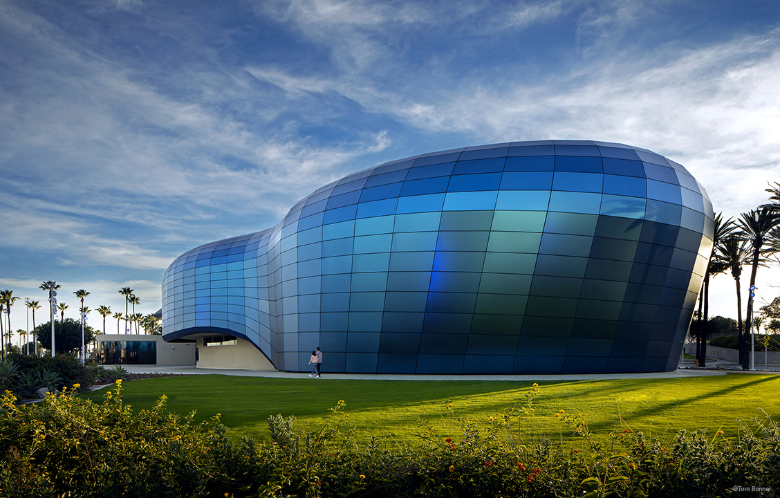
For science-based, ecology-focused institutions like the Aquarium of the Pacific, their mission is their brand. In this case, the organization’s mission is to engage visitors in examining their relationship with our ocean planet, and to explore today’s most important environmental issues. They wanted their building’s façade to be an extension and articulation of that mission statement.
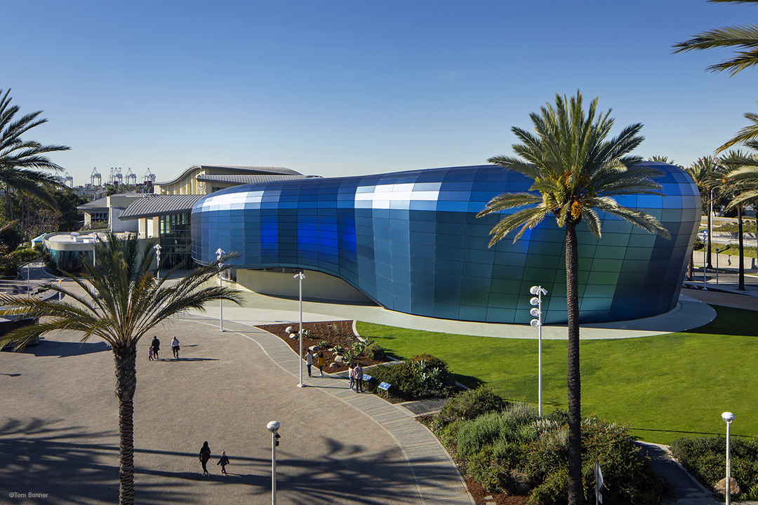
EHDD’s concept was to engage the original building as a marquee for Pacific Visions–it is a community and regional icon. For the new program’s wrapper, the development of form derives from the rich bio-diversity of the Pacific Ocean, referencing both microscopic and monumental sea creatures. In designing this new wing of the Aquarium, EHDD embraced the concept of fluidity–both in the biomorphic facade and in how visitors flow through the spaces–from the entrance, through the new galleries and the Honda Theater.
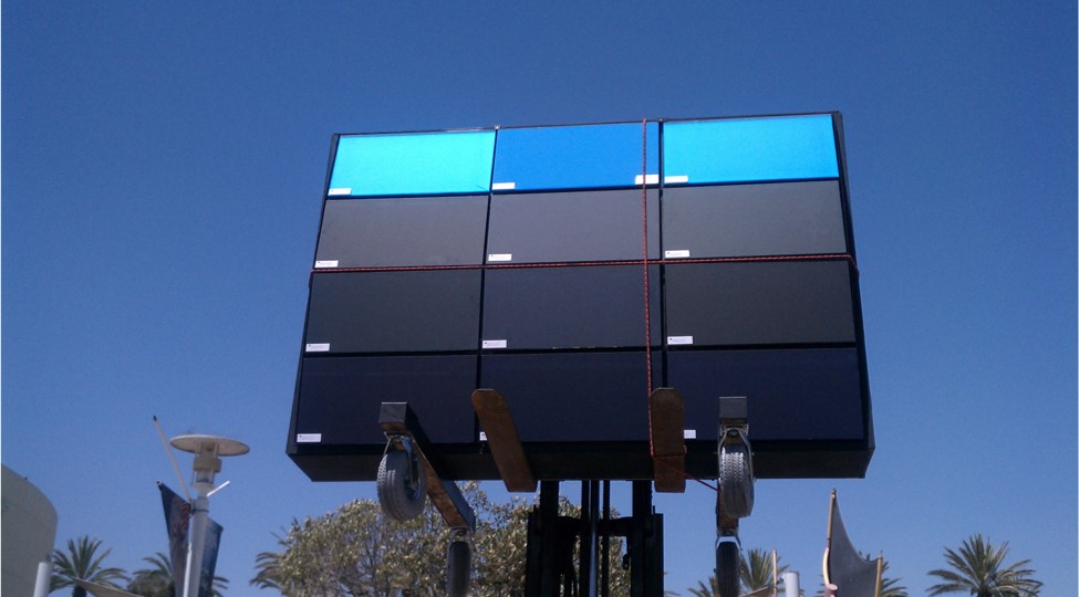
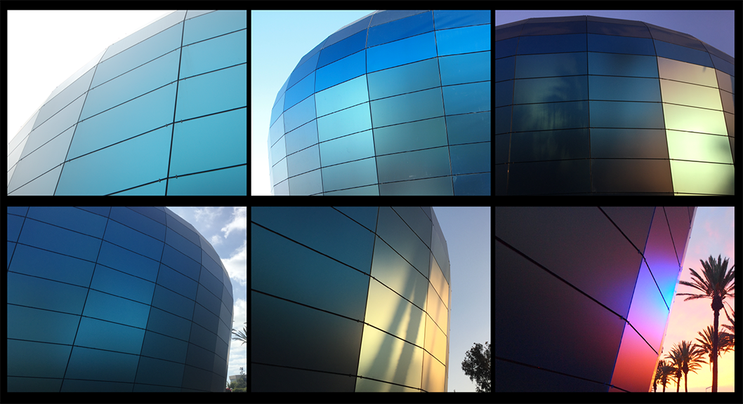
The qualitative approach to our material investigation focused on depth, variability, and luminosity. Materials needed to be opaque, without reflectivity, and bird-safe. This process involved over a year of research, experimentation, and testing. We couldn’t have realized the final effect without engaging fabricators early, as we needed to invent a unique glass assembly. The glass assembly thickness is aesthetic, and also has structural requirements. Digital mock-ups demonstrate the effect on a macro level – for example, rich color variation was depicted at different times of the day. This was further tested by creating a physical scale model to represent the desired visual effect. Getting the color correct was essential because it would become the aquarium’s brand. The color needed to be timeless, derived from nature.
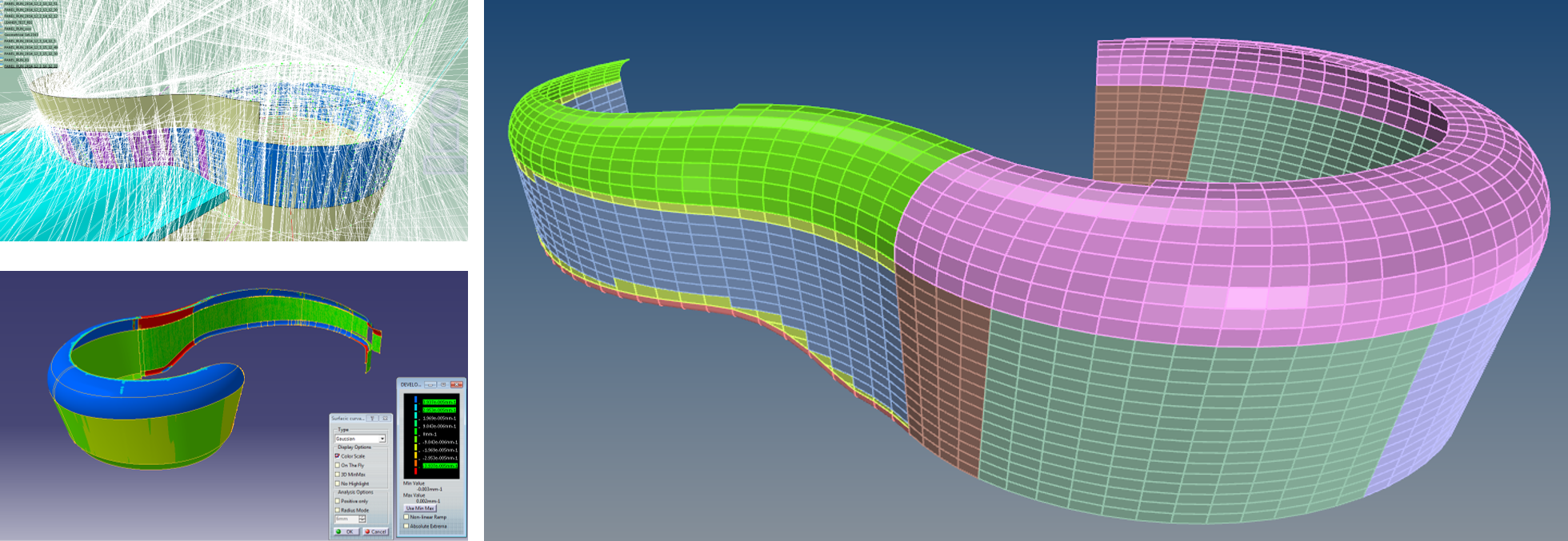
BuroHappold’s task, as the technical design team, was to begin investigating the technical approach for the aquarium’s complex form. We started with developing computational tools that let us test different paneling strategies. We initially sought a single, or minimum number of panels that could be used in the final installation to achieve minimum variability while maintaining the curvature of the design. We tested many versions of this approach before identifying the right design.
Our first study concluded with almost 1900 panels, and the uniformity of panels was not what we, or the wider design team, had originally envisioned. The form lent itself to a scalable paneling, rather than a repetitive system. We then tried a strategy that would allow a more natural flow of panels that could accentuate the surface aesthetics on a macro level. The paneling consistency was a balancing act between the maximum feasible size of a panel, and the smallest one that allowed the form to achieve the intended architectural design.
In testing this for cost efficiency, we discovered that fabricating custom sizes of panels did not increase cost since all fabrication is CNC-controlled. Additionally, we learned that reducing the panel numbers by more than half resulted in decreasing the amount of connections, structure, and site work—yielding about 30% in overall savings. We then created a digital mockup of the new paneling system, which became the ‘backboard’ on which to interact with the design team and client. This strategy afforded us the possibility of not only refining the organic shape, but also allowed us to evolve it so we could emphasize the dynamic quality through the panelized system.
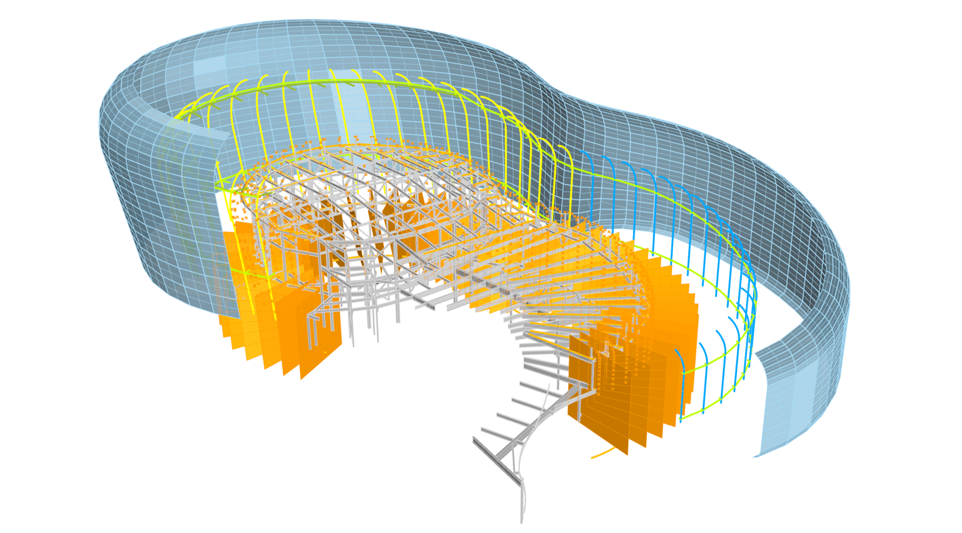
Simultaneously, we worked on developing a structure that supports the glass installation. The structural system is essentially an interface between the glass geometry and primary structure layout. The structure is a skeleton for the skin, following the natural shape and is supported by the primary structure behind.
When we designed the structure, we needed to follow four principal guidelines:
1. Support the glass panels in the most efficient way
2. Connect back to the existing structure where it has sufficient capacities
3. Minimize the amount of penetrations through the envelope
4. Account for seismic movements
The result was a structural skirt design. This allows the structure to hang from the top connection and to slide at the bottom. The system was designed with intentional open joints between panels. Since the structure or skirt would move under seismic events, there was a risk for a direct impact on the joints between the glass panels. This movement, and having the structure non-parallel in all areas, meant that we had to control the joints dimensionally. We created a script that simulated the seismic drifts on the system and visualized where the maximum joint sizes were needed. This analysis was done on the horizontal and vertical joints. Once we established the maximums, we were able to prescribe a single dimension for all of the joints. We then translated this to the actual fabrication model that was developed by glass specialists Sentech Architectural Systems. By enabling a digital process, we were able to confirm the numerical parameters for all of the geometrical conditions and design one adjustable detail.
The design and engineering relied on a holistic computational design process that included a data-centric model and automation. This enabled seamless coordination and exchange of models with the design team, manufacturer, and builder. The final confirmation of the design was tested on site utilizing a full-scale mock-up before authorizing the fabrication and installation of the building skin system. The result was a façade system that met all expectations of the client and design team. This success in developing such a unique façade system was due to a close collaboration between the design team, façade engineers, and subcontractors.
The new Pacific Visions wing will open at the Aquarium of the Pacific on May 24, 2019, visit http://www.aquariumofpacific.org/ for visitor information.
