Blog Archives
Seismic Shifts
Exploiting Opportunities in Retrofit Projects
While seismic renovation projects may be thrilling to structural engineers, they don’t typically get an architect’s heart racing. But they should. Our current experience at University of California, San Francisco’s (UCSF) Parnassus campus shows that a major seismic renovation can open the door to a range of opportunities to explore design, sustainability and planning improvements in a campus environment. Anytime campus leadership is spending major time and money on a capital improvement project we feel it is our responsibility to look beyond the narrow brief and find the leverage points to elevate the project into something transformative for that institution.
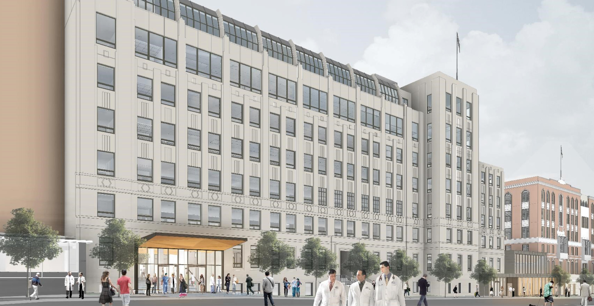
UCSF’s Clinical Sciences Building, a seven-story structure built in 1932, is one of two remaining original buildings on their Parnassus Heights campus. A structural analysis scored the building to be at the highest risk for earthquake damage, triggering the need for a retrofit to comply with University of California policy. Our enhanced seismic design utilizes post-tensioned shear walls that rock and restore to their vertical position after an event, rather than absorbing stresses and permanently deforming as code-complaint shear walls do. A seismically-resilient design of non-structural systems, such as partitions and pipework, safeguards systems that typically represent the largest proportion of earthquake related damage for small to moderate earthquakes. The result is a building that promises to be operational after even major earthquakes and can operate as a resilient resource to the UCSF community when it completes construction in 2017.
The need for seismic safety served as a trigger to rethink the role of this building in the broader context of space utilization at UCSF. In place of the labs and research spaces that accreted in the building over time, a new program of clinical office space and classrooms serves essential campus needs while maximizing the building’s inherent features of narrow floorplates and modest floor-to-ceiling heights.
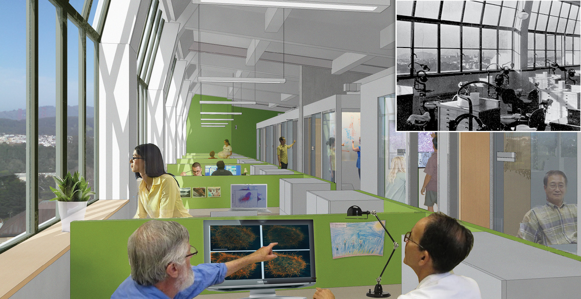
A historic photo of the original, north-facing dentistry clinic is revealing. In the early 20th century, there was no better way to achieve the high footcandle levels needed for oral surgery than to utilize the bright and even light found in the consistently-foggy Parnassus campus environment. Today high-octane dentist lights are a flexible but energy-intensive substitute.
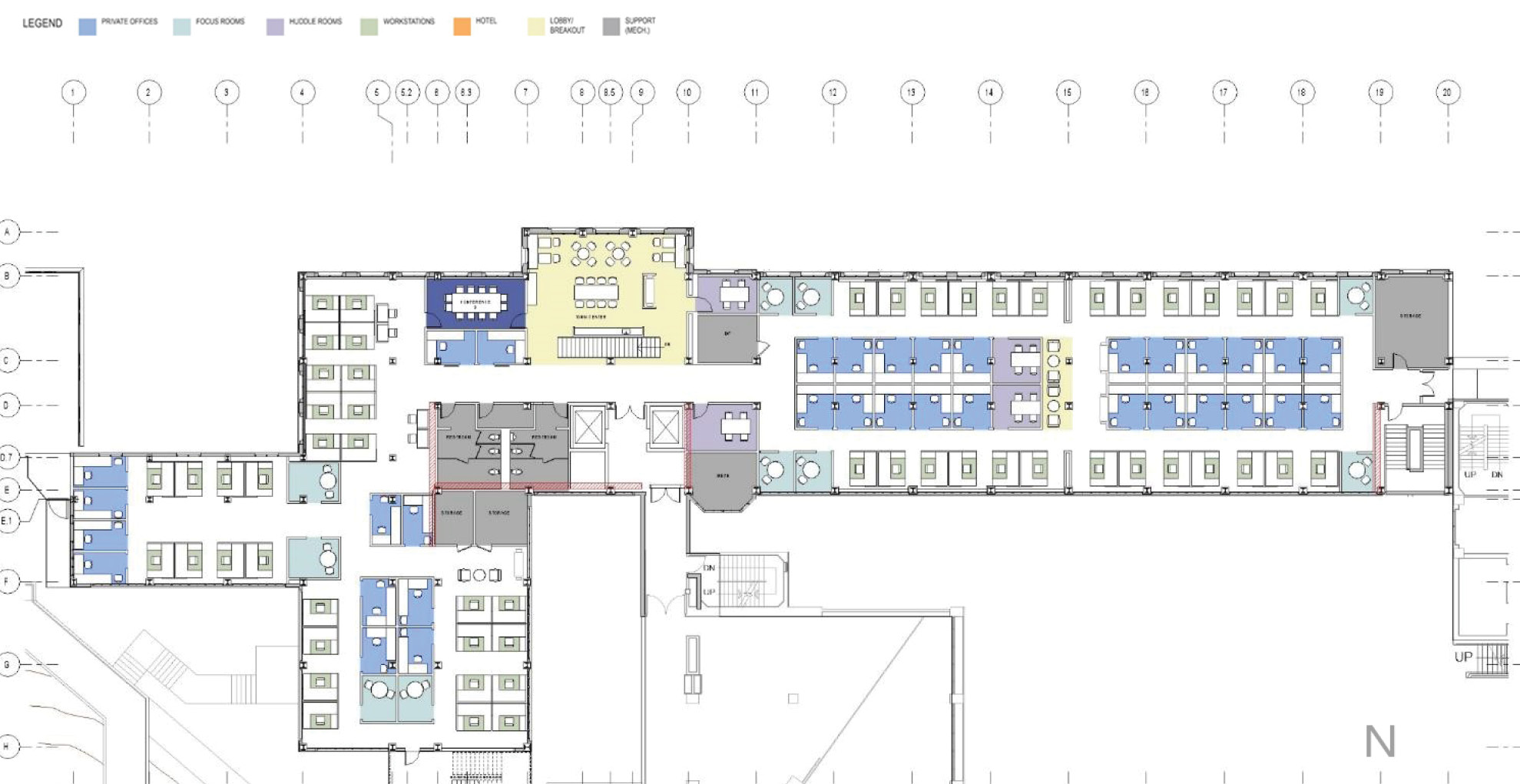
Open floor plans and thoughtful zoning makes the most out of the inherent, passive features that served the building in an era before modern mechanical and electrical systems. The programming and layout re-establishes cross ventilation and daylighting as the primary means for thermal comfort and daytime lighting. The narrow building footprint runs east/west, which allows the majority of spaces to be glare-free and naturally daylit, reducing electric lighting demand and improving indoor environmental quality. Breathtaking views of San Francisco and the Bay are opened up to all occupants by locating enclosed spaces generally towards the interior. Thermally-massive concrete walls can retain heat through the night, evening out the diurnal swings characteristic of the local climate. The result is an energy use intensity (EUI) of 21 kBtu/sf/yr, roughly 75% less than a typical existing office building today.
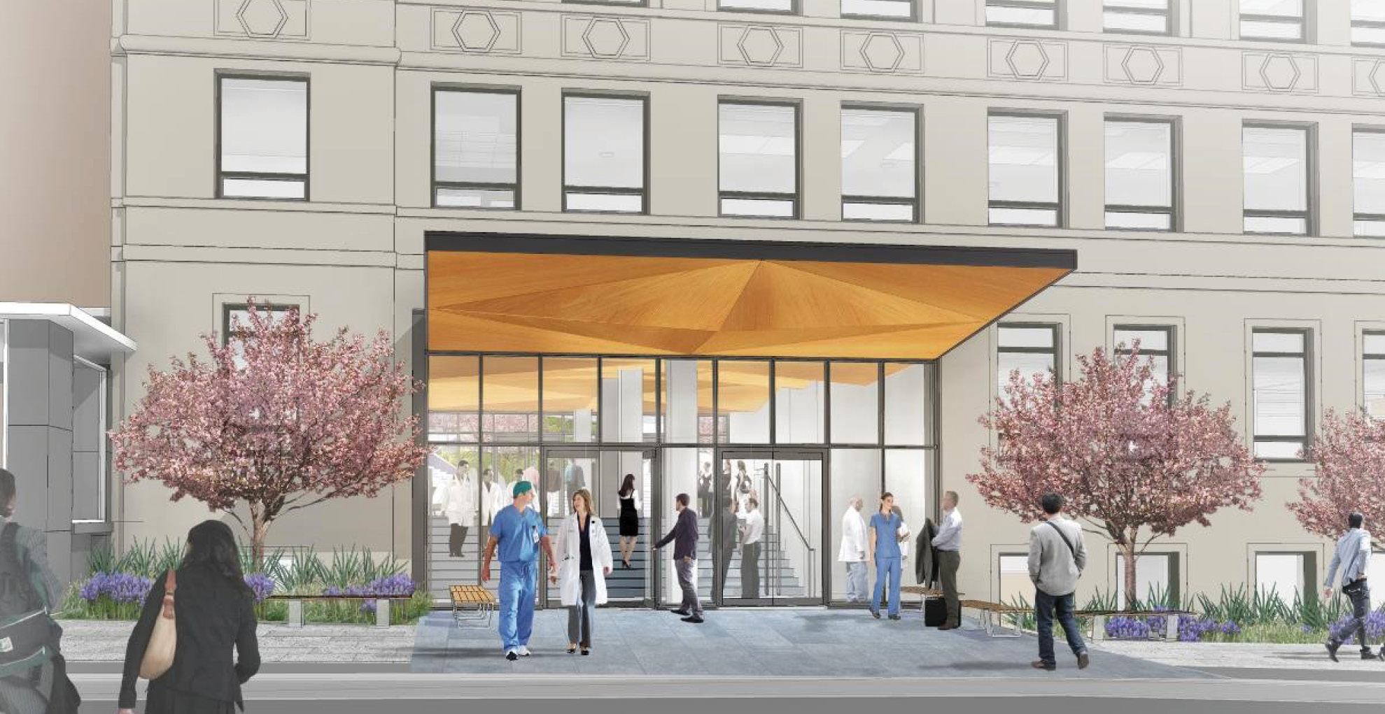
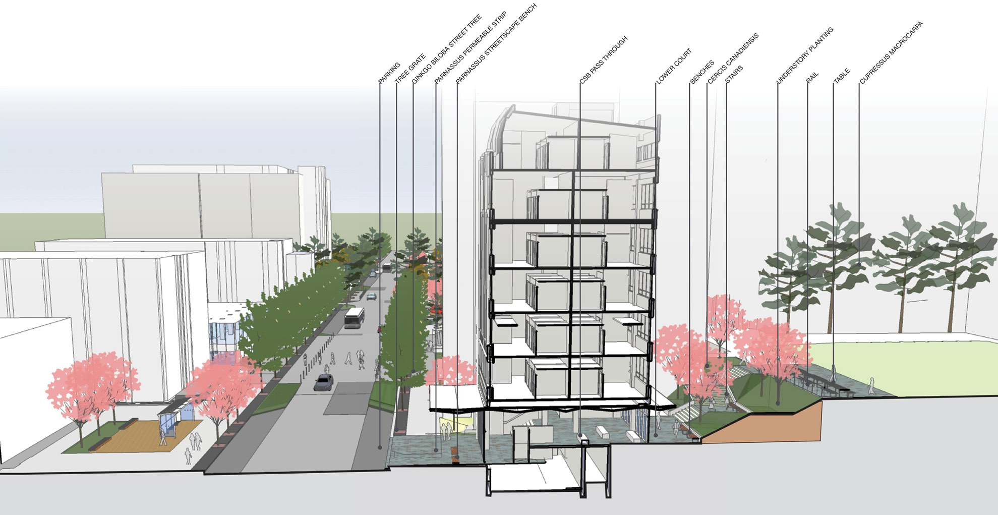
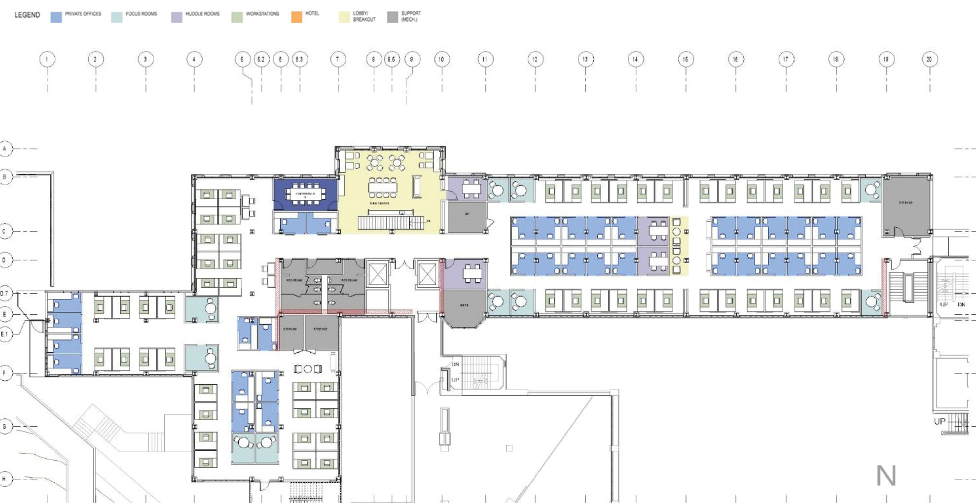
The newly retrofit building will include office and instructional space, as well as a long-needed north-south connection between the two primary outdoor spaces on campus, Parnassus Avenue and Saunders Court. The team used an innovative Hybrid Activity-Based Working (ABW) model to support different work styles by providing defined spaces for privacy, meetings, collaboration and community in addition to an assigned workstation. Open floor plans adjacent to exterior walls improves daylighting, allows for cross-ventilation and provides open access to breathtaking views of San Francisco and the Bay. Beyond typical programming, the team undertook a deeper analysis of future trends in the workplace, increasing technology, mobility and changes in the workplace culture.
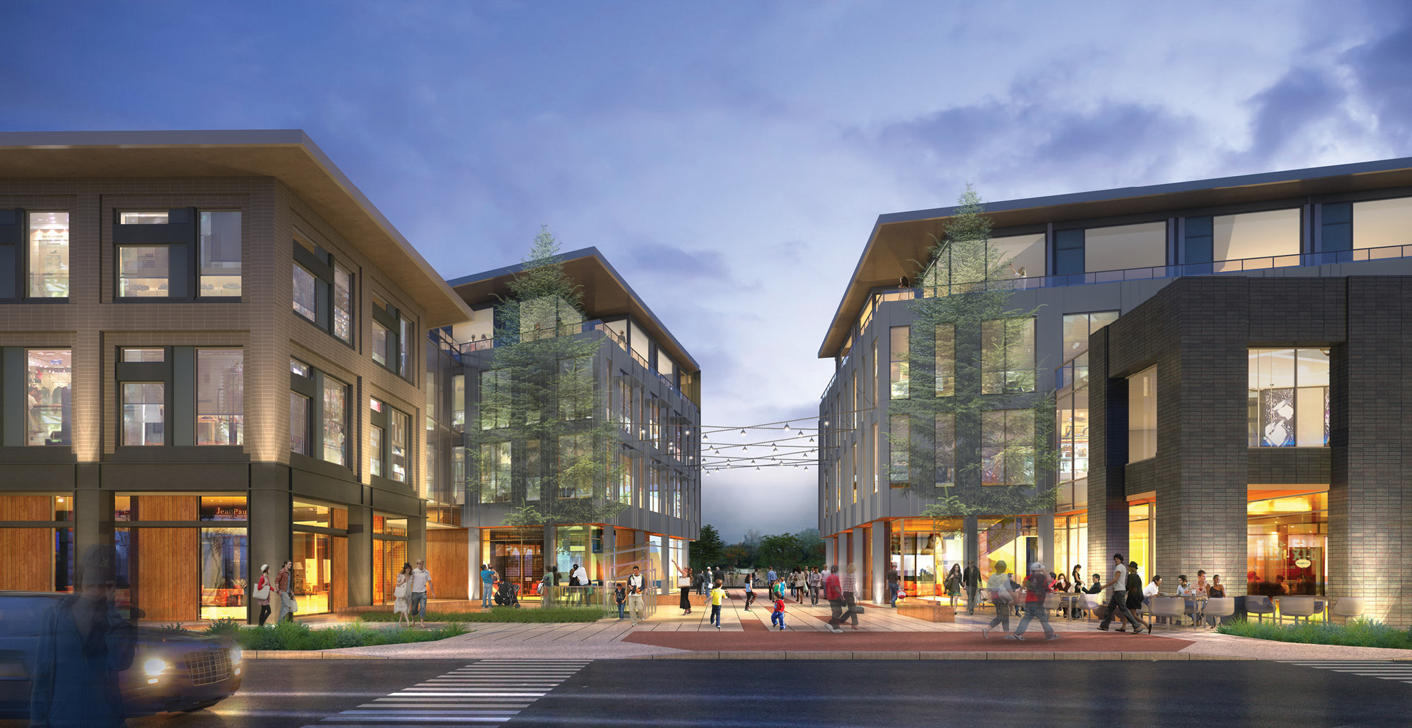
A final opportunity addresses campus planning. The character of urban campuses like UCSF are defined by the spaces in between their buildings. Decades of infill development at UCSF has resulted in an opaque campus with poor connectivity between outdoor spaces. A surgical cut through the Clinical Sciences building creates an inviting north-south connection between the two primary outdoor spaces on campus, Parnassus Avenue and Saunders Court. This new campus connector was not in the project program; it was an opportunity that revealed itself when we looked holistically at how this project could improve the campus more broadly.
Each project has its leverage points. At UCSF’s Clinical Sciences Building we feel that we’ve extended an EHDD tradition of exploiting the potential of a specific site and program to create something that is more than the sum of its parts.
Net Zero 3.0
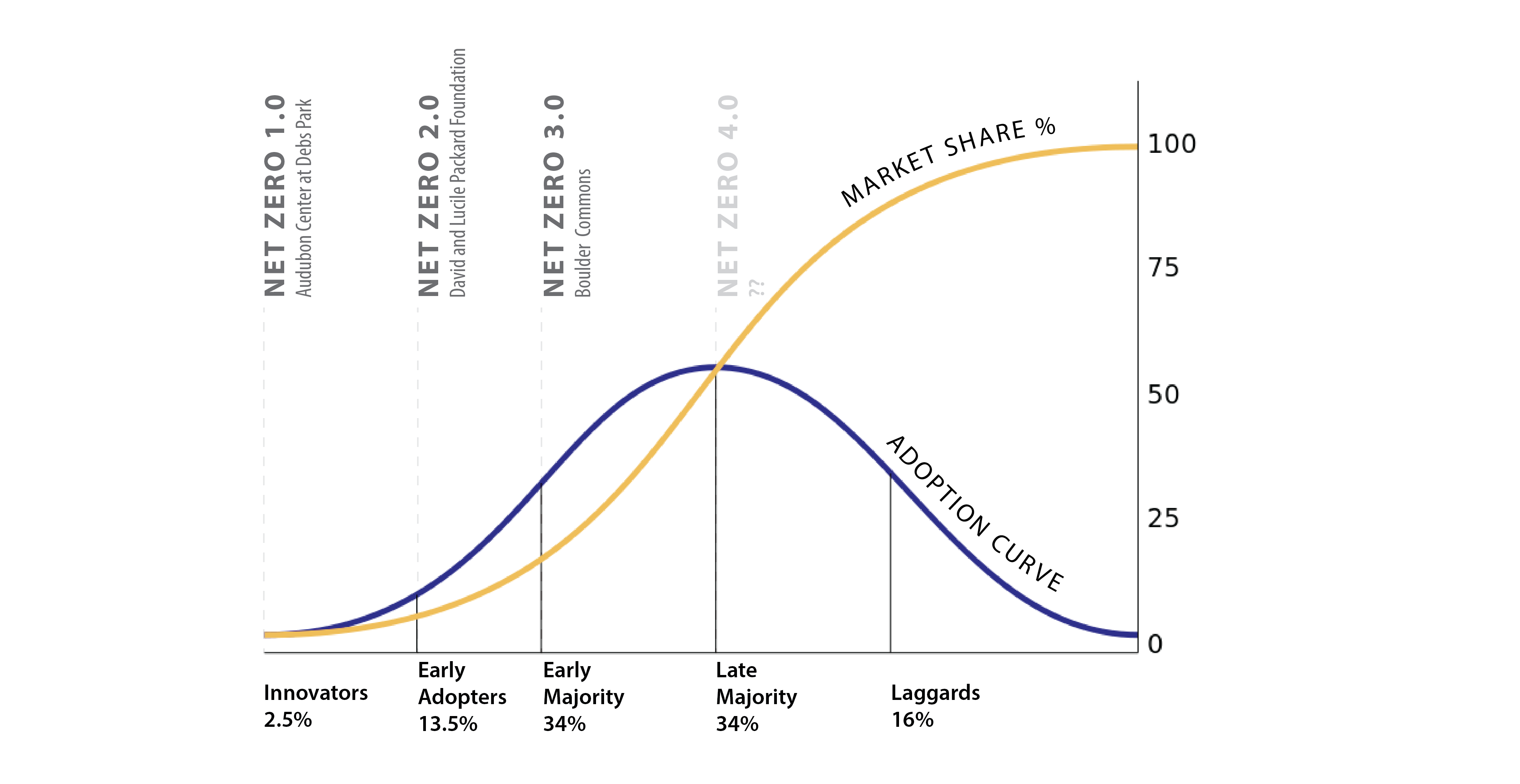
In the classic “diffusion of innovation” diagram, a bell curve describes the path of an innovation from early adoption through market dominance. We all know this path from experience: remember your first friend with a smart phone? Or the first time you saw the Prius? You were intrigued, and perhaps thought them futuristic. Now you can’t imagine your world without them.
We just entered the year 2016. In signing the COP21 treaty, 195 nations agreed to limit greenhouse gas emissions levels to aim to keep global temperature rise under 2°C. Now for the harder part: how? According to the best climate science, programs such as Architecture 2030, and strategic plans of the state of California and others, all new buildings need to be designed to net zero energy (NZE) standards by year 2030 in order for us to avoid the worst impacts of climate change. So where are we today, less than 15 years from 2030, on the NZE “diffusion of innovation” path?
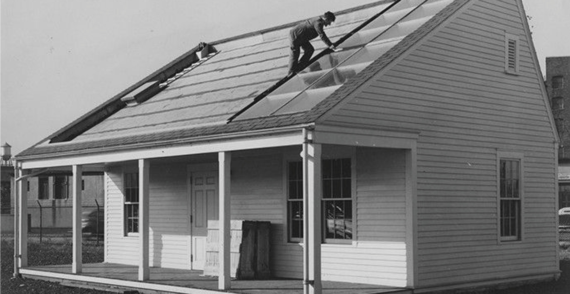
First, let’s quickly put today’s efforts in historical context. As far back as 1939, with the MIT Solar House #1 project, architects and engineers have been experimenting with homes powered by photovoltaics. In the late 20th century these experiments took off in the US Southwest, Japan and Germany in particular. Let’s call this era Net Zero 1.0. The “innovators” responsible for these projects were answering the question, “What if?” EHDD’s first foray into NZE design began in 2001 with the Audubon Center at Debs Park. This nature center in Los Angeles uses a battery array and an improvised load shedding strategy to function without a grid connection.
Further experimentation in non-residential projects such as Chartwell School (2005) led us to design the first NZE office building in the country for David Kaneda’s IDeAs electrical engineering office in 2007. This in turn gave us the confidence to propose a net zero design for the David & Lucile Packard Foundation headquarters. In 2013, this 50,000 SF building operated for its first year at net positive energy, and was certified as the largest NZE building in the country by the International Living Futures Institute. This period, Net Zero 2.0, was driven by “early adopters” who were demonstrating proof-of-concept. At Packard, our goal was “replicability”, which we defined as identifying strategies that could transform the building industry within the next decade. Financial viability was important but there was an understanding that innovation is not easy.
Today we are at an inflection point where innovation reaches critical mass. This is Net Zero 3.0. The “early majority” are leveraging a happy confluence of factors that make NZE good business. Some of these enabling factors include:
Low Photovoltaic (PV) Prices: In 2008, the estimated PV cost for a +300 kw system at our Packard NZE project was at $8.50/watt. This past year we received three bids for a Power Purchase Agreement (PPA) for a similar sized PV array at a private school in Marin County at $3/watt. This PPA will cost 20%-38% LESS than PG&E with no upfront capital cost. It saves money from day one. The upshot: If you have the space to put the PVs, a zero energy building can be cheaper than a conventional building powered solely by the utility company.
Energy Codes are raising the baseline: California’s latest Title 24 energy code requires many of the energy efficiency measures that were considered unusual in Net Zero 2.0 buildings. External insulation, air-tightness requirements, LED lighting, and spectrally-selective low-e glass are among the measures now standard in new buildings in California and many other states. The upshot: The incremental cost to exceed code-mandated efficiency in many states is minimal.
LED lighting is finally here: LED lighting is no longer just beyond the horizon. The technology has matured to provide excellent color, ease of control and dimming, and good optics. When you consider the life-cycle benefits of low maintenance, combined with reduced energy bills, they are the obvious choice for thoughtful building owners. The upshot: Low lighting energy use is achievable without sacrificing quality or affordability.
Plug Loads are trending down: Plug loads for IT have been falling, driven by the desire for longer battery life on our mobile devices, and a new generation of low power consuming chips. In a mobile world governed by battery performance, efficiency is driven by economics not environmentalism. The upshot: The 10-ton gorilla of “uncontrollable” plug loads may be less of a problem as time goes on.
Commissioning is now common: This signals a recognition that buildings need to be operated properly in order to perform properly. The required NZE upgrade to ongoing energy monitoring and diagnostics is the logical next step. The upshot: Owners are engaged in ensuring proper operation so that buildings can achieve the design performance goals.
So what does Net Zero 3.0 look like? One of our projects nearing start of construction is instructive: a 100,000 SF speculative NZE office building in Boulder, CO. The client, a mission-focused investment company, intends to own and operate this building at NZE for the long term, thereby offering a new model of speculative mixed-use infill development that yields triple-bottom line returns. The design process is an interplay between the cost budget, the renewable energy potential of building surfaces, and the resultant energy budget that we have to work with to get to NZE. Our target Energy Use Intensity (EUI) of 28 kBTU/sf is calibrated to the available PV area on the roof and on the southeast-facing façade. Integrating vertically-oriented PVs into that façade promises to be an economically-rational approach since we can subtract out the cost of the avoided cladding material to offset the reduced production efficiency associated with the vertical application. The overall leasing and marketing strategy is geared to take full economic advantage of the life-cycle benefits; for example, tenants will adopt plug load budgets in their lease agreements. Therefore, the overall pro-forma requires a holistic approach to valuing the asset differently than conventional development. Design, operations, and property management are integrated from the start.
We are just at the start of Net Zero 3.0. Yet recent legislation like California’s SB 350, which authorizes state energy authorities to seek 50% increase in energy efficiency by 2030, and implementation of COP21 will drive us towards Net Zero 4.0. During that phase the “late majority” will make NZE buildings into the new business-as-usual. The real question is no longer, “What if?” or “How exactly?” but “Why?”
Brad Jacobson, AIA LEED® AP BD+C
Associate Principal
Greenbuild 2015: Reflections
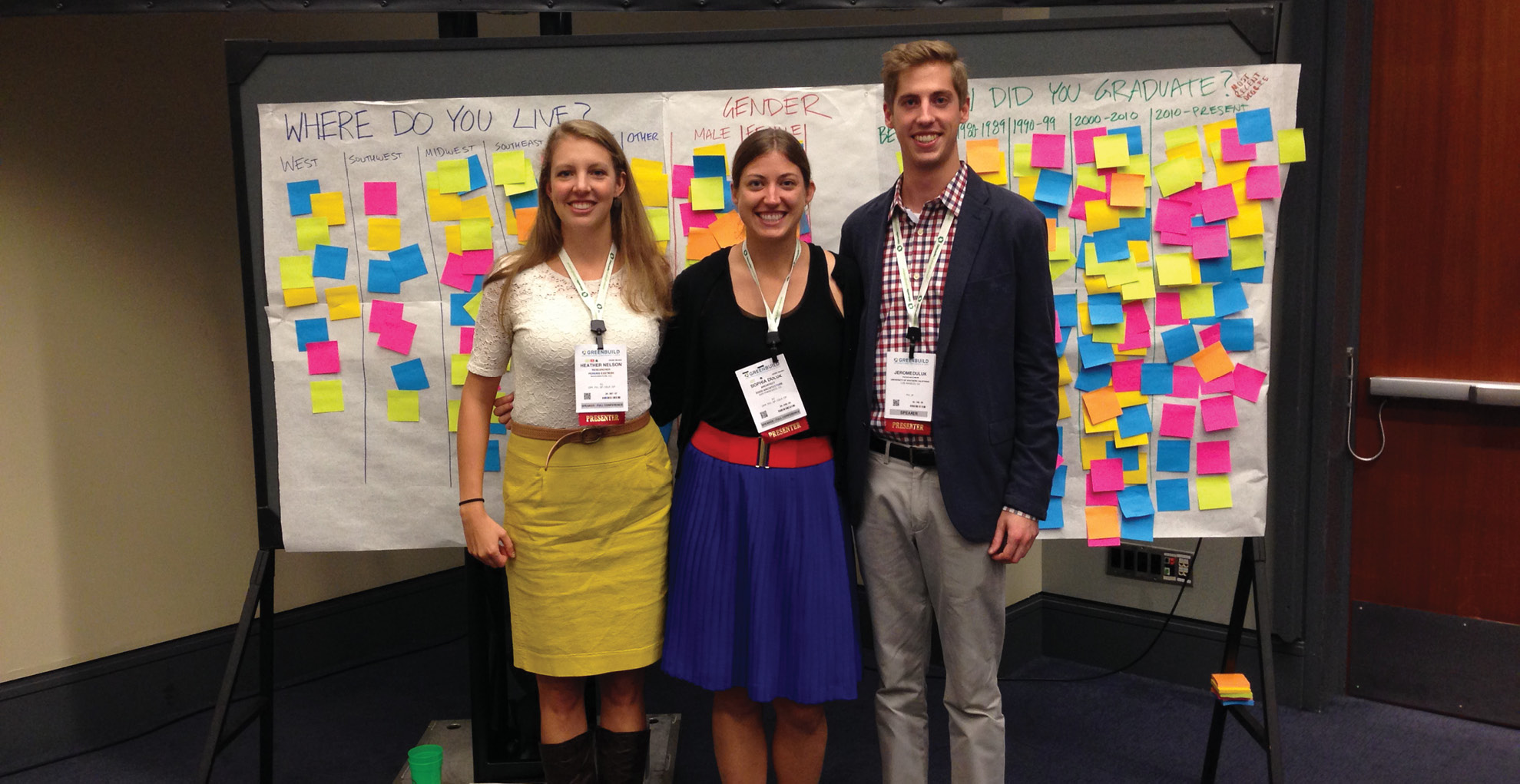
I had the fortune of spending the week of November 16 in Washington D.C. at the 2015 Greenbuild Conference. My research group was accepted to present our session, How Age and Gender Effect the Path to Carbon Neutrality, and we were very excited to share our research. I have been working on this project with my co-presenter, Heather Nelson, for about two years now, and my brother, Jerome Duluk, who is excellent with statistical data analysis, joined our team a few months ago to help us with an in-depth analysis. We applied to present at Greenbuild about a year ago, and after the three tier review system, we got our notification that of the only 18% of sessions that were accepted, we were one of them! Once we got this notification, the real work began to extract the most interesting nuggets from our study.
When Heather and I both graduated with our Master’s degrees from the University of Oregon, we left our sustainability bubble of a school and entered into the real world. We were quickly struck by the lofty goals of Net Zero Energy (NZE), and the ambition of the 2030 Challenge, but were disheartened by the overall lack of progress towards these goals. We began to ask why this was happening. Are architects blaming cost and lack of interest from clients? Do architects have the knowledge they need to reach these goals?
To begin to answer these questions, we launched a national survey with two parts:
1. A knowledge section to test architect’s knowledge of basic passive design strategies.
2. An implementation section where we gleaned how they both gained and applied this knowledge.
The results were compelling, with a mixture of confirming and disproving our hypotheses. We worked over the course of a few months to determine what was significant and what was insignificant, and what would interest attendees at our session.
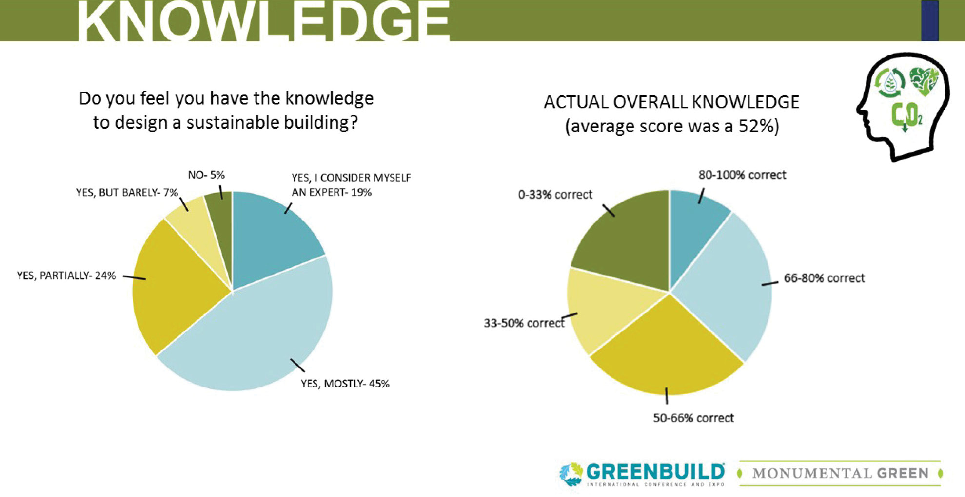
The day of our session finally arrived. We were in a special set room, which meant we had multiple screens, a collaboration style table arrangement, and a dynamic central stage that would lend itself well to the three of us moving during our session. When we got through the methods and the raw data, we led a quick activity to see who in the room would have, according to our data, gotten the highest scores on our knowledge section. In our survey the average score was a 52%, a failing score at most universities. We first asked everyone in the room to stand up, and then proceeded to ask all the women to sit down. Then, the people who live in the Midwest and Southeast were asked to sit, followed by those who had not graduated in the 1990s. We were left with less than 15 of our 150+ attendees still standing.
This was an impactful activity, but what we learned from our knowledge section is that gender, age, and location do not have a statistically significant impact on your actual knowledge. So being a man, or from the West Coast, or graduating in the 1990s, does not inherently make you smarter. What makes you smarter, which we learned from our implementation section, is where you get your information, and how often you get it.
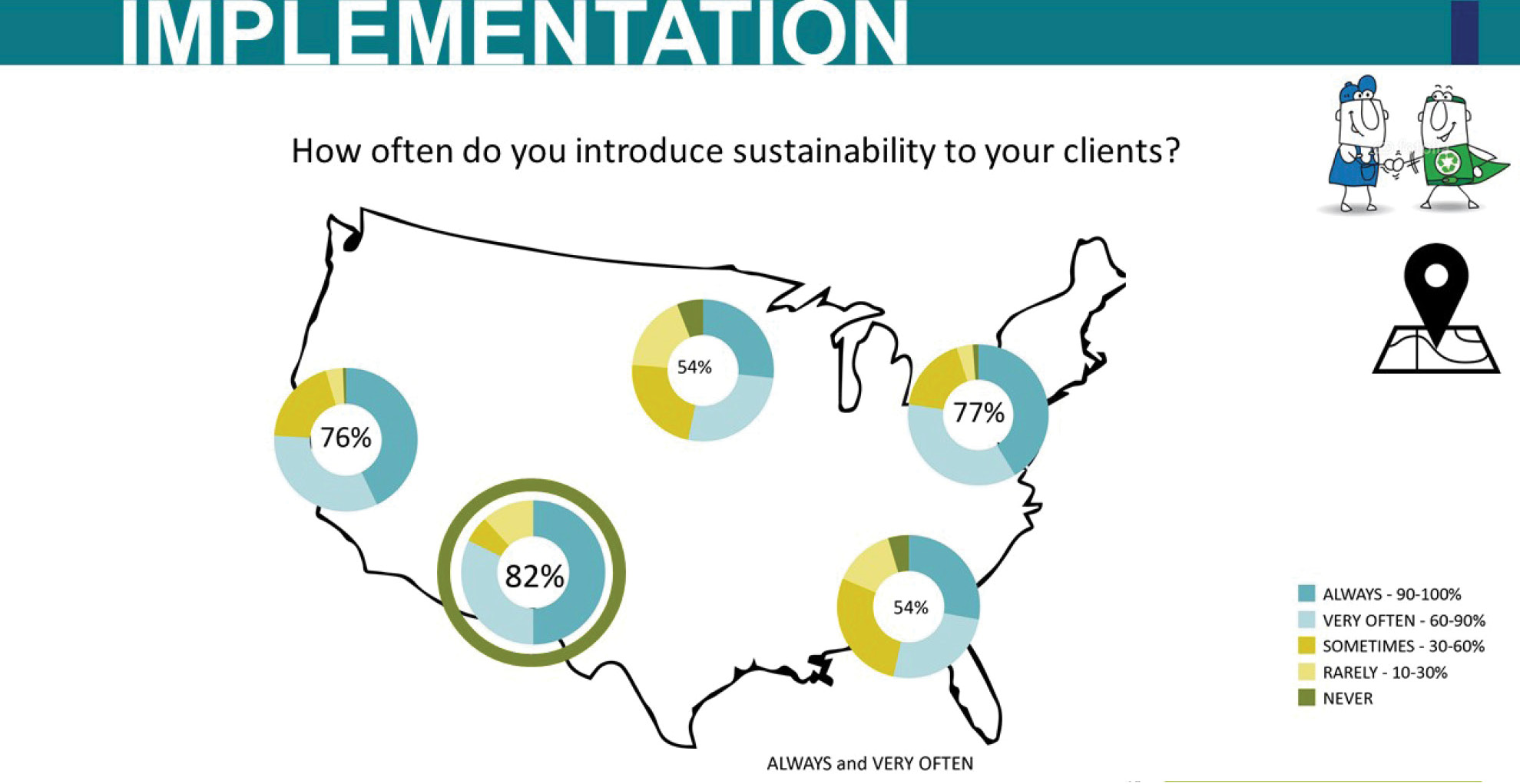
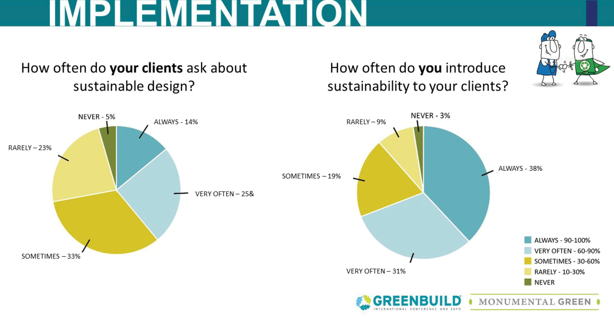
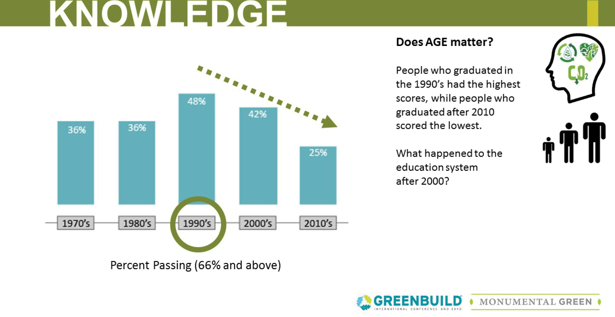
We found that people who regularly connect with colleagues about sustainability via conferences, lunch–and-learns, and webinars, not only had higher scores, but also were far more likely to introduce sustainability to clients. From our survey we learned that more than ¼ of architects introduce sustainability less than half the time, and that 12% of architects report they introduce sustainability to less than ¼ of clients. We also saw that working on a NZE building, which only 29% of respondents have done, and measuring building performance post-occupancy, which only 4% of architects are regularly doing, had a huge effect on both knowledge level and how often knowledge was shared with clients and other architects. Working on a NZE building forces architects to push the limits of design, while doing post-occupancy studies can teach us what was successful and unsuccessful in our projects, which we can carry into future projects. When we looked at the age breakdown from our survey, we found that people who had graduated between 2010 and the present had the lowest scores on the knowledge section, and they felt that education was the biggest problem in our field.
We finished our presentation with a discussion, which caused our session to run over due to the attendees being so deep into the discussions taking place. We spurred some great questions about what people are currently doing in their practice to share knowledge, and reflect on how often they bring up sustainable design practices to clients. I have presented at four other conferences, including the American Solar Energy Society Conference and the Gulf Coast Green, and this was my favorite presentation that I have been a part of. Hearing people ask more questions and want to know what they could be doing better was inspiring, and many people came up to us afterwards commenting on how our presentation was their favorite session.
Overall, Greenbuild was an amazing experience. There’s nothing like presenting your hard work in front of 150+ people. I am grateful that I had the opportunity to present, and to anyone that has something they are passionate and knowledgeable about – do not be afraid to share it with the world.
Design Month at EHDD
The “maker” trend is a catch phrase heard outside the confines of our office, and even outside the architecture profession. While you might find a maker space in our clients’ buildings or a tool for learning in our clients’ programs, it can also be a brand distinction for an artisan cheese, a DIY (Do It Yourself) YouTube video, or handmade card. “Maker Culture” even has its own Wikipedia page. It has gained popularity across the country and in many different fields.
At EHDD, making is something beyond a trend or a catch phrase, it is at the core of many of our personalities and ambitions. We are makers. We have musicians, chefs, DIY home-renovators, furniture makers, painters, photographers, videographers, writers, and more amongst our midst. Many of our designers, architects and technical staff have deep passions and personal ambitions for making things.
Every year we dedicate a month (or so) to celebrate design in a series of lunchtime and evening events that get the office talking and thinking about design beyond our usual project-based work. This year our design month title was EHDD Makes. It was just one of the many ways our enthusiasm for making informs our office culture. While it was the inspiration for a month long event, I see it as the essence of most of the people that work here.
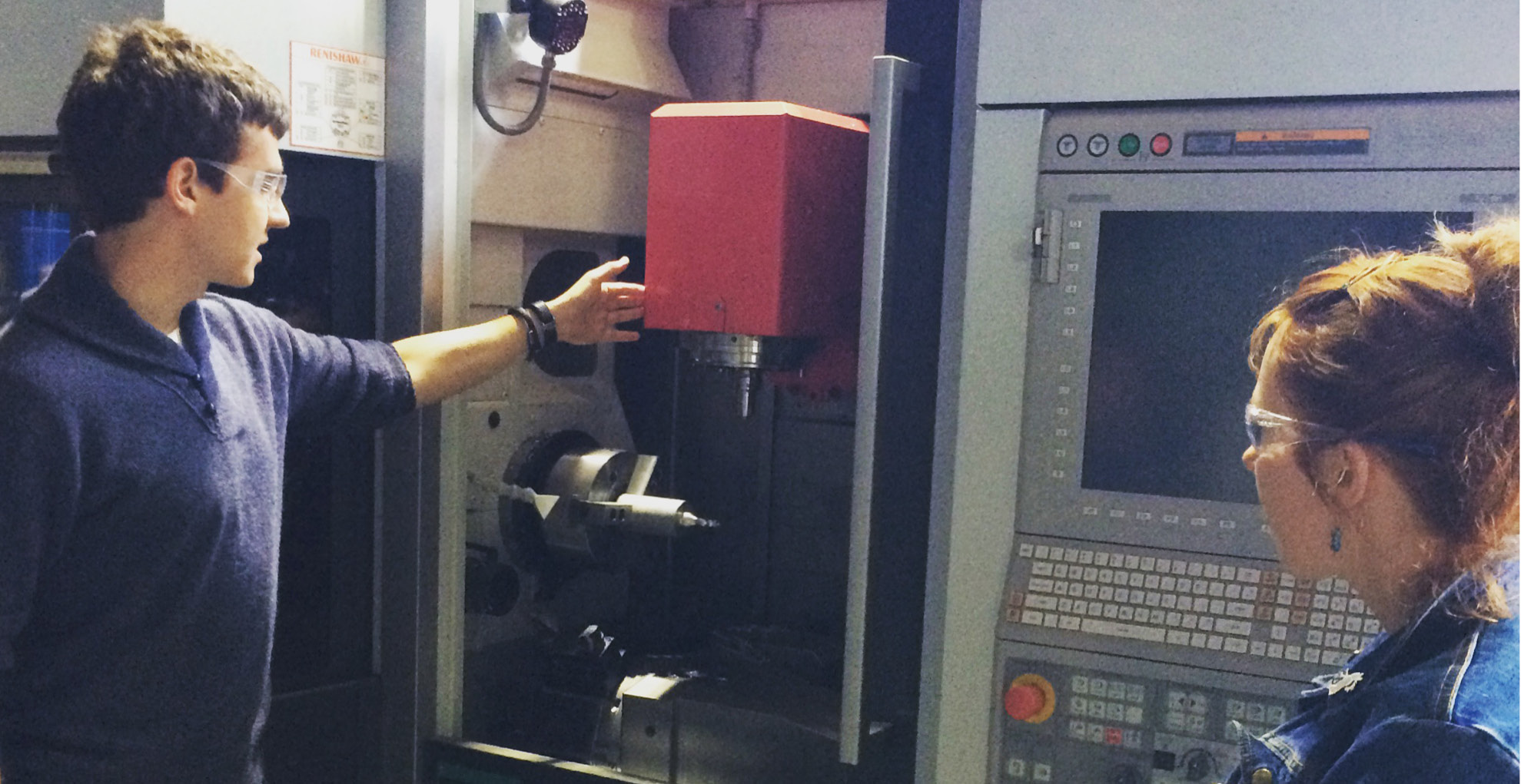
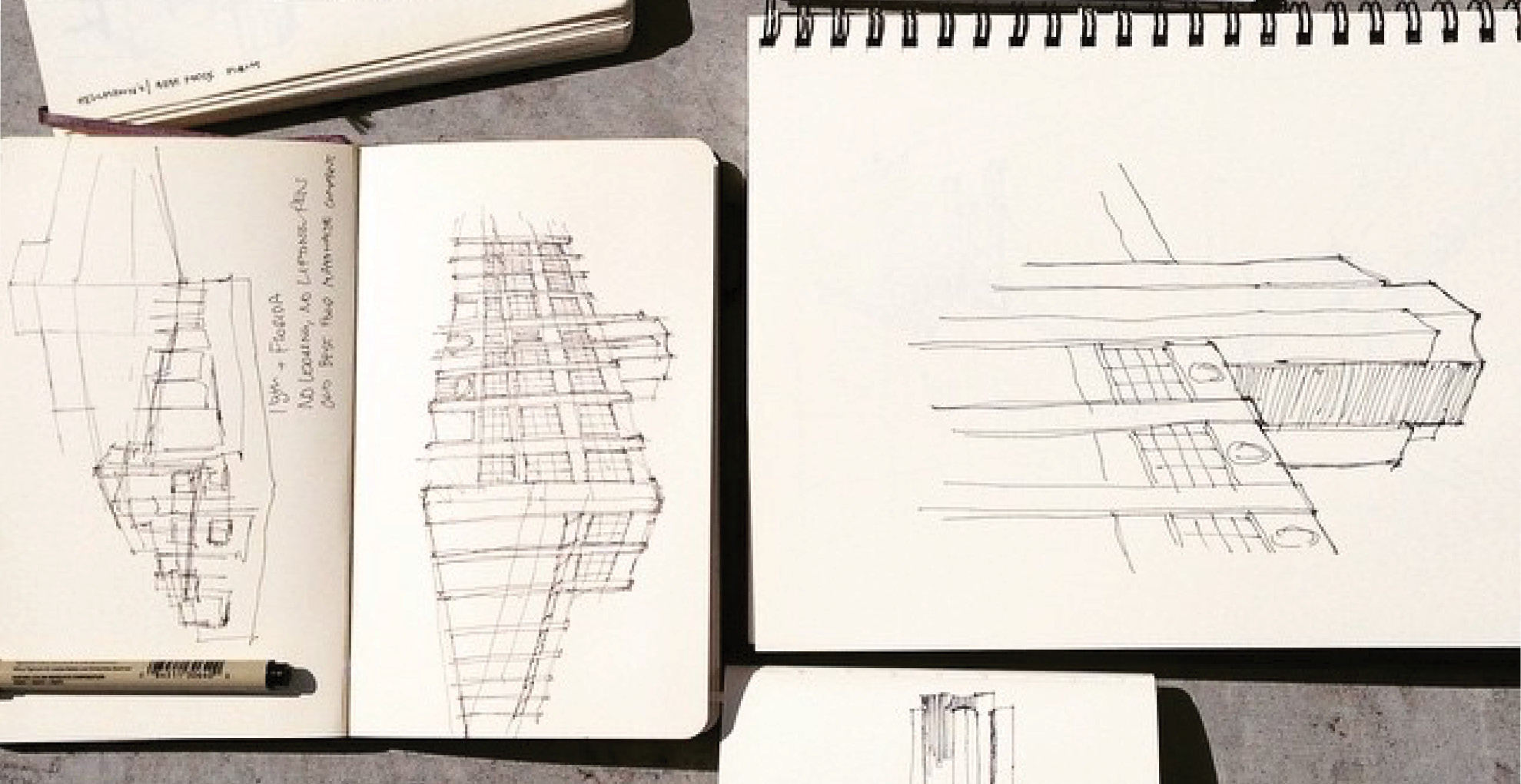
As architects at EHDD, much of our time is spent documenting the design for something someone else will make. EHDD Makes is a theme centered on the act of making with a goal to learn about and engage in craft and fabrication, and to tap into our local maker network. This year we visited local maker studios, got out and sketched, and had hands on demonstrations and discussions.
Check out some of the highlights from this year:
Mixology Kickoff Event with Method Brewing: Robert Schiemann is a computer scientist and mixologist, he came in and wowed us with a tasty selection of margarita cocktails. Each drink tasted notably different with just one or two ingredients slightly altered or swapped out. Finding the right combination of ingredients in any design, edible or otherwise, is an art.
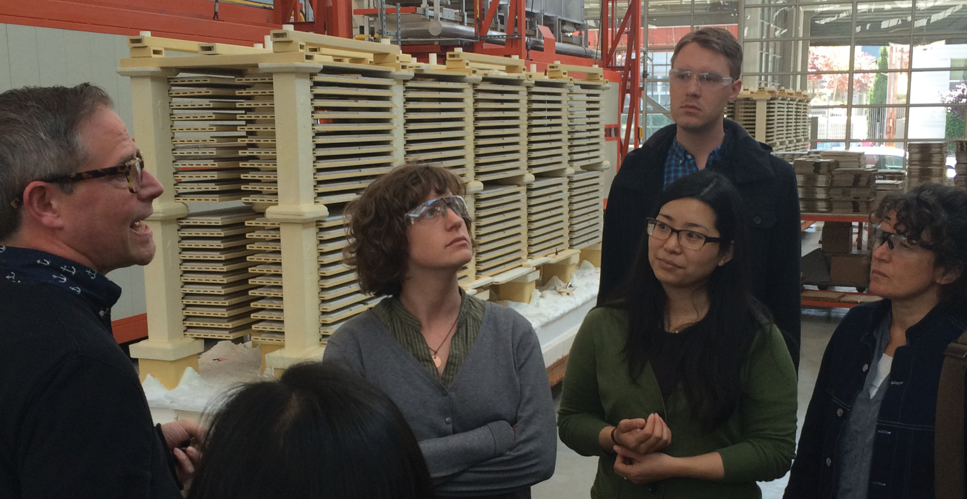
Heath Ceramics Factory Tour: We toured the Heath factory on 18th Street,which is around the corner from our office. We got a historical narrative of Heath, as well as a peek into the secrets of how their beautiful tiles and other ceramic products are made. We witnessed enormous kilns and ceramics being made and glazed by hand.
It’s a Sketchy Neighborhood Tour: Our own Kevin Killen, director of the residential studio at EHDD, lead a group of us through the Mission and talked about the history of the area, including buildings that were once used to house factories, breweries, and auto manufacturing. He has continued this tradition beyond design month, weaving it in to short lunch trips.
Gemmitti Model Art Tour: Gemmitti is a local model maker around the corner from our office. They gave us a tour of their space and talked about their work.
3D Print Workshop: Matt Bowles, a designer at our office, is also rehearsed in the art of 3D printing. He did a demo on how to create a 3D model from our in-house machine to a group of us itching to learn.
Pier 9 Autodesk Artists in Residence Tour: We toured the Artist in Residence workshops at Pier 9. This is a program run by Autodesk (whose name is on a lot of the software we use). They have nifty machinery in their workshops, including a plethora of 3D printers, top of the line wood machines, and super precise metal fabrication machines.
A Magical Trip through the Mangroves
I vividly remember my first (and only) walk through a Mangrove forest on the north coast of Australia. There was a boardwalk path through an otherworldly swamp filled with a tangle of roots and tubes supporting the canopies above. Birds called, the ocean hummed in the distance, and I was on the lookout for crocodiles and snakes. It was a magical experience. When I heard we had been contacted through Public Architecture’s 1% Program by a non-profit working to protect the Mangroves in El Salvador, I leapt at the chance to help.
EHDD signed on to the 1% Program shortly after its founding in 2005 – committing to spend 1% of the firms time on Pro Bono projects. We have met that commitment and mostly exceeded it, but always by finding our own non-profit partners in need. When EcoViva contacted us, it was the first time we’d been approached through the through the 1% website, which acts as a matchmaking portal between designers and non-profits.
It’s easy to see why they sought us out. Their mission – creating community-led initiatives for a sustainable future – aligns perfectly with our own – that great design recognizes our responsibility to the future. Therefore, it was no surprise that we liked them from the start. EcoViva works with the Mangrove Association to build grassroots support for sustaining the fragile mangrove ecosystem in the Bahia de Jiquilisco, El Salvador.
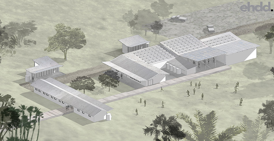
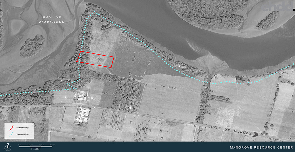
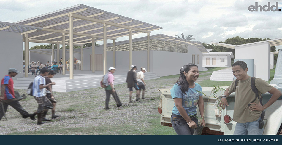
They had been given a piece of land near the bay and are planning to develop a Mangrove Resource Center – a place for the community to gather, for education and a base for community organizing, as well as a lab for research with an eventual residence for scientists to be able to come and stay while they study the mangroves. Our task – to create a masterplan for the site and a concept for the buildings – designed to be dignified, inexpensive, and sustainable. With feedback from the client, we developed a plan and some visuals, which will be used to convey the concept and raise funds for the construction.
We hope this is just the beginning of the collaboration, and that we will be able to help EcoViva realize the Mangrove Resource Center and maybe go visit ourselves. I for one am looking forward to another magical trip through the mangroves.
Find out more by clicking on the following links: 1% Program and EcoViva.
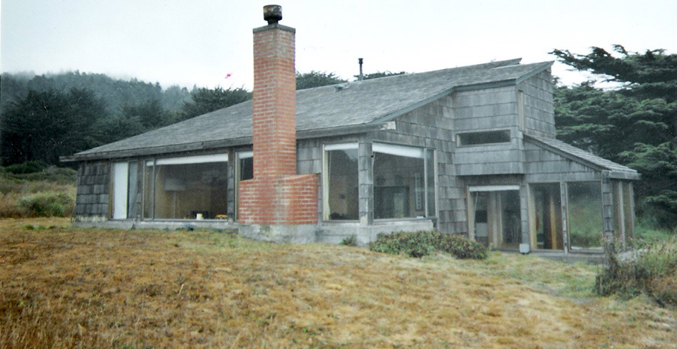
Sea Ranch at 50!

Even though I grew up in Northern California, my first trip to Sea Ranch did not happen until after I finished architecture school. That first visit was the culmination of a ten-day cross-country road trip with a fellow classmate that started in muggy Connecticut and ended up on the cool and windy Mendocino coast. That was in 1989, which, as it turns out, was the 25th birthday for Sea Ranch. My traveling companion wisely counseled that we ditch the faithful pick-up truck in San Francisco that brought us safely across the continent, opting instead for a ride in another friend’s 1968 Mustang for the final leg up Highway One to this place called Sea Ranch. It seemed like the proper ride for that trip up the coast.
Originally conceived in the mid-1960’s by a Hawaii-based development company as an environmentally friendly development in harmony with land that had already been clear-cut of timber and trampled by ranch animals, the Sea Ranch project was a radical idea for radical times. Considering all of the political, financial, cultural and social turmoil that the world (and the Bay Area) was experiencing during the nascent stage of this real estate development in the middle of nowhere, it is amazing that it actually went forward.
One can only imagine a group of developers in a boardroom round about 1964, proclaiming something to the effect of “Hey, man—here’s an idea—let’s sink a ton of dough into buying this run-down ranch 120 miles north of San Francisco on this windy, rocky coast, with no beaches, a little bit of sun, AND let’s only build out only half of the land, and sell the lots to weekenders! And while we’re at it, let’s decide to only let folks build these houses with natural materials! Like, redwood, man! And no flat roofs, and no roof overhangs, and you have to screen your parking space so I don’t have to look at your old car, man.”
At that point, I suppose, all eyes turned to the lone banker sitting at the end of the boardroom table, who pulled off his tinted octagonal glasses, and could have only given the reply “groovy baby, let’s do this.” It goes without saying that a lot of not-so-great things happened in the late 1960’s (Vietnam, MLK and RFK assassinations, race riots, campus riots, Soviet invasions in eastern Europe, etc., etc.), but as my friends and I drove up the coast in that convertible 1968 Mustang, arriving hours later at the scenic clusters of faded wood houses, it reminded me that some really good things also came out of those crazy times.
Bill Turnbull and the Barns.
A month after my first trip to Sea Ranch, I found myself working at the architectural office of William Turnbull (known then as William Turnbull Associates) at Pier 1 ½ in San Francisco. The funky office “décor” was literally frozen in time (in 1968, of course) and sported walls of neon green, orange and yellow paint that were the legacy of Charles Moore—the friend of Bill, his former business partner, a frequent collaborator, and a mentor to a whole generation of architects both near and far.
Although the bright colors, the rustic materials, and the bare light bulbs were all hallmarks of the early Sea Ranch projects of Bill and Charles and partners, it was the way these buildings fit into their natural surroundings, and drew inspiration from the vernacular architecture of the former sheep ranches and buildings of the Mendocino Coast that would put Sea Ranch on the architectural map.
Subsequent trips to Sea Ranch with friends included several weekend trips and stays at different Turnbull-designed houses in the hills above the highway and in the meadows, which included the “Binker Barns”, a series of exceedingly simple, rustic and barntastic houses that Bill Turnbull and master builder Matt Sylvia built by themselves on spec. The simple vernacular forms of these houses betrayed Bill’s dairy farm roots, and demonstrated that the form and scale of these structures were equally cozy and familiar for both weekenders and Guernseys alike.
Bill went on to design homes at Sea Ranch spanning three decades and continued to explore spatial relationships with his small rustic houses that fit in to their natural surroundings. In the late 1980’s and early 1990’s, Turnbull designed new horse stables and the Sea Ranch employee housing, which secured for him the architectural hat-trick of building housing for pretty much all of the Sea Ranch residents, except for the deer.
Lawrence Halprin and that Porsche.
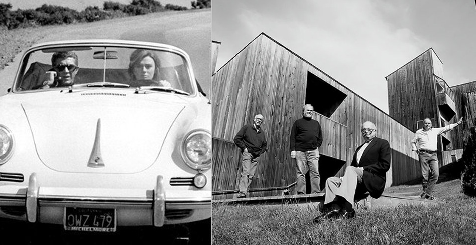
Even in 1989, Bill’s office still had models and photos from various Sea Ranch projects still hanging on the walls, including the iconic Condominium #1 and the Moonraker Recreation Center. My favorite Sea Ranch artifact was the large black and white photo (circa 1968?) of the Sea Ranch Lodge Sign on the edge of the highway, standing alone in the wind (no trees growing around it yet), with a lone car parked next to it. The car in the photo was a mid-1960’s bathtub convertible Porsche—something Steve McQueen would have driven up to Sea Ranch. That photograph exuded a northern California vibe of weekends at the beach, hot tubs, coastal pine trees and German cars all wrapped up in one iconic image of cool: delicately balancing the wealth associated with second homes and the casualness of the northern California beach life.
Lawrence Halprin was the landscape architect involved in the master planning of Sea Ranch, and was also a frequent collaborator with Bill Turnbull. I met Mr. Halprin in his San Francisco office in the early 90’s, and although that South of Market office space may have been his second or third location since opening his doors, the walls were still adorned with his beautiful Sea Ranch sketches.
The land that had been looked at for the development had most recently been a sheep ranch, and the prime areas of the tract were comprised of a series of coastal, wind-swept meadows divided at intervals with large hedgerows of trees to help break the wind. Halprin’s landscape and development plan for Sea Ranch flew in the face of traditional suburban development patterns and proposed to site new development in harmony with the existing landscape and topography of the hills and meadows.
Halprin’s big design idea for developing this land, which was probably the most radical part of the whole notion that became Sea Ranch, was to ditch the traditional residential planning ideas and to cluster new development in groups sited relative to the existing hedgerows, treading as lightly as possible on the landscape. These master plan ideas acknowledged what the sheep already knew—it can be windy and cold out in the fully exposed meadow, and if you want to stay warm, you need to point your butt into the wind and huddle together with your friends.
Listening to the stories about the birth of Sea Ranch from the man who first sketched it out on paper was enlightening, to say the least, but before I left Halprin’s office, I summoned my courage to ask him something that only one of the old masters could answer for me: Was it true that his old office on Montgomery Street filled in as Jacqueline Bisset’s office in the iconic San Francisco film “Bullit?”
“Yes, it was,” he confirmed. He reminded me that Ms. Bisset played Steve McQueen’s girlfriend in the film, and that the scene in his office included some back and forth dialogue and some inside jokes about the fountain in Justin Herman Plaza, and also that her car in the film, which Steve McQueen drove, was a mid-1960’s bathtub convertible Porsche.
Charles Moore and the Negronis.
While working at Bill Turnbull’s office, I was also fortunate to be working on a large project that was a design collaboration with Charles Moore. Mr. Moore made frequent visits to Turnbull’s office in those days for design meetings, and sometimes we were catching him on the way up to or returning from a visit to his amazing corner unit at the Condo #1 at Sea Ranch.
My same architecture school classmate who accompanied me on my first visit to Sea Ranch ended up working at an office in Los Angeles that also collaborated with Charles on several projects.Through this connection, I got invited to visit Moore’s condo while he was there with a group of architects and consultants. The location of the key for Moore’s unit (under a flower pot at the time) was one of the worst-kept secrets in the Sea Ranch architectural community, so it was nice to be invited, as opposed to snooping around with fellow architects.
The first time I walked in the door, I was immediately struck by the realization that all of the knick-knacks that appeared in the iconic interior photos of this space from the late 1960’s (the Campari bottles, the Moroccan door, the groovy Marimekko pillows, etc.) were all still there, and not much worse for the wear.
The Campari, as it turned out, was for making Negronis, which is a perfect beach house cocktail for hot and sunny beaches, and even more so for a beach house with strong winds roaring up the seaside cliff and swirling around (and through) those thin, insulation-free walls. It really was built like a barn, but with really nice views. While Joe Esherick’s Hedgerow houses place you firmly in the tranquility of the Sea Ranch meadow, Moore’s condo on the cliff is all about the precarious balance of a house on the Pacific Rim, and the wind, rain and crumbling shoreline that comes with that living arrangement.
Joe Esherick and the Hedgerows.
Halprin’s and the developer’s ambitious vision for Sea Ranch was also shared by Joe Esherick, whose “Hedgerow Houses” belong in the group of buildings from the early golden age of Sea Ranch design and construction. Originally envisioned as demonstration houses, the Hedgerow houses were homes loosely connected like a group of farmyard structures, using the leeward side of the hedgerow as protection from the prevailing winds.
My own experience with these hedgerow houses includes a couple birthday weekends and an office retreat visit. The big appeal of these simple, modest boxes, in my opinion, are the large glass areas in the living rooms that make for an ideal spot to view the critters in the meadow or have a hot cocoa while the wind and rain swirls around the house outside the window.
Cable TV was a late arrival at Sea Ranch (let alone broadband connections), and most days were spent outside. Our classic beach house protocol was to surrender your wristwatch (remember those?) at the door upon arrival. One of the really nice things about Sea Ranch was the remoteness–no TV and no internet forced you to go outside (you could only play so much checkers or Monopoly), and talk to your companions, or read a book or cook a big meal with the group.
If the weather outside was too wet and windy, one could spend the afternoon looking out the big living room window, set below the meadow grasses, which gave you a deer’s-eye view across the meadow. For me, the magic of Joe Esherick’s Hedgerow houses were these front-row seats that Joe designed for me to comfortably watch the field mice and the deer work their way through the meadow, or just a warm place to stare at the clouds rolling by.
My Sea Ranch at 50.
Twenty years after my first visit to Sea Ranch, I started working at Esherick, Homsey, Dodge & Davis. Joe Esherick passed away in 1998, and though I never got to know or work with Joe, his ideas and his stories still ooze from the walls around here. Many of the design lessons to take from the houses that Bill, Charles and especially Joe designed at Sea Ranch still resonate loudly today in our current design work: simple & durable materials, responsiveness to the environment & the local climate, and to remember to have a “thick sweater and a good hat.”
Sea Ranch, like those of us in our 50’s, may be showing a little more grey and may be a little bit larger than it used to be, but it still looks pretty good for 50. While the cliffs will continue to erode and the shoreline (and probably the climate itself) will continue to change at Sea Ranch, I have no doubt that it will continue to inspire architects and designers, as it will inspire you to spend an afternoon reading a book, keep you up late at night soaking in a hot tub, get sand in your ears, and make you park your convertible behind the fence where the neighbors don’t have to see it—for at least another 50 years.
Kevin S. Killen, AIA, LEED® AP
Director of Residential Studio
Living Cities Competition
We were surprised and honored to win the Metropolis Magazine Living Cities Tower Competition earlier this year. Though we completed this project outside the context of the office, we benefited from EHDD’s longstanding tradition of fostering young designers and encouraging creative exploration.
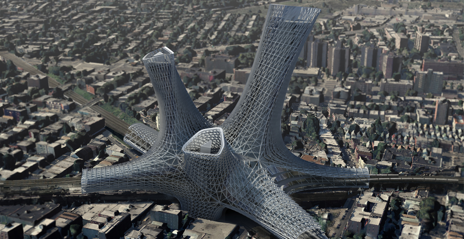
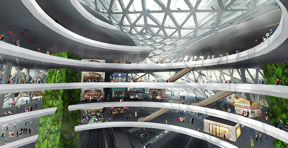
The unrestricted format of the ideas competition hosted by Metropolis Magazine was a great complement to the rigor of designing buildings at EHDD. Our concept and design, The Urban Alloy Towers ascribes to a different aesthetic language than the projects that we typically work on at the firm; however, the core ideals of creating a collectively greater future for our clients, society, and the environment – is at the essence of our work in both contexts. The Urban Alloy Towers centered around three key ideas: repair of urban fabric around the rifts created by mass transportation infrastructure, the creation of the neighborhood with in a building that strengthens the social ties of its inhabitants and optimized building systems that optimizes the solar performance of a complex form.
Our main concepts for Urban Alloy included:
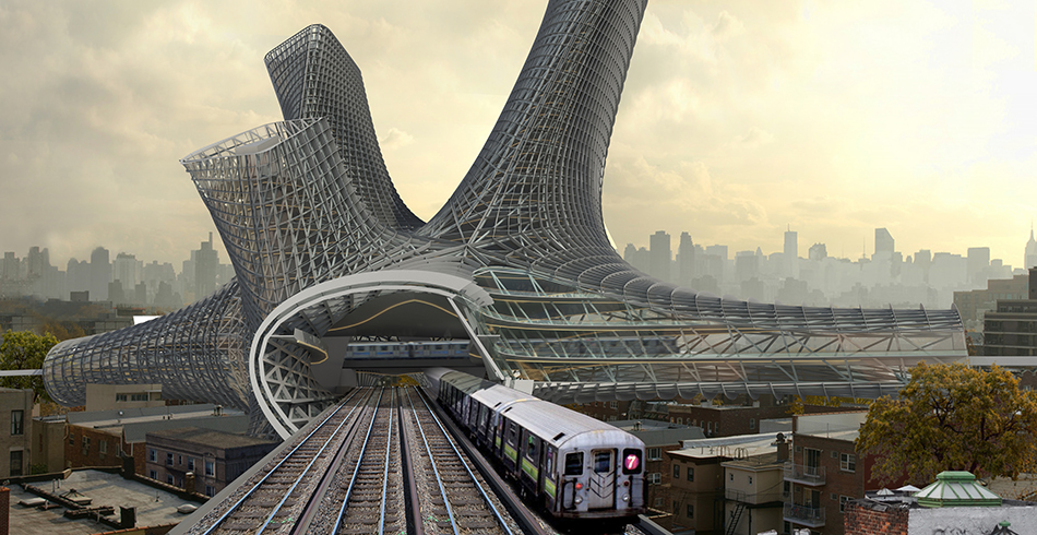
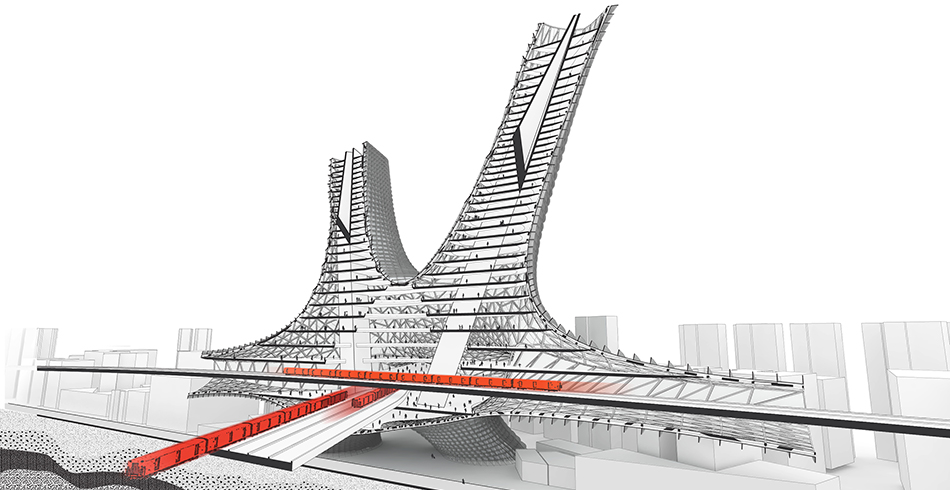
Urban Concept: The most dynamic cities of the 21st century, such as New York, are anthropomorphic alloys that act as engines for innovation and social cohesion. These cities, with their continually evolving demographics, will forge the dynamic societies of the future. With the rapid rise of near instantaneous communication, a city’s livability has gained prominence as an attractor for top minds. In order to secure its future as the leading global center, New York needs to continue to grow in smart ways. We see the opportunity to draw the energy of Manhattan out into the four other boroughs without disrupting existing land use. Urban Alloy proposes a residential typology rooted in the remnant spaces surrounding the intersection of transportation infrastructure, such as elevated train lines and freeway interchanges. With the proposed design and specified materials, we aimed to optimize a heterogeneous and highly linked set of living environments capturing the air rights above these systems.
Living Concept: The combination of escalating land prices and the acceleration of city migration have made urban renewal based modes of densification unfit for the contemporary city. Urban Alloy is the symbiotic re-purposing of the air rights above transportation corridors in New York. Urbanist’s have long touted the benefits of greater housing density near public transportation hubs; Urban Alloy proposes the advancement of this idea by locating the system directly on the intersections between surface and elevated train lines. We chose the intersection of the LIRR and the 7 train as a test case. The paradigm of one size fits all is obsolete. Urban citizens want diverse living situations where they can work, play, eat and rest within a pedestrian zone. As technology creates the market desire and a conditioning for personalization, society is more willing to pay a premium for spaces that are tailored to their particular needs. (See Program Diagram describing the wide range of living options.)
Skin Concept: The wide range of programmatic options inspired a blend of floor plate geometries that transition from cylindrical to triangular from the base to the top of each tower. This blend, along with constraints instilled from the site, generates a complex geometry that requires a new facade optimization paradigm. A composite or alloy of multiple flexible systems is required to optimize a skin in which every point has a unique environmental exposure. The system is deployed on a grid that follows the geometric directionality of the surface. At each intersection of the grid, the normal of the surface is analyzed against its optimal solar shading and daylight transmitting requirements. An authored algorithm then generates vertical and horizontal fin profiles that blend with the profiles at adjacent nodes. The result is an optimized system of decorative metal fins that are unique to each specific solar orientation. Based upon the tenants of current solar facade design, the algorithm utilizes deep horizontal fins along southern exposure, and deeper vertical fins along east and west facing surfaces. This system generates specific fin depth and orientation for every point on the surface.
This competition was a chance to explore ideas for the future of architecture and its rule in shaping the city. In the next hundred years we think that architecture will be both more sensitive to its context and more formally imaginative, because designers will invent new building types by linking efforts to optimize programmatic and environmental considerations.

Connecting the Dots
Sometimes it takes a while to connect the dots…
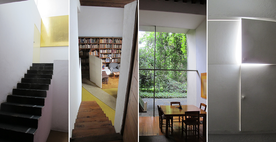
My partners and I hold our shareholder’s meetings in different places every Fall. This is a time for reflecting on the past year and setting the vision for the future. We go to new places to be inspired by nature, cities, design, architecture, and whatever else we encounter along the way. We’ve been to places as diverse as London, Berlin and the San Juan Islands and once even held our meetings on Amtrak’s Coast Starlight. One of these meetings was recently held in Mexico City— the closest mega city we could find with parallels to Mumbai, where we’ve recently established an office. While in Mexico City, I was fortunate to visit Luis Barragán’s house. The house revealed a few things to me about its architect, and by association, two of my mentors – Joseph Esherick and Alan Buchsbaum – and the impact they had on me and my work.
Mexico City has a population of over 21 million. A fine case study for learning how people live, how they cope, and how architects and urban designers deal with a growing city in a more environmentally conscious age. For anyone who hasn’t visited this metropolis in the last 20 years, it’s worth a trip. The air is cleaner; people dine on sidewalks in trendy neighborhoods where design reigns supreme. This changing landscape is the product of a growing talent pool of young Mexican architects and designers, making a mark on an evolving city from high rises and mega developments to large civic parks.
Increasingly, we find ourselves reaching out to local practitioners in the places we visit in order to engage in dialogue, learn what they’re doing and share more about our practice in the States. In the Mexico City meeting we initiated a round table discussion held at the Barragán House, attended by a lively, conversant group of local practitioners and educators. We were treated to snacks and fine tequila courtesy of the caretaker’s family distillery. The lively discussion was preceded by a tour of the house, led by a young Barragán scholar. In Mexico, Pritzker Prize winner Barragán is the godfather of architecture and his spirit looms large. He reverred among the young generation of architects in a way that Legoretta, heavily influenced by Barragán and far more prolific, is not.
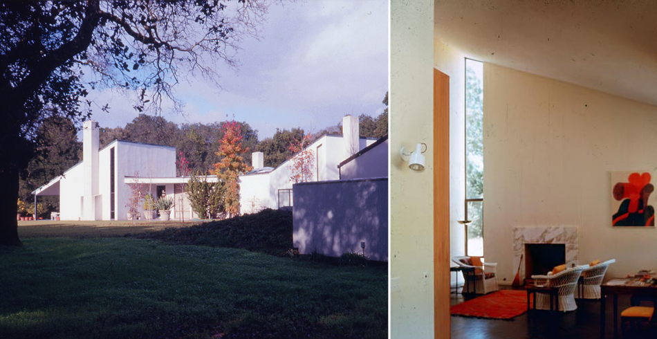
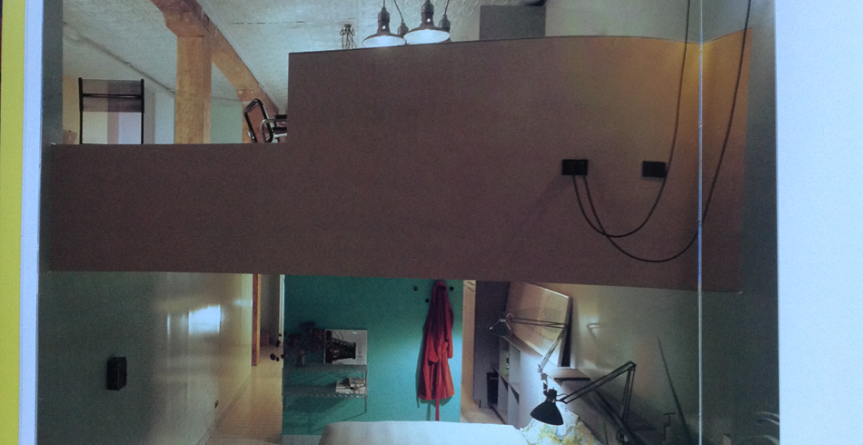
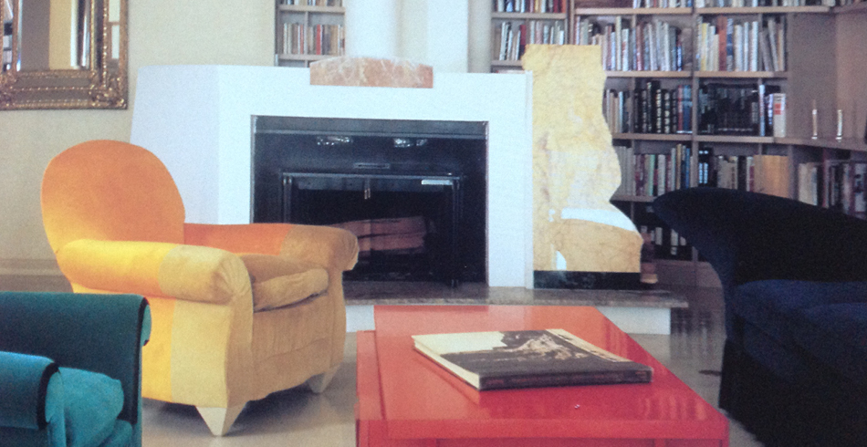
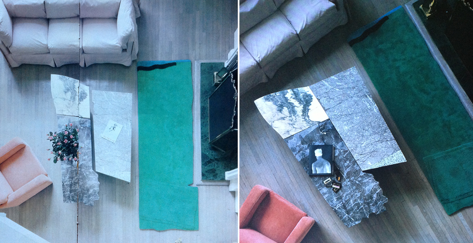
I was struck by the similarity of light quality here as in Joseph Esherick’s classic houses. Panels over windows modulate light and blend into the wall surfaces, not unlike those found in Esherick’s Cahill House in Woodside, CA. Views to nature are carefully composed for that view, and not in the service of crafting the most balanced elevation. Planes of sharp color define spaces and influence one’s perception of adjacent white surfaces, depending on time of day. Alan Buchsbaum, a master of color in his own right was known to have been influenced by Barragán. Buchsbaum, a far less private and religious man than Barragán, also chose to have his studio under the same roof as his home, with a both a ceremonial, and far less formal way to move between the two. In fact, what struck me most about Barragán is not apparent looking at photos and plans of his work: Barragán was a choreographer and his architecture is defined by how one moves from room to room, never passing through corridors.
Upon reflection after the trip, it occurred to me that both Esherick and Buchsbaum, like Barragán, shared fascination with space over form and both appear to have been influenced by him. Buchsbaum, an architect and designer in NY, made his reputation re-appropriating industrial loft spaces in what would become known as the high tech style of the 1970s. His designs created colorful safe havens from the city for actors, artists, and performers – his friends and clients. Esherick eschewed form for form’s sake and worked from the inside out, carefully positioning a house to take full advantage of the site, without destroying it in the process. His designs were crafted to follow movement through the house, the dynamic movement of the sun, the nuance of daylight, and carefully framed views of that Northern California landscape.
I don’t know if either ever visited “Casa Barragán” or met Luis himself but their debt to him seems apparent, to me anyway. I can’t help but think that what struck me most about Barragán’s house is what I learned long ago from Joseph Esherick and Alan Buchsbaum.
BMW Guggenheim Lab Competition
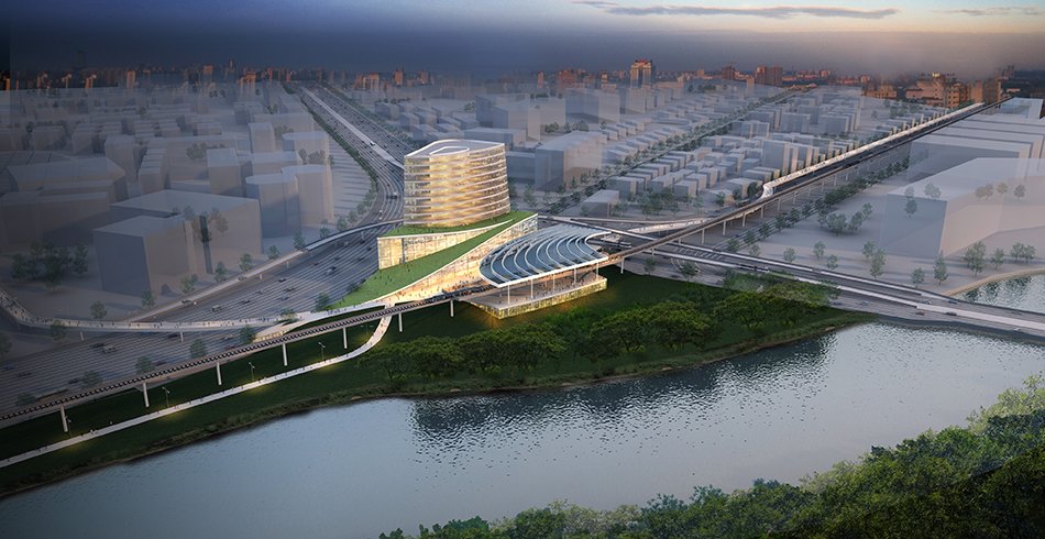
In December 2012, EHDD and EHDD India participated in a Global Design Competition to redesign one of Mumbai’s busiest traffic junctions. The BMW Guggenheim Lab in Mumbai explored the growing need for public spaces that enhance everyday life for more of those who live in Mumbai. As part of this exploration, the Solomon R. Guggenheim Foundation and Mumbai Environmental Social Network (MESN) launched a global search in November, 2012 for innovative proposals to redesign one of Mumbai’s busiest transportation hubs, the Kala Nagar traffic junction.
Connecting Island City to Mumbai’s western suburbs through five main traffic arteries, this junction has one of the highest traffic volumes in Mumbai, with about 60,000 drivers and cyclists passing through per hour, both above and below the flyover, at peak times. Research also shows that the Western Express Highway, which connects with the junction, ranks among the ten most dangerous roads in Mumbai, as measured by casualty rates. The competition brief sought proposals for a “viable, mixed-use intersection that caters to both individuals and communities and represents a more progressive view of Mumbai’s city infrastructure.”
We approached the project with a broader perspective about the remaking of Mumbai as a sustainable successful Global City and focused our submittal on the following:
1. Use this opportunity to reinforce the emerging urban growth of Mumbai as a “Poly-Centric City”, centered on mixed-used district centres, that are well connected by public transit and open space.
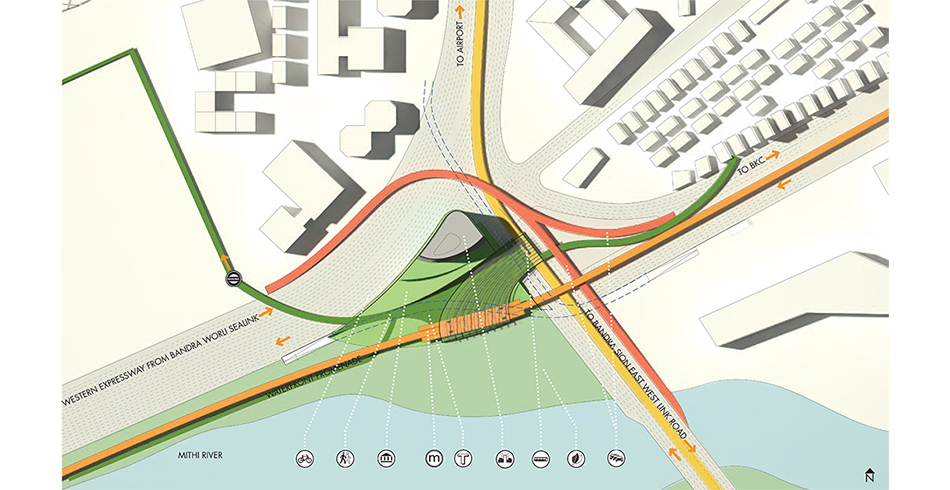
2. Redesign the Kala Nagar junction to reinforce its role as a destination in the district, and a gateway to Bandra Kurla Complex (BKC) – a major business centre of Mumbai. After studying the existing conditions and improvements proposed by MMRDA, the EHDD team proposed realignments of the proposed infrastructure to recapture land area and create meaningful public open space. The proposal also connects the Mithi River to the junction and creates a new multi-modal, mixed-use parcel as a commercial and public space.
The key planning principles were:
1. Create a multi-modal, pedestrian-friendly Transit Hub.
2. Create a District Centre and Mixed-Use Destination with retail, commercial and cultural amenities.
3. Expand and integrate the waterfront park and promenade into the mixed-used development.
4. Create a Landmark for Kala Nagar and a Gateway to BKC.
EHDD’s entry was Short-listed among the Top 10 for the final round from a total of 40 entries and exhibited for public view in Mumbai. For more information visit http://www.bmwguggenheimlab.org/kala-nagar-traffic-junction
Authors: Samir Shaikh, Project Manager, EHDD India; Joseph Schollmeyer, LEED AP, Senior Designer, EHDD; Amy Leedham, LEED AP NC, Designer, EHDD
Designing for Dirt at MY Farm
When comparing apples to apples, many will opt for the one that was grown in pesticides and flown over from New Zealand. There are several reasons for this, mostly boiling down to cost or habit. Nonetheless, local and organic produce is simply better for our bodies, our communities and our planet. There are countless articles, books and films to argue this point, but nothing is more convincing than the crunch of a carrot yanked right from the dirt. In order for the local, organic food movement to be truly effective, it needs to reach a critical mass. It will require leading by example and raising awareness about the benefits—and that’s exactly what the high school students running the Mission Youth (MY) Farm are doing.
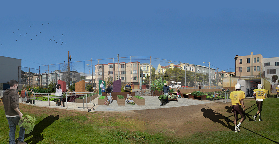
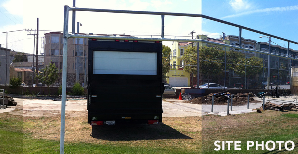
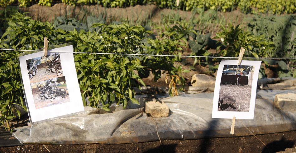
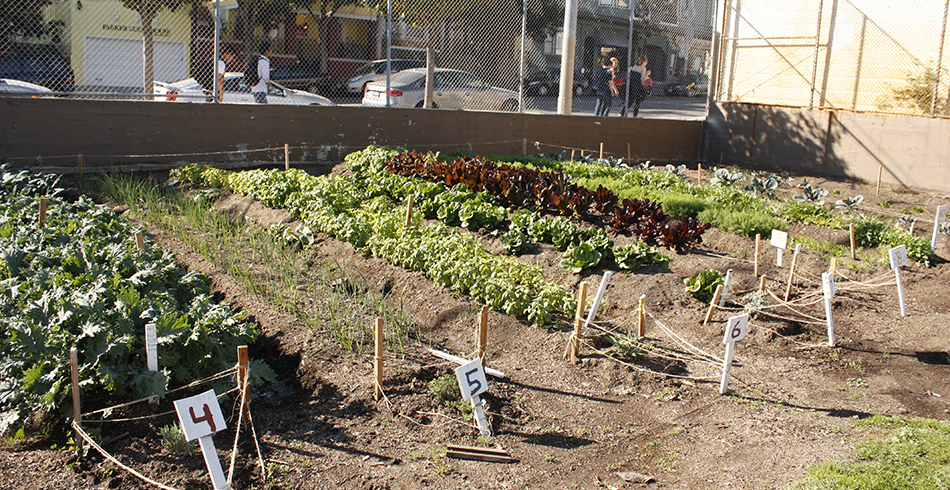
MY Farm is a fully-functional site for urban agriculture on the northwest edge of the Mission High School campus in San Francisco. The whole endeavor was prompted by the growing Green Pathways program, an educational initiative seeking to engage its students in all aspects of environmental sustainability. MHS Community School Coordinator, Brian Fox, and Green Pathways Food and Agriculture Coordinator, Rachel Vigil, led the charge in transforming a 7,900 square foot patch of concrete and asphalt into the urban farm it is today. The initial idea was that this underutilized portion of campus would be repurposed to accommodate both educational and production needs. Students would be involved in every aspect of the farm – from seeding and harvesting, to packaging and distribution, to marketing. To make it all work, asphalt would need to be torn up, soil brought in, and a very limited space configured in the most efficient way possible. That’s where EHDD came in.
You may be asking what any of this has to do with architecture? The resulting site, after all, contains hardly any permanent structures. What is the role of the architect if not to design buildings? The answer lay in the idea that architects, more than building-makers, are solvers of complex design problems. Architectural expertise is not limited to structures; it is a wider discipline in which conundrums are pondered—and resolved—through the lens of design.
MY Farm was a small site with significant constraints. Planting space had to be maximized to meet the demands of a substantial distribution to the school cafeteria, a student-run farm stand, a Community Supported Agriculture box, and local grocery store since Bi-Rite has committed to selling a percentage of MY Farm crops. In order to accomplish this, all the major requirements of a production site were considered: irrigation, drainage, washing and packing stations, tool storage, a greenhouse for seedlings, compost, sunlight and shading, just to name a few. Then there were the demands of a public, educational site: allowing sufficient gathering space for classes, ensuring ADA accessible pathways and planter beds, navigating the permit approval process for both the school district and the City, negotiating how much of the site would be utilized for athletic equipment storage as the eastern edge of the farm borders the MHS football field, and so on. Finally, all of this would be executed under the highest standards of sustainable practice and with a small (and at times undetermined) budget.*
That impact was certainly felt by the four fairly junior staffers from EHDD. Early on in the design process, the EHDD team walked the ten blocks from our office to MHS to spend an afternoon with the students. We set out on foot in small groups, examining topics relating to food justice and exploring the blocks around MHS. We gained a better understanding of the greater context in which the farm would exist. We agreed that more people should have greater access to better food. We dug into some complex questions: Where does our food come from? How was it grown? Who has access to it? And how should it be valued? These are the questions at the heart of the design of MY Farm.
The EHDD team sought ways to translate some of the overarching intentions of the Green Pathways program into design terms. For example, a public rain garden was implemented as a way to engage the neighboring community. A portion of the sidewalk adjacent to the farm on Church Street was replaced with permeable pavers and native plantings. In addition to the myriad benefits of a rain garden and beautification of the block, the new sidewalk also gives a public face to MY Farm. It blurs the border between the campus and surrounding neighborhood with living and breathing things. It echoes the farm’s hope to have an impact extending beyond the MHS community alone.
Braden Marks
Project Assistant
*MY Farm was designed pro bono by Jennifer Devlin-Herbert, Phoebe Schenker, Leah Marthinsen, Jessica Lane and Braden Marks as part of EHDD’s participation in Public Architecture’s 1% Program.