The Architecture of Productivity

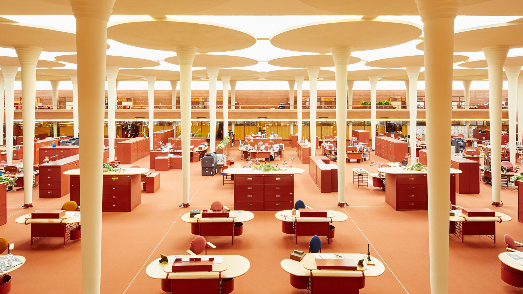
When I first began researching the presentation that this article is adapted from, I stumbled upon a startling fact: the open office pre-dates the cubicle. In the early 1900s, Frederick Taylor set out to improve the productivity of white-collar workers by using techniques from factories–placing dedicated workstations in open rooms. In 1939, Frank Lloyd Wright designed the Johnson Wax Headquarters, a beautiful open office defined by thin white columns, deep red filing cabinets, and oval desks. For over 50 years, an entirely open workplace was a popular office type.
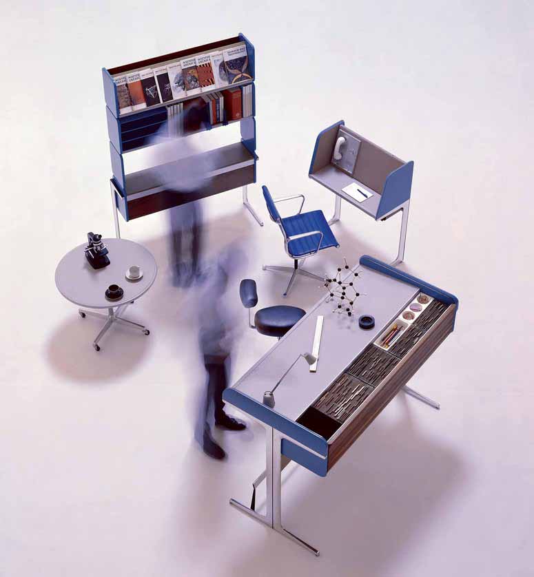
Robert Propst, working for Herman Miller, created the first office cubicle in 1964, called the Action Office. Invented to give workers more privacy and versatility in their workplace, they were a flop in practice due to a high price tag and limited market reach. Four years later came the second iteration (the Action Office 2!) which was cheaper and more modular, and these really took off – there were even tax breaks offered for companies that adopted them. The original Action Offices look and feel like products designed to benefit the common worker, but throughout the 1970s and ’80s companies used them to cram more people into smaller spaces. Hence, the grey sea that we associate with office cubicles today.
In response to that sickly feeling often evoked by rows upon rows of cubicles, tech start-ups in the 1990s began touting the fully open office again. However, they unwittingly believed this was an innovation, rather than revisiting an older idea. The trend came to the desk of Frank Gehry in 2010, when he received the brief for what I will call “The Bilbao of Open Offices” – Facebook’s 434,000 square foot office in Menlo Park. The giant, single-room facility is named Building 20, a nod to MIT’s famous building 20 of the mid-late 1900s nicknamed the “plywood palace.” MIT’s ramshackle warehouse became a hub for innovation during WW2 and beyond, a truly adaptable space that allowed researchers and professors to customize their offices however they saw fit. Gehry’s Facebook office, I would argue, doesn’t seem to carry the same character and organic development of its namesake.
This brings us to today, a time when the open office is not limited to Silicon Valley tech start-ups, far from it. As of 2017, 70% of US workers are working in a space with low or no partitions (Haynes 2008). And the research is unfortunately quite clear – the open office is not good for productivity. Open offices result in a 62% increase in sick days, and 54% of high-performance employees say they are too distracting (Sundstrom, Burt and Kamp 1980). On average, people are interrupted once every 3 minutes, and they are correlated with a 15% drop in productivity (Brennan, Chugh and Kline 2002). Additionally, an open office doesn’t even promote interaction between colleagues, because we prefer to speak with some privacy and without interrupting others. Surprisingly, we collaborate and speak face-to-face with co-workers more as our offices become more enclosed (Bernstein and Turban 2018 ).
If this is true, then you may ask–why are open offices so pervasive? There are a few reasons. First, they are positive in many other regards that contribute to the success of a business. They are great for marketing purposes, as they photograph well. They are 20% more cost-effective than closed offices (Rood 2017), and they are flexible, adapting well to changes in business size. These three points, you may note, are crucial to start-ups. Start-ups do not have a lot of liquid cash, they need an office fast, a flashy looking space to attract investors, and they don’t know if they will have 500 or zero employees next week.
Another reason for the layout’s popularity is a sensible but misguided assumption that a more “open” organization, where colleagues share ideas and resources, requires physical openness. Improving the openness of a business is less about the space, and is more about the removal of barriers that limit the flow of ideas and collaboration. Michael Brill, Professor of Architecture at NY State, makes an excellent point about open space in a company. “Tearing down the walls does not make the energy, it may just expose what is already there to view.” (Brill and Wiedeman 2001). (Brennan, Chugh and Kline 2002) The final benefit, and perhaps the best aspect of the open office, is the flat playing field they create. Executives and CEOs don’t have their own offices, which shows they’re part of the team, sitting side by side with everyone. This creates a sense of teamwork—that no matter where you stand, you’re chipping in. In recent years, companies have been researching how to adapt the open office plan in more productive ways. Gensler’s U.S. Workplace Survey 2019 provides action steps to optimize people’s performance, one of which advocates for a variety of spaces and types of enclosures to fulfill various working styles. (Gensler 2019)
Throughout the last decade, architecture Professor David Dewane has developed a possible solution to our open office problem – the Eudaimonia Machine. The machine is a theoretical concept of an optimal office. It is a long narrow structure, consisting of five sequential spaces – each can only be accessed by walking through the previous one, to not miss a step in the process. Each space is designed for a different aspect of our working lives. The idea was put into practice in 2018 at the STORY concept store in NYC and showed promising results. (Work/Space 2018)
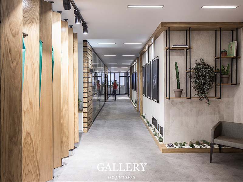
Stage 1: The Gallery.
Meant to be a showcase of the work produced by people in the spaces, to inspire those that arrive and provide a healthy dose of peer pressure for employees.
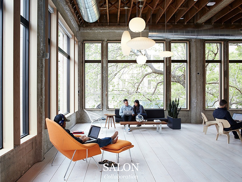
Stage 2: The Salon.
This room contains a café, possibly a bar, and is furnished with couches and WiFi. The space is designed for conversation, the place where we go to relax, share, and debate. We work through ideas here.
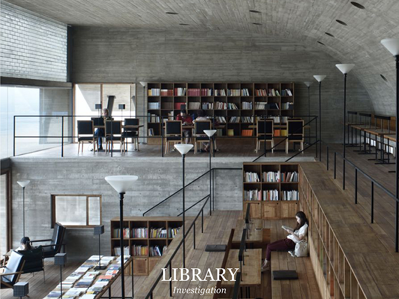
Stage 3: The Library.
It contains records of the work produced and the references found within the machine, Dewane calls this the “hard drive” of the machine.
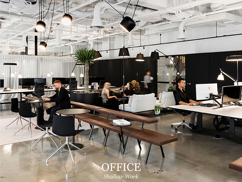
Stage 4: The Office.
Stage four is what we would see as a typical open office – though the intent is very different. It contains conference rooms and open desks or cubicles, but is made for “shallow work” only. Shallow work is talking with team members, attending meetings, answering email, all those things that are necessary, but tend to get in the way of our primary focus. This is so effective, because high-density environments make complex tasks more difficult, but have been shown to aid in the completion of simple tasks – possibly due to the “buzz” or “energy” that start-ups love to mention (Haynes 2008).
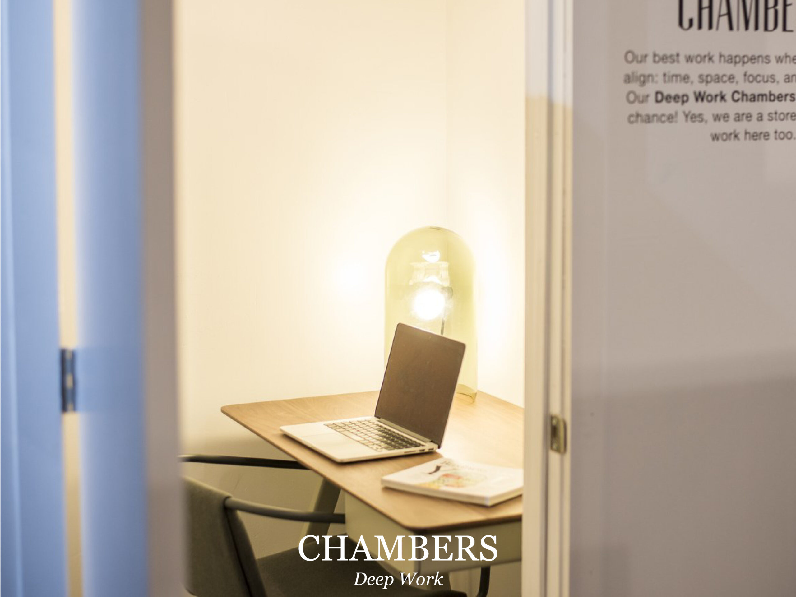
Stage 5: The Chamber.
Finally, we arrive at the chamber. These are small, entirely private office spaces, with soundproof walls. They are meant to have simple furniture, only a desk and a chair, ample natural light if possible, and no other distractions. Dewane imagines a worker spending ninety minutes inside, taking a ninety-minute break to work on more shallow tasks, and repeating this two or three times, at which point they will have achieved their limit of concentration for the day.
Dewane’s system takes its name from the Greek concept of eudaimonia, a state in which one is achieving their full human potential. He explains the goal of the machine “is to create a setting where the users can get into a state of deep human flourishing—creating work that’s at the absolute extent of their personal abilities.” (Newport 2016) The Eudaimonia machine gives a sense that there is real significance to the spaces where we work, and by treating them with care and respect, we, in turn, treat our work with respect. It sounds a little starry-eyed I know, but there is something special about having a truly beautiful workplace that makes us feel inspired and full of purpose every morning.
Of course, the Eudaimonia Machine is not the only way to improve the productivity of workers. A smaller scale solution is what I have taken to calling my “Peet’s Coffee Corner.” This is in reference to Peet’s in the San Francisco Ferry Building, and as far as I can tell, is the only spot in that building that allows me to sit outside the flow of traffic, looking into it, with my back against a wall. I tend to go over there to read in the last half hour of my lunch period, and it has become vital to my work day: the solitary break is like a midday nap. In fact, I have written and edited most of this story in that very chair. We need to give people in offices more Peet’s Coffee Corners–not necessarily a dedicated relaxation space like a break room, but more informal areas. Just as we have spontaneous interaction spaces, we also need spaces of spontaneous rejuvenation.
Architects and interior designers have immense power to shape the way people work, create, and invent every day of their lives. We have a responsibility to the people who live in the spaces that we design; because they are not just users, or clients, who “occupy” offices–they are people, and we must design their buildings in such a way that they have the opportunity to maximize productivity and realize their potential.
Bibliography
Bernstein, Ethan, and Stephen Turban. 2018. “The impact of the ‘open’ workspace on human collaboration.” Philosophical Transactions of the Royal Society 373.
Brennan, Aofie, Jasdeep Chugh, and Theresa Kline. 2002. “Traditional versus Open Office Design: A Longitudinal Field Study.” Environment and Behavior 279–299.
Brill, Michael, and Sue Wiedeman. 2001. Disproving widespread myths about workplace design. Jasper: Kimball International.
Gensler. 2019. “U.S. Workplace Survey 2019.” Gensler Research Institute 22-23.
Haynes, Barry. 2008. “The impact of office layout on productivity.” Journal of Facilities Management 189-201.
Newport, Cal. 2016. Deep Work. New York City: Grand Central Publishing.
Rood, Erik. 2017. Why offices are becoming more ‘open’. Data Analysis, Interview Q’s.
Salama, Ashraf M, and Leanne Courtney. 2013. “The Impact of the Spatial Qualities of the Workplace on Architects’ Job Satisfaction.” International Journal of Architectural Research 7 52-64.
Sundstrom, Eric, Robert Burt, and Douglas Kamp. 1980. “Privacy at Work: Architectural Correlates of Job Satisfaction and Job Performance.” Academy of Management Journal 101-117.
2018. Work/Space. March. https://thisisstory.com/our-new-story-is/.
Image References
1. SC Johnson https://www.scjohnson.com/en/a-family-company/architecture-and-tours/frank-lloyd-wright/designed-to-inspire-sc-johnsons-frank-lloyd-wright-designed-administration-building
2. George Nelson Foundation http://www.georgenelsonfoundation.org/george-nelson/works/action-office-1-a01-132.html
3. ALTKAT Photography, Elissa Stampa office in Istanbul by Slash Architects http://www.altkat.com/elissa-stampa
4. Mariko Reed Photography, VSCO Headquarters in Oakland http://marikoreed.com/project/vsco/
5. Shenliang Su via ArchDaily, Seashore Library by Vector Architects https://www.archdaily.com/638390/seashore-library-vector-architects/556d277fe58ece956600011d-seashore-library-vector-architects-photo
6. Woods Bagot Studio, Perth https://www.woodsbagot.com/projects/woods-bagot-perth-studio
7. STORY Workspace https://thisisstory.com/our-new-story-is/
8. EHDD office, photo: Cian Hrabi
