The View from Down Under
Fifteen long hours later, I’m in Australia. It feels simultaneously like the other side of the planet (what is the sun doing in the north?) and a lot like California (laid-back, golden, full of good food). I land in Sydney and shortly drag my jet-lagged self to a party filled with architects and hosted by my friends at Bennett and Trimble. It turns out to be a great introduction to the architecture of Sydney. Not only do I hear all the native lore about Jorn Utzon and the Opera House (more on that later), but everyone is abuzz with the new addition to the MCA which had opened the weekend prior. One guest describes it as a very prominent missed opportunity. Designed by Sam Marshall in association with the New South Wales Government Architect’s Office, many guests preferred the original competition winning design by SANAA. I had many chances to observe it coming in and out of Circular Quay on the ferries. After visiting it, I had to agree – the galleries were crammed into the old office building while the addition contained new office space and lots of oversized circulation. The two pieces have nothing to do with one another and feel awkwardly joined.
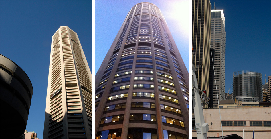
Could it be because of my recent project – renovating the Round House for the 75th anniversary of the Golden Gate Bridge – that several of my favorite buildings in Sydney are round? The modernist Harry Seidler, with the structural engineer P.L. Nervi, built many of Sydney’s more elegant towers in the 60’s and 70’s including the circular Australia Square with it’s Sol LeWitt mural and the MLC Centre with its gravity defying traveler’s club in front. Also, recently completed by Ingenhoven Architects of Germany and Architectus of Australia, the 1 Bligh Street tower is not only round it’s a marvel of sustainable design. The central atrium serves to ventilate and daylight the entire building, in tandem with a double skin facade. Other features include a tri-generation system and black-water recycling. It embodies what I would come to realize is the effortless integration of sustainability that characterizes a lot of Australian architecture and culture. For example, dual flush toilets are so ubiquitous they never require signage. Signs on row houses warning “tank water in use” are everywhere in Melbourne, alerting people that non-potable water is being used for irrigation. Ironically, in a country where natural resources far outnumber inhabitants, they are pushing to reduce their footprint.
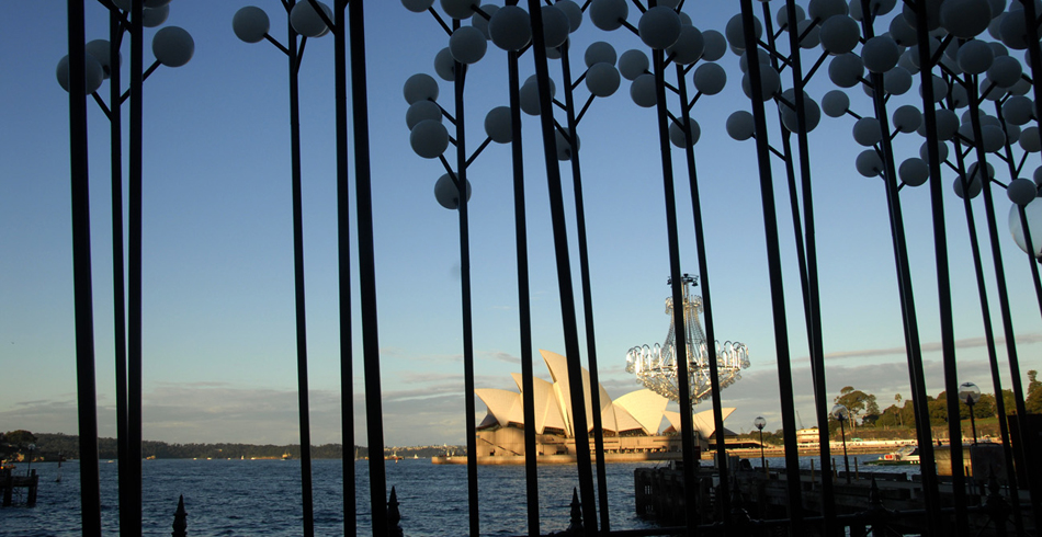
The setting of Sydney is striking, with its hills and water and the whole city seems to revolve around the iconic opera house. Having seen so many photos I was prepared to be disappointed, but just the opposite was true. The building is even more awe inspiring in real life. I arrived in the middle of Vivid Sydney, an annual event that features projection and illuminated installations all over the city, but mostly along the waterfront. The projection on the opera house was hypnotizing, and made use of the unexpected texture of the shells. Even the official story of the opera house (as relayed on the tour) is that the building (10 years late and $95 million over the estimate) is hard to comprehend. The hubris and effort that went in to it are hard to quantify, but then so is the spectacular result. To hear the architects at the party tell it, it’s an example of design triumphing, and the huge reward that’s possible with great risk. Although it’s hard not to feel that the legacy of the scale and inventiveness of the opera house has led to some demonstrations of just what the risks are. But the opera house glows and it’s impossible to imagine Sydney without it.
If Sydney is all sparkle and light, Melbourne is all darkness and mystery. Not just because of the gray weather. The laneways are filled with street art and surprises; each neighborhood a new adventure at the end of a tram line. The way the Melbourne Theater Company building resolves itself into surprising volumes when illuminated at night. Melbourne is filled with restaurants, bars, shops, and galleries all constantly changing. The Council House 2 seemed to embody this idea – the first time I walked by it seemed like an opaque box, but the next day the shutters had been opened to reveal an intricate second skin. The building uses its sustainable features as signs – yellow wind turbines – water capture that slides over the glass sheets of the awnings, green vertical screens, every angle has a story to tell.
I think we have a lot to learn from Australia – this alternate version of California that’s booming down under. They share a lot of our optimism about the future, and our desire to preserve the incredible natural beauty that surrounds us. Together, we could do great things! If only it wasn’t on the other side of the planet!
Phoebe Schenker, AIA, LEED AP BD+C
Project Architect