Blog Archives
The Design Evolution of Student Housing Beyond COVID-19

I first heard the phrase “Alone Together” from a UC San Diego student last year on a panel at a Higher-Education-focused design conference, well-before any whispers of the forthcoming pandemic. She invoked the idea in response to a question we Architects ask clients on every project, “What do you want from your communal spaces?” The student spoke about “Alone together” within the context of design goals, describing students’ desires for flexible spaces where they could study or lounge, see, and be seen to feel connected while also being productive. Of course, #AloneTogether has recently evolved into a very different and unifying meaning for the entire world, but the trend of such flexible spaces is more relevant than ever. When students return to campuses, such spaces can help them feel connected in a new world of social distancing and offer administrators adaptability for future preparedness. As COVID-19 responses change the world around us, and institutions strategize how to embrace a new normal, we can consider several such recent Higher Education design trends that might also help students reclaim their campus community and student life.
Smaller and Virtual Classrooms
Institutions were already thinking about and planning for longer-term shifts to virtual instruction. Now, that timing has been dramatically accelerated. A recent Cornell study noted a switch to teaching large lecture courses online and teaching smaller seminars face-to-face “would not appreciably reduce the interconnectedness of students.” (1) Housing could easily adapt bedroom or study spaces into Zoom conference rooms, which could flexibly support several students taking the same virtual classes or forming study groups to boost the feeling of a learning community. Just as many of us are feeling exhausted by workdays packed with video meetings, students experience similar fatigue, and they’ll need to rely on each other through in-person networks for recovery and support (2).
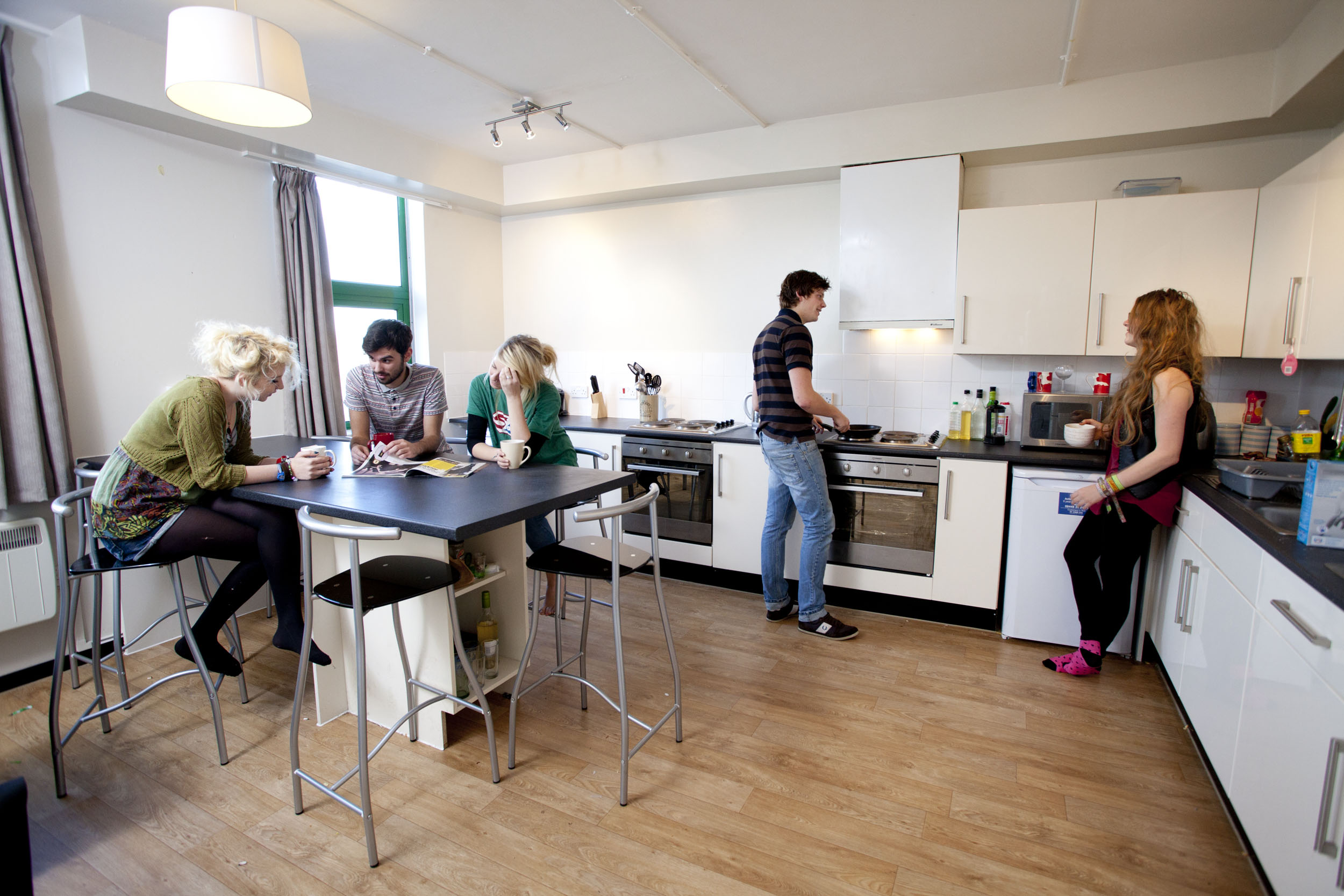
Communal Kitchens in Student Housing
UC Berkeley Vice Chancellor and CFO Rosemarie Rae believe that “Communal kitchens are the plan for the future,” in part due to data collected last year showing students’ apartment-style kitchens were only being used 5% to 20% of the time (3). Communal kitchens might be re-sized for group-quarantine and pandemic recovery too. We can anticipate an aversion to mass-group dining halls to continue in the near future. Kitchens that can serve multiple students not only improve individuals’ sense of self-reliance and resilience but also strengthen their immediate network of roommates and neighbors when engaging in a family-style cooking experience.
Daylighting and Venting
In many post-occupancy studies about the attributes that contribute to preferred social and study environments, access to views, daylighting, and the outdoors consistently rise as the most important features. Access to both has long been favored by designers encouraging wellness in interior environments; now, during quarantine and for potential future sheltering, they are more critical than ever. Exterior air venting and circulation is not only a sustainable design strategy; it now helps to implement CDC recommendations that we better ventilate and significantly reduce the recycled air of our interior environments. (4)
Increased Unit Density
In response to our affordable-housing crisis, many housing renovations and new residential buildings have been boosting bed-density to drive down rental rates. In tandem, bathrooms and lounges are being broken-out to join the aforementioned communal-kitchens in larger group-living spaces that serve more units and students. Four-bedroom units are typically the first to be rented, and a recent project of mine saw five, six, and even seven-bed units. When these units flank the communal spaces to form ‘pods,’ they effectively create micro-neighborhoods, and such groups of 15-50 students are right-sized for what Dunbar referred to as “Sympathy Groups” and “Close Networks,” respectively (5). For this and potential future Shelter-in-Place directives, such layouts are ideal for students who choose to “quaranteam” — to band together and support each other in the face of pandemic trauma. (6)
President of Pomona College, Gabrielle Starr, astutely notes that “human connection is key to generating and testing knowledge, unleashing creativity, and fostering the emergence of a new generation of thinkers and problem solvers. Now we must reimagine what community looks like after fundamental disruption.” (7) These planning trends suggest that we were already on the right track in effectively redesigning student communities, likely because they originated with flexibility, affordability, sustainability and connectivity as some of their primary goals. We cannot let COVID-19 disrupt such intentions, as they are now more necessary than ever to foster student success.
Bibliography
- https://osf.io/6kuet/
- https://www.mindful.org/zoom-exhaustion-is-real-here-are-six-ways-to-find-balance-and-stay-connected/
- Bisnow’s Bay Area Student Housing & Higher Ed Summit at Hotel Nikko in San Francisco, 2019
- https://www.abbae.com/technical-learning/covid-19/
- https://www.bbc.com/future/article/20191001-dunbars-number-why-we-can-only-maintain-150-relationships
- https://us.cnn.com/2020/04/17/us/quaranteam-coronavirus-wellness-trnd/index.html
- https://www.chronicle.com/article/How-Will-the-Pandemic-Change/248474?key=Q-8a5P7D5OHujVB3ZSRDR1GphAxyJHteTzvSQOkhcVQD5MtPBXKCPh-DWXbb-Sfhdms2YmlfdmpYbVhMdk8zdDI4aU9RVHF4ZG1Qbkhwa0dxMWZaMTA2VFBHcw
Image References
- UC Berkeley Maximino Martinez Commons. Photo: Russell Abraham
- https://zolostays.com/blog/wp-content/uploads/2019/07/Screenshot_20190731-182654__01-min.jpg
- http://www.studenthousingguide.co.uk/wp-content/uploads/2015/01/MG_44621.jpg
- https://media.treehugger.com/assets/images/2017/12/fabrica-coliving-apartment-space-scholarship-3.jpg.650x0_q70_crop-smart.jpg

Where Are We Going to Live?

“The top three priorities we are currently addressing, 1. Housing, 2. Housing, and 3. Housing,” said John Rahaim, San Francisco’s acting Planning Department Director, as he addressed a crowd of architects, developers, and construction industry insiders at this year’s Facades conference. Rahaim continued to outline the challenges which have plagued the housing market – escalating construction costs, development fees, arduous and lengthy approvals, often among multiple jurisdictions, and the need to find low equity options for the region’s disadvantaged residents. He addressed the misconception that “if there isn’t housing, then more people won’t move here.” His office’s research and his own experience have led Rahaim to the conclusion that as long as there are jobs and other economic opportunities, people will continue flocking to the Bay Area, expecting housing to work itself out. As we have seen in recent years, this ever-expanding demand, combined with ballooning salaries of technological and financial professions, has stressed the market and created what many have been calling a housing “bubble” in the region, with eye-watering prices and no vacancies.
Bubble or not, it seems clear to most that if the region is to continue to prosper, more space needs to be made. This reality is evidenced in a 2018 report by the City of San Francisco Planning Department, which found, “63% of the Bay Area’s housing stock is single-family homes,” and “15% are 20+ units” (Rahaim & al, 2018). Although there is agreement the region’s housing market is in crisis, many efforts to address shortages have generated more controversy than consensus, with an array of different governmental and private sector groups fighting to see their ideal vision of growth enacted (Fang, T.).
Although a clear path forward has not yet been established, people tend to acknowledge that more housing is needed and quickly. Ideally, this new, repurposed and infill construction is an excellent opportunity to explore new forms of housing that provide a more diverse set of financial, social, and architectural possibilities–the refined versions of which will serve to make the region more resilient in the face of future pressures.
Our region is familiar with alternative housing models, and many different communities have emerged out of thoughtful collaborations between city governments, residents, designers, and planners. As a young resident of the Bay Area, I am familiar with many friends and colleagues who have pursued non-traditional housing options in order to live affordably, or as a way to create new networks, among other reasons. Listed below are three of the models which are most prevalent and successful in our area, although others exist:
Co-housing:
One of the typologies that have gained some traction in the Bay Area is the concept of Co-housing, a model where each resident has a private unit that is centered around a common space such as an outdoor patio, kitchen, or living room. The organization of the community is democratic and encourages residents to interact through shared meals, events, and other cooperative structures. Several successful projects in this vein exist throughout the Bay Area:
- Swans Market, Oakland
- Phoenix Commons, Oakland
- Mountain View Co-Housing, Mountain View
- Pleasant Hill Co-Housing, Pleasant Hill
This housing model seems to be the most normative in its financial model, with individuals still owning and controlling private property. However, it affords many progressive benefits such as the potential to dramatically increase density, perform more sustainably, and create strong social connections between residents.
Limited equity housing collectives (LEHC):
This model of housing is meant to make homeownership more affordable and is centered around a non-profit which owns the property and then sells its shares to prospective buyers. Owners of the shares have rights to the unit and to participate in the democratic operation of the community. When selling their shares, owners are typically not given any profits from the inflation of the price, if any, as this money goes back to sustain the organization. These organizations tend to be smaller and, in our area, typically don’t build their property but instead pool resources together to buy an existing structure. One of the successful projects of this type is the Parker Street Cooperative, a LEHC formed in Berkeley in 1988. The building has 24 units, a mix of studio and 1 BR, and the current share price for a 1 BR is $21,000. Although “Federal programs and cultural attitudes that helped launch a majority of the large limited-equity co-ops across the nation are long gone–this model of resident-controlled, long-term affordable housing may be experiencing new interest” (Ortiz, 2017).
Co-living:
This term is the loosest of these models but has recently become associated with a more contemporary notion of living arrangement, where residents rent out a small private space and share most of their other space with others. This trendy model is meant to appeal to a younger generation less interested in homeownership and more in shared experiences, flexible live/work environments, and other amenities that are provided by a parent organization.
Companies of this type have been popping up quickly around the Bay Area with Haas, HubHaus, OpenDoor, Roam, and Starcity, to name a few. The most prominent of these, Starcity, has recently received approval from the city of San Jose to build a 790 unit building, which will feature “65% bedrooms, and 20% of the building is dedicated to communal spaces and kitchens” (Brinklow, 2019). Although many have criticized these projects as glorified dorms lacking true solutions to affordability, their popularity clearly suggests Bay Area residents are willing to consider alternatives to traditional housing typologies in search of a different financial, social, or architectural reality.
The housing models listed above are just a few of the alternative typologies that exist in the Bay Area. No one model will solve our issues. Some of the models are best suited to older residents who are looking for community, while others are best when serving young professionals looking for an affordable place to live while starting their career. Generally, we need to be more flexible and understand all the possibilities at our disposal in order to make informed suggestions about what is best suited where. As stewards of our built environment and compassionate community members, the onus is on us architects and designers to explore the intricacies of these and other models. We must question how appropriate design can be an ally–building upon prospective housing models’ strengths while limiting risks and weaknesses, and helping to create a more diverse and, therefore, resilient market for housing in the region. As a young architect, I am tremendously motivated by this challenge. For me, it is an amazing opportunity to be a part of the coalition who will shape the future character and vibrancy of our home for the better.
Bibliography
Bowles, N. (2018, March 4). Dorm Living for Professionals Comes to San Francisco. Retrieved from New York Times: https://www.nytimes.com/2018/03/04/technology/dorm-living-grown-ups-san-francisco.html
Brinklow, A. (2019, February 27). San Jose approves co-living ‘dorms’ for downtown area. Retrieved from curbed: https://sf.curbed.com/2019/2/27/18243252/san-jose-coliving-dorms-starcity-housing-crisis
COHOUSING IS…. (2019). Retrieved from McMant and Durrett Architects the co-housing company: http://www.cohousingco.com/cohousing
Fang, T. (2019, July 18). Over 8 In 10 Bay Area Residents Agree State In Housing Crisis, Poll Finds. Retrieved from CBS SF Bay Area: https://sanfrancisco.cbslocal.com/2019/07/18/housing-crisis-bay-area-california-quinnipiac-poll/
Kristy Wang, B. G. (2017, September 21). Retrieved from SPUR: https://www.spur.org/news/2017-09-21/could-germany-s-co-developed-urban-housing-be-model-bay-area#
Ortiz, L. (2017, April 15). Will Limited-Equity Cooperatives Make a Comeback? Retrieved from Shelterforce: https://shelterforce.org/2017/04/25/will-limited-equity-co-ops-make-comeback/
Rahaim, J., & al. (2018). San Francisco Housing Needs and Trends Report. San Francisco: San Francisco Planning Department.
Trust, B. A. (n.d.). Cohousing and Limited Equity Cooperatives: What’s the Connection. Retrieved from http://bayareaclt.org/docs/cohousing_and_limited_equity_co-ops.pdf
Wang, K., & Grant, B. (2017, September 21). Could Germany’s Co-Developed Urban Housing Be a Model for the Bay Area? Retrieved from SPUR: https://www.spur.org/news/2017-09-21/could-germany-s-co-developed-urban-housing-be-model-bay-area#
Image References
Image 1: Mountain View Co-Housing Community http://mountainviewcohousing.org/
Image 2: Parker Street Cooperative (LEHC) http://parkerstcoop.org/
Image 3: The Guardian – https://www.theguardian.com/world/2018/aug/15/happy-together-lonely-baby-boomers-turn-to-co-housing
Image 4: PYATOK – http://www.pyatok.com/work/project/112/SWANS-MARKET
Images 5: Starcity co-living https://www.citylab.com/life/2019/06/cohousing-san-jose-room-for-rent-starcity-coliving-housing/590731/
EHDD Promotes Quyen Luong and Lynne Riesselman to Associate Principal
November 14, 2019
SAN FRANCISCO (CA, USA) – EHDD Architecture announces the promotion of Quyen Luong, AIA, and Lynne Riesselman, AIA, LEED® AP BD+C, to Associate Principal. “My partners and I are pleased to announce the promotions of Lynne Riesselman and Quyen Luong to Associate Principal because of their exceptional contributions to the firm. Both are demonstrated design leaders at EHDD and have led many of our highest-profile projects over the years. As we continue to grow, Lynne and Quyen will be instrumental in assuring EHDD’s legacy of design excellence,” stated Duncan Ballash, AIA, LEED® AP BD+C, Principal and President of EHDD.
Luong brings imagination and sensitivity to complex design, working on projects that range from aquariums to multi-use housing, schools, and libraries. She approaches design with the intent of transforming the everyday into the unexpected, translating concepts into places that embody an institution’s core mission. Recent projects include the Pacific Visions expansion at the Aquarium of the Pacific, UC Davis Tercero Student Housing, and the National Aquarium of New Zealand. Luong remarked, “The design process is an opportunity to give rigor to curiosity, and shape to meaning.” She received her Bachelor of Arts in Art History from Wesleyan University in 1999 and her Master of Architecture from Rice University in 2005. She has practiced architecture for fourteen years and is a member of the American Institute of Architects (AIA).
Riesselman approaches design with a desire for leveraging the interconnectedness of the natural and built environment. Over the last 14 years she has brought a rigorous design ethic to museums and cultural centers, aquariums, higher education and commercial projects. With recent work including the Kansas City Zoo Aquarium, the Marine Science Institute of Redwood City, and the Presidio Tunnel Tops Youth Campus, she is focused on creating spaces that engage, and inspire with a lasting impact on the greater public. Riesselman believes, “A truly successful design must speak to the ethos of its organization, rooted in the place it inhabits, and never hesitate to create its own identity.” Riesselman received her Bachelor of Architecture from Carnegie Mellon University in 2005. She is a member of the American Institute of Architects (AIA).
About EHDD
Founded in 1946, EHDD seeks to create built environments that enhance our culture, honor the natural environment, and respect and delight the people who use them. Headquartered in San Francisco, EHDD serves clients around the world in Aquariums, Museums and Science Centers, Education, Corporate Office, Mixed-Use Development, and Government. EHDD is a Top 10 AIA COTE honoree, and featured in “The Habits of High-Performance Firms, Lessons from frequent winners of the AIA COTE Top Ten Award.”

Architecture and Social Media’s Effects

Unlock, Snap, and Post is all it takes to share images or content in today’s digital age. Three easy steps and the online world is at your disposal. Tagging people and places associates them with your digital footprint. This content is then readily available at your fingertips within seconds, whether it be a dog wearing a Pikachu outfit or global events that will define our moment in history.
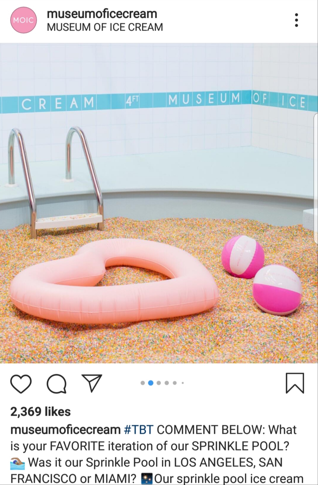
But, what does all of this speed and access to information mean to the world of architecture? These new technologies and behaviors have made the consumption of architecture unlike ever before. Gone are the days when the architect dictated how and where the process of architecture happened. The role is evolving, and there is an ever-increasing control in the user’s hands. Take for instance pop-up architecture like the Museum of Ice Cream and the Color Factory, the ultimate destinations for any millennial. The attraction here for youth is the numerous possibilities to be able to take those memorable Instagram pics.
Architecture here is very much pulled apart; what one is consuming and distributing is based on the likelihood of an audience liking and sharing your photograph. And what this, in turn, allows is the increasing popularity of the physical site with a particular experience, one that is of smiles and bliss. Numerous landmarks have become associated with this phenomenon, where Instagrammable locations just become part of a tourist’s checklist like San Francisco’s Lombard Street.
How do we create architecture today, when structures are being consumed faster than they are being produced? Do Instagrammable features need to be an increased part of architecture or are they the direct byproduct of producing architecture in the age of technology? We do have to acknowledge that this has flipped the grounds on the traditional publication and consumption of architecture, but then also does this mean that we are losing control over what we produce?
There is an increasing demand to produce buildings and spaces that invite this type of online popularity. These conditions give the Architect less agency; they are not able to fully design the spatial experience as they need. However, a direct result of this new trend has been that we can gain critical feedback on the go while exploring beyond traditional building typologies. This surplus of information can be used to engage with audiences unlike ever before. Social media allows individuals to express themselves without a filter – this brutal honesty from the community is less likely to be heard in a public forum or meeting. Such data can be used by designers to better understand what users demand. In this way, we can use the power of social media to our advantage and still address critical issues like climate change and sustainability, while also making “photogenic” architecture.
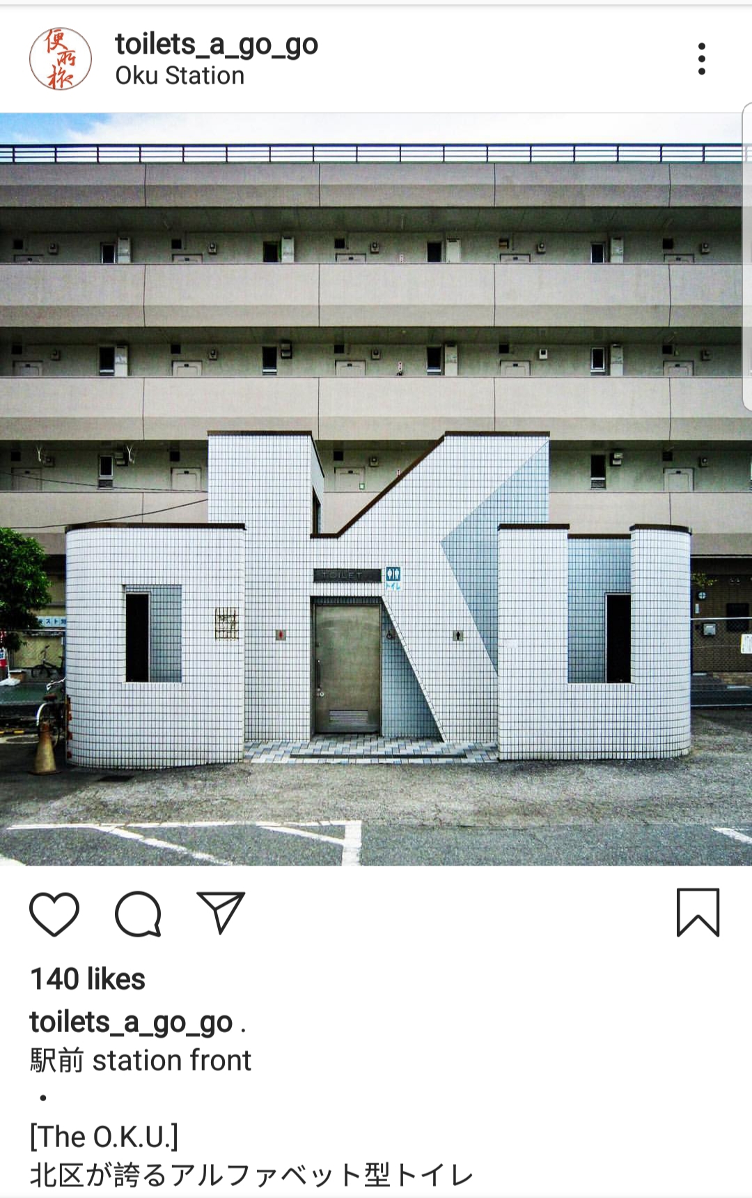
A few weeks ago, I stumbled upon the Japanese Instagram Page “Toilets-a-go-go” which shows images of public bathroom pavilions. Once you get past the funny and somewhat misleading name, this page brings something new and unique to light. In the west, public restrooms and facilities are often considered of minor importance and aren’t seen as the most desirable buildings to design. But what this page allows for is the power of architecture to improve a neglected, yet arguably important building type, while facilitating continued experimentation.
The power of social media is only increasing; every day millions of individuals are able to access an online world that was not available to them the day before. Architecture is quite literally “spreading” through social media. As a result, designers gain greater access to inspiring precedent images and essential insight into global trends. But does this mean that we need to partake in every single fad that follows, or will we be selective and critical of the buildings and experiences that we create?
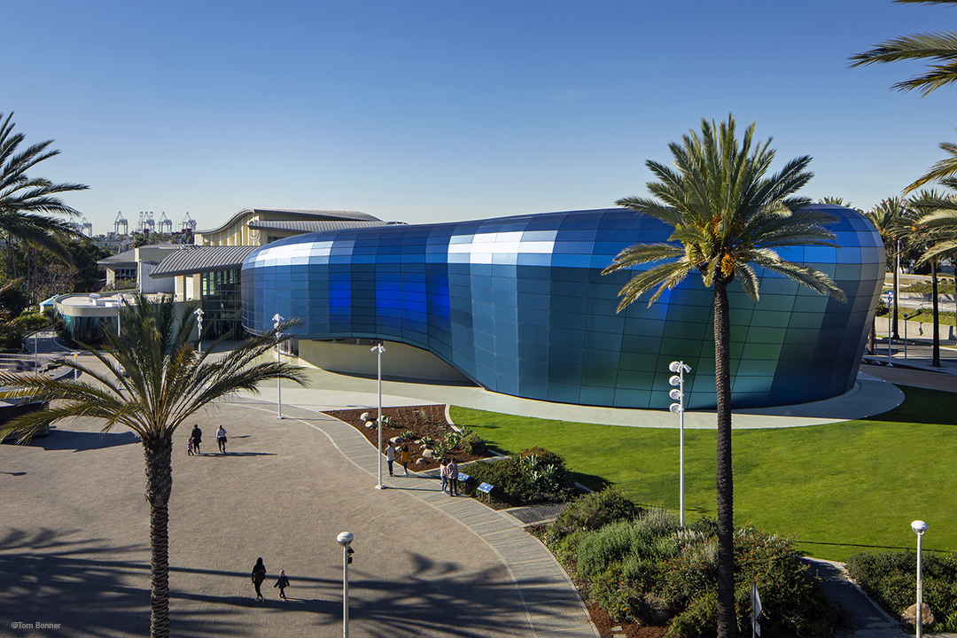
Pacific Visions – A Story of Brand and Architecture as One

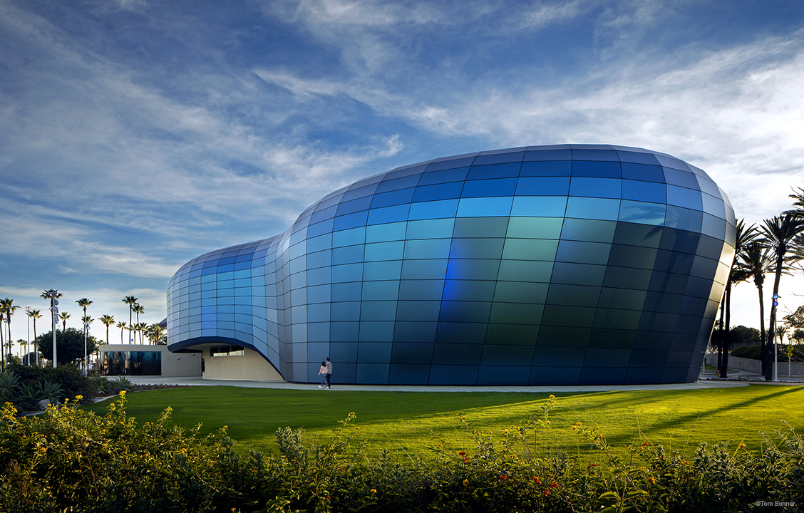
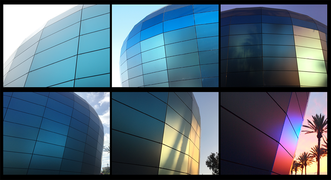
For science-based, ecology-focused institutions like the Aquarium of the Pacific, their mission is their brand. In this case, the organization’s mission is to engage visitors in examining their relationship with our ocean planet, and to explore today’s most important environmental issues. They wanted their building’s façade to be an extension and articulation of that mission statement.
EHDD’s concept was to engage the original building as a marquee for Pacific Visions–it is a community and regional icon. For the new program’s wrapper, the development of form derives from the rich bio-diversity of the Pacific Ocean, referencing both microscopic and monumental sea creatures. In designing this new wing of the Aquarium, EHDD embraced the concept of fluidity–both in the biomorphic facade and in how visitors flow through the spaces–from the entrance, through the new galleries and the Honda Theater.
The qualitative approach to our material investigation focused on depth, variability, and luminosity. Materials needed to be opaque, without reflectivity, and bird-safe. This process involved over a year of research, experimentation, and testing. We couldn’t have realized the final effect without engaging fabricators early, as we needed to invent a unique glass assembly. The glass assembly thickness is aesthetic, and also has structural requirements. Digital mock-ups demonstrate the effect on a macro level – for example, rich color variation was depicted at different times of the day. This was further tested by creating a physical scale model to represent the desired visual effect. Getting the color correct was essential because it would become the aquarium’s brand. The color needed to be timeless, derived from nature.
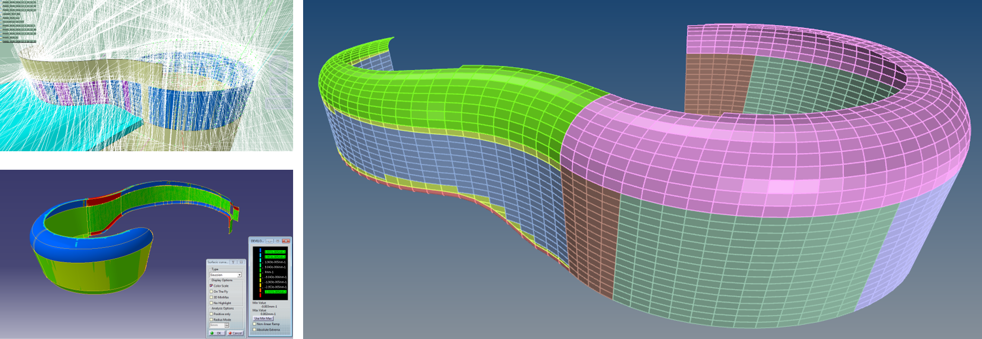
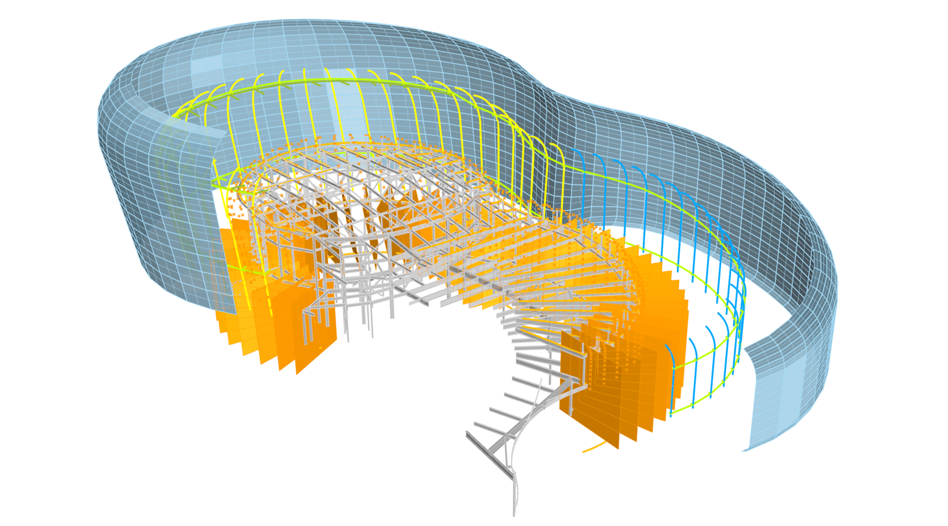
BuroHappold’s task, as the technical design team, was to begin investigating the technical approach for the aquarium’s complex form. We started with developing computational tools that let us test different paneling strategies. We initially sought a single, or minimum number of panels that could be used in the final installation to achieve minimum variability while maintaining the curvature of the design. We tested many versions of this approach before identifying the right design.
Our first study concluded with almost 1900 panels, and the uniformity of panels was not what we, or the wider design team, had originally envisioned. The form lent itself to a scalable paneling, rather than a repetitive system. We then tried a strategy that would allow a more natural flow of panels that could accentuate the surface aesthetics on a macro level. The paneling consistency was a balancing act between the maximum feasible size of a panel, and the smallest one that allowed the form to achieve the intended architectural design.
In testing this for cost efficiency, we discovered that fabricating custom sizes of panels did not increase cost since all fabrication is CNC-controlled. Additionally, we learned that reducing the panel numbers by more than half resulted in decreasing the amount of connections, structure, and site work—yielding about 30% in overall savings. We then created a digital mockup of the new paneling system, which became the ‘backboard’ on which to interact with the design team and client. This strategy afforded us the possibility of not only refining the organic shape, but also allowed us to evolve it so we could emphasize the dynamic quality through the panelized system.
Simultaneously, we worked on developing a structure that supports the glass installation. The structural system is essentially an interface between the glass geometry and primary structure layout. The structure is a skeleton for the skin, following the natural shape and is supported by the primary structure behind.
When we designed the structure, we needed to follow four principal guidelines:
1. Support the glass panels in the most efficient way
2. Connect back to the existing structure where it has sufficient capacities
3. Minimize the amount of penetrations through the envelope
4. Account for seismic movements
The result was a structural skirt design. This allows the structure to hang from the top connection and to slide at the bottom. The system was designed with intentional open joints between panels. Since the structure or skirt would move under seismic events, there was a risk for a direct impact on the joints between the glass panels. This movement, and having the structure non-parallel in all areas, meant that we had to control the joints dimensionally. We created a script that simulated the seismic drifts on the system and visualized where the maximum joint sizes were needed. This analysis was done on the horizontal and vertical joints. Once we established the maximums, we were able to prescribe a single dimension for all of the joints. We then translated this to the actual fabrication model that was developed by glass specialists Sentech Architectural Systems. By enabling a digital process, we were able to confirm the numerical parameters for all of the geometrical conditions and design one adjustable detail.
The design and engineering relied on a holistic computational design process that included a data-centric model and automation. This enabled seamless coordination and exchange of models with the design team, manufacturer, and builder. The final confirmation of the design was tested on site utilizing a full-scale mock-up before authorizing the fabrication and installation of the building skin system. The result was a façade system that met all expectations of the client and design team. This success in developing such a unique façade system was due to a close collaboration between the design team, façade engineers, and subcontractors.
The new Pacific Visions wing will open at the Aquarium of the Pacific on May 24, 2019, visit http://www.aquariumofpacific.org/ for visitor information.
The Architecture of Productivity

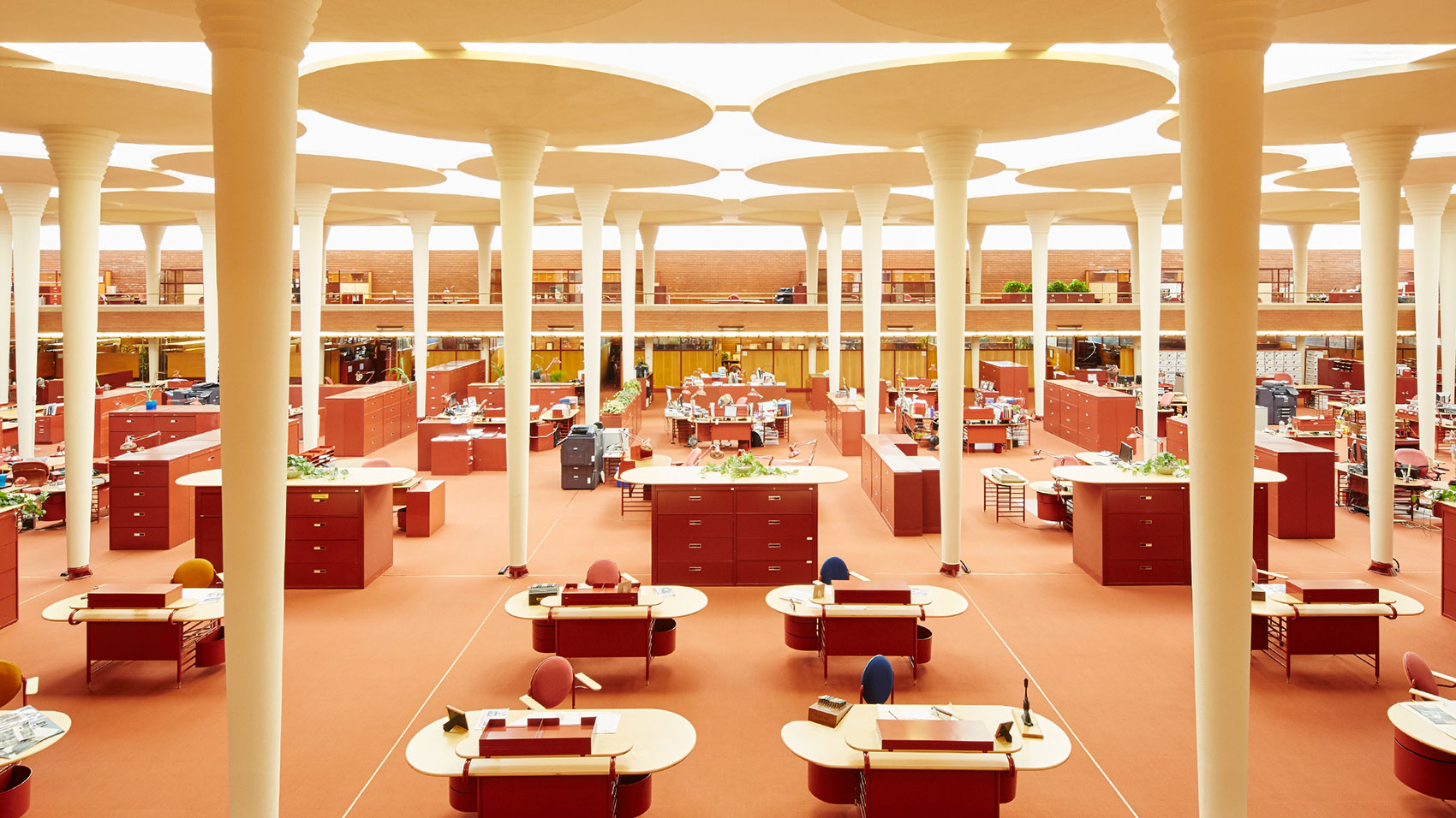
When I first began researching the presentation that this article is adapted from, I stumbled upon a startling fact: the open office pre-dates the cubicle. In the early 1900s, Frederick Taylor set out to improve the productivity of white-collar workers by using techniques from factories–placing dedicated workstations in open rooms. In 1939, Frank Lloyd Wright designed the Johnson Wax Headquarters, a beautiful open office defined by thin white columns, deep red filing cabinets, and oval desks. For over 50 years, an entirely open workplace was a popular office type.
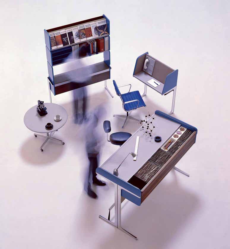
Robert Propst, working for Herman Miller, created the first office cubicle in 1964, called the Action Office. Invented to give workers more privacy and versatility in their workplace, they were a flop in practice due to a high price tag and limited market reach. Four years later came the second iteration (the Action Office 2!) which was cheaper and more modular, and these really took off – there were even tax breaks offered for companies that adopted them. The original Action Offices look and feel like products designed to benefit the common worker, but throughout the 1970s and ’80s companies used them to cram more people into smaller spaces. Hence, the grey sea that we associate with office cubicles today.
In response to that sickly feeling often evoked by rows upon rows of cubicles, tech start-ups in the 1990s began touting the fully open office again. However, they unwittingly believed this was an innovation, rather than revisiting an older idea. The trend came to the desk of Frank Gehry in 2010, when he received the brief for what I will call “The Bilbao of Open Offices” – Facebook’s 434,000 square foot office in Menlo Park. The giant, single-room facility is named Building 20, a nod to MIT’s famous building 20 of the mid-late 1900s nicknamed the “plywood palace.” MIT’s ramshackle warehouse became a hub for innovation during WW2 and beyond, a truly adaptable space that allowed researchers and professors to customize their offices however they saw fit. Gehry’s Facebook office, I would argue, doesn’t seem to carry the same character and organic development of its namesake.
This brings us to today, a time when the open office is not limited to Silicon Valley tech start-ups, far from it. As of 2017, 70% of US workers are working in a space with low or no partitions (Haynes 2008). And the research is unfortunately quite clear – the open office is not good for productivity. Open offices result in a 62% increase in sick days, and 54% of high-performance employees say they are too distracting (Sundstrom, Burt and Kamp 1980). On average, people are interrupted once every 3 minutes, and they are correlated with a 15% drop in productivity (Brennan, Chugh and Kline 2002). Additionally, an open office doesn’t even promote interaction between colleagues, because we prefer to speak with some privacy and without interrupting others. Surprisingly, we collaborate and speak face-to-face with co-workers more as our offices become more enclosed (Bernstein and Turban 2018 ).
If this is true, then you may ask–why are open offices so pervasive? There are a few reasons. First, they are positive in many other regards that contribute to the success of a business. They are great for marketing purposes, as they photograph well. They are 20% more cost-effective than closed offices (Rood 2017), and they are flexible, adapting well to changes in business size. These three points, you may note, are crucial to start-ups. Start-ups do not have a lot of liquid cash, they need an office fast, a flashy looking space to attract investors, and they don’t know if they will have 500 or zero employees next week.
Another reason for the layout’s popularity is a sensible but misguided assumption that a more “open” organization, where colleagues share ideas and resources, requires physical openness. Improving the openness of a business is less about the space, and is more about the removal of barriers that limit the flow of ideas and collaboration. Michael Brill, Professor of Architecture at NY State, makes an excellent point about open space in a company. “Tearing down the walls does not make the energy, it may just expose what is already there to view.” (Brill and Wiedeman 2001). (Brennan, Chugh and Kline 2002) The final benefit, and perhaps the best aspect of the open office, is the flat playing field they create. Executives and CEOs don’t have their own offices, which shows they’re part of the team, sitting side by side with everyone. This creates a sense of teamwork—that no matter where you stand, you’re chipping in. In recent years, companies have been researching how to adapt the open office plan in more productive ways. Gensler’s U.S. Workplace Survey 2019 provides action steps to optimize people’s performance, one of which advocates for a variety of spaces and types of enclosures to fulfill various working styles. (Gensler 2019)
Throughout the last decade, architecture Professor David Dewane has developed a possible solution to our open office problem – the Eudaimonia Machine. The machine is a theoretical concept of an optimal office. It is a long narrow structure, consisting of five sequential spaces – each can only be accessed by walking through the previous one, to not miss a step in the process. Each space is designed for a different aspect of our working lives. The idea was put into practice in 2018 at the STORY concept store in NYC and showed promising results. (Work/Space 2018)
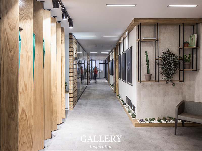
Stage 1: The Gallery.
Meant to be a showcase of the work produced by people in the spaces, to inspire those that arrive and provide a healthy dose of peer pressure for employees.
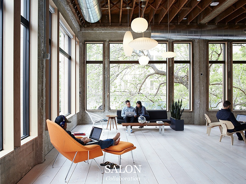
Stage 2: The Salon.
This room contains a café, possibly a bar, and is furnished with couches and WiFi. The space is designed for conversation, the place where we go to relax, share, and debate. We work through ideas here.
Stage 3: The Library.
It contains records of the work produced and the references found within the machine, Dewane calls this the “hard drive” of the machine.
Stage 4: The Office.
Stage four is what we would see as a typical open office – though the intent is very different. It contains conference rooms and open desks or cubicles, but is made for “shallow work” only. Shallow work is talking with team members, attending meetings, answering email, all those things that are necessary, but tend to get in the way of our primary focus. This is so effective, because high-density environments make complex tasks more difficult, but have been shown to aid in the completion of simple tasks – possibly due to the “buzz” or “energy” that start-ups love to mention (Haynes 2008).
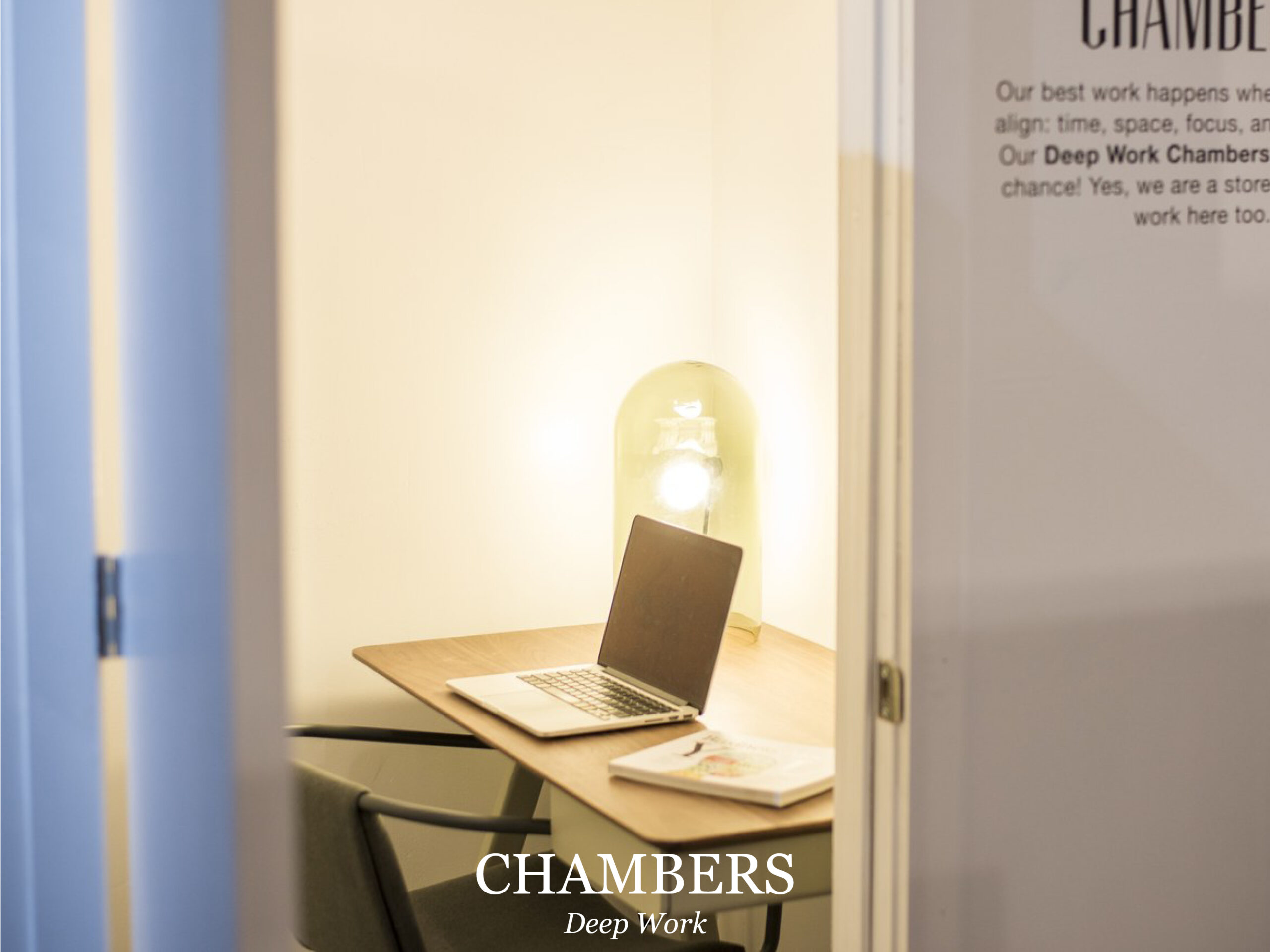
Stage 5: The Chamber.
Finally, we arrive at the chamber. These are small, entirely private office spaces, with soundproof walls. They are meant to have simple furniture, only a desk and a chair, ample natural light if possible, and no other distractions. Dewane imagines a worker spending ninety minutes inside, taking a ninety-minute break to work on more shallow tasks, and repeating this two or three times, at which point they will have achieved their limit of concentration for the day.
Dewane’s system takes its name from the Greek concept of eudaimonia, a state in which one is achieving their full human potential. He explains the goal of the machine “is to create a setting where the users can get into a state of deep human flourishing—creating work that’s at the absolute extent of their personal abilities.” (Newport 2016) The Eudaimonia machine gives a sense that there is real significance to the spaces where we work, and by treating them with care and respect, we, in turn, treat our work with respect. It sounds a little starry-eyed I know, but there is something special about having a truly beautiful workplace that makes us feel inspired and full of purpose every morning.
Of course, the Eudaimonia Machine is not the only way to improve the productivity of workers. A smaller scale solution is what I have taken to calling my “Peet’s Coffee Corner.” This is in reference to Peet’s in the San Francisco Ferry Building, and as far as I can tell, is the only spot in that building that allows me to sit outside the flow of traffic, looking into it, with my back against a wall. I tend to go over there to read in the last half hour of my lunch period, and it has become vital to my work day: the solitary break is like a midday nap. In fact, I have written and edited most of this story in that very chair. We need to give people in offices more Peet’s Coffee Corners–not necessarily a dedicated relaxation space like a break room, but more informal areas. Just as we have spontaneous interaction spaces, we also need spaces of spontaneous rejuvenation.
Architects and interior designers have immense power to shape the way people work, create, and invent every day of their lives. We have a responsibility to the people who live in the spaces that we design; because they are not just users, or clients, who “occupy” offices–they are people, and we must design their buildings in such a way that they have the opportunity to maximize productivity and realize their potential.
Bibliography
Bernstein, Ethan, and Stephen Turban. 2018. “The impact of the ‘open’ workspace on human collaboration.” Philosophical Transactions of the Royal Society 373.
Brennan, Aofie, Jasdeep Chugh, and Theresa Kline. 2002. “Traditional versus Open Office Design: A Longitudinal Field Study.” Environment and Behavior 279–299.
Brill, Michael, and Sue Wiedeman. 2001. Disproving widespread myths about workplace design. Jasper: Kimball International.
Gensler. 2019. “U.S. Workplace Survey 2019.” Gensler Research Institute 22-23.
Haynes, Barry. 2008. “The impact of office layout on productivity.” Journal of Facilities Management 189-201.
Newport, Cal. 2016. Deep Work. New York City: Grand Central Publishing.
Rood, Erik. 2017. Why offices are becoming more ‘open’. Data Analysis, Interview Q’s.
Salama, Ashraf M, and Leanne Courtney. 2013. “The Impact of the Spatial Qualities of the Workplace on Architects’ Job Satisfaction.” International Journal of Architectural Research 7 52-64.
Sundstrom, Eric, Robert Burt, and Douglas Kamp. 1980. “Privacy at Work: Architectural Correlates of Job Satisfaction and Job Performance.” Academy of Management Journal 101-117.
2018. Work/Space. March. https://thisisstory.com/our-new-story-is/.
Image References
1. SC Johnson https://www.scjohnson.com/en/a-family-company/architecture-and-tours/frank-lloyd-wright/designed-to-inspire-sc-johnsons-frank-lloyd-wright-designed-administration-building
2. George Nelson Foundation http://www.georgenelsonfoundation.org/george-nelson/works/action-office-1-a01-132.html
3. ALTKAT Photography, Elissa Stampa office in Istanbul by Slash Architects http://www.altkat.com/elissa-stampa
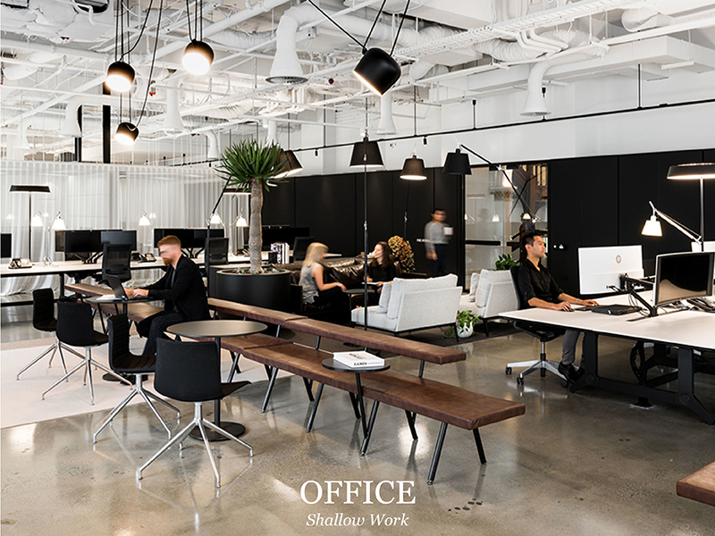
4. Mariko Reed Photography, VSCO Headquarters in Oakland http://marikoreed.com/project/vsco/
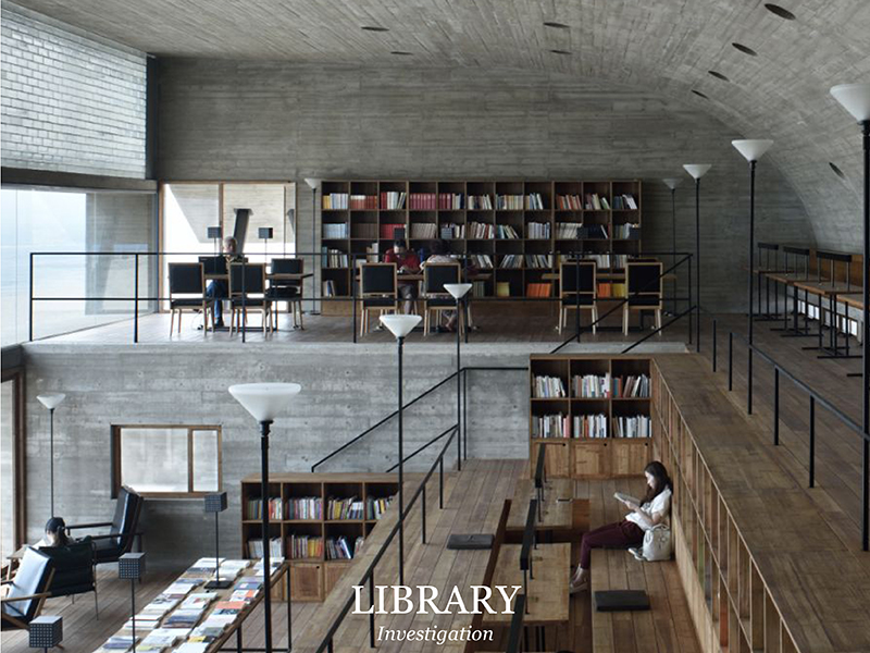
5. Shenliang Su via ArchDaily, Seashore Library by Vector Architects https://www.archdaily.com/638390/seashore-library-vector-architects/556d277fe58ece956600011d-seashore-library-vector-architects-photo
6. Woods Bagot Studio, Perth https://www.woodsbagot.com/projects/woods-bagot-perth-studio
7. STORY Workspace https://thisisstory.com/our-new-story-is/
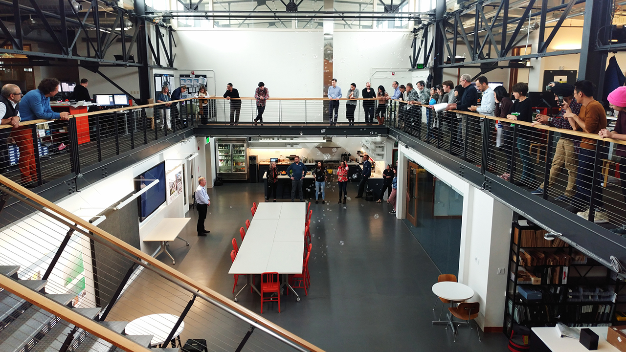
8. EHDD office, photo: Cian Hrabi
Desert Dwelling at Taliesin West

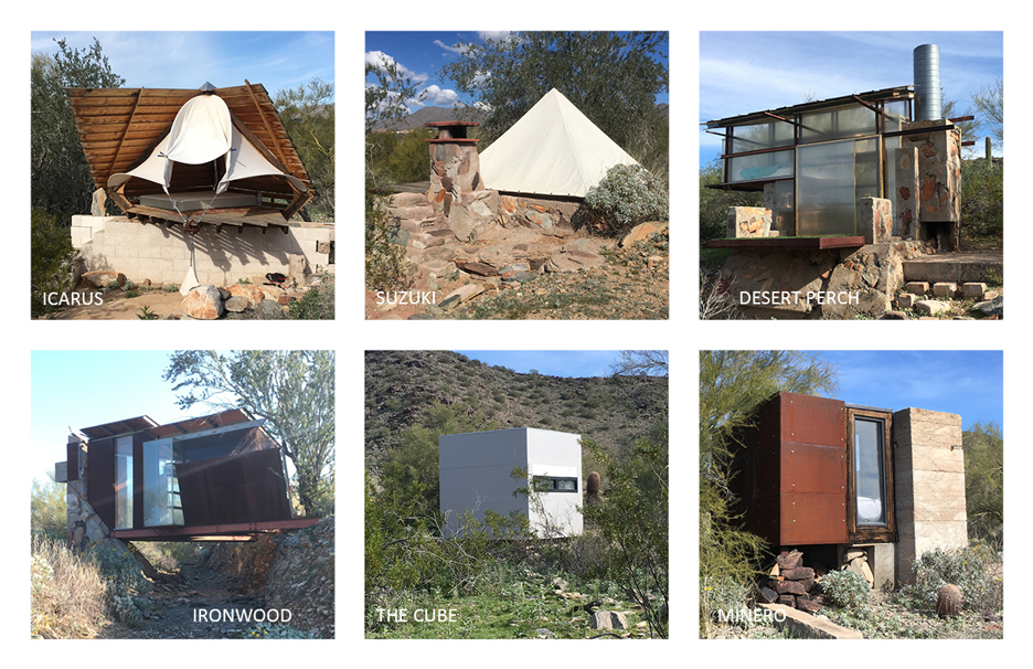
There is a long tradition of experimental housing at the School of Architecture at Taliesin (SOAT), formerly known as the Frank Lloyd Wright School of Architecture. When Wright and his apprentices started Taliesin West in 1938, the apprentices slept in pyramid-shaped canvas tents over concrete slabs and “desert masonry” bases, scattered throughout the desert at the base of the McDowell Mountains in what is now Scottsdale, AZ.
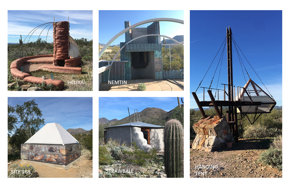
Today, approximately 20 M. Arch students reside in the locations of their predecessors. The shelters have evolved from simple shepherd’s tents to a wide array of experimental structures, but they’re all required to be located on the historic sites. Many make use of the low desert masonry walls, which have outlasted the canvas by decades, to create new forms of shelters.
Under the leadership of Aaron Betsky, dean since 2015, SOAT plans to expand to 60 students within a few years. However, fewer than 25 habitable shelters currently exist on the property. At a rate of 5-7 students completing a new shelter each year, there soon won’t be enough housing to meet demand. Temporary group housing could offer a solution ̶ the school would have enough beds to grow their student body now, and later repurpose the housing structure when enough of the approximately 75 sites are developed for each student to have their own shelter.
This past January, I spent four weeks at Taliesin West, sleeping in the desert shelter known as Hanging Tent. Built in 2001 by Fatima Elmalimpinar and Fabian Mantel, Hanging Tent takes the basic form of the shepherd’s tent, and suspends it several feet above the desert floor. It was a beautiful place to watch the super blood moon through the (retrofitted) acrylic roof, but that same clear roof made it too hot to occupy during the day.
Mornings, I meandered along a small path past other shelters, both functional and not. Walking through the desert at Taliesin West gives you a glimpse into its history: so many projects exist in a kind of unfinished limbo. I picked up about 1,000 rusty nails hidden among the cholla cacti. Finding nails became a meditative practice and an exercise in seeing. Each time I thought I’d picked up the last nail in the desert, more would suddenly appear when I refocused my eyes. With every nail I’d wonder: what did this once hold together?
My biggest find was a 20”x30” piece of bullet-ridden rusty steel, with only trace remnants of what I assume was sign enamel. I imagine it once menacingly declared “No Trespassing.” To transport it to the historic drafting room where I worked, I slung the sign over my shoulder with a rusty post. With the sharp bullet-exit side of the sign facing out, I was armored like many other desert-dwelling life.
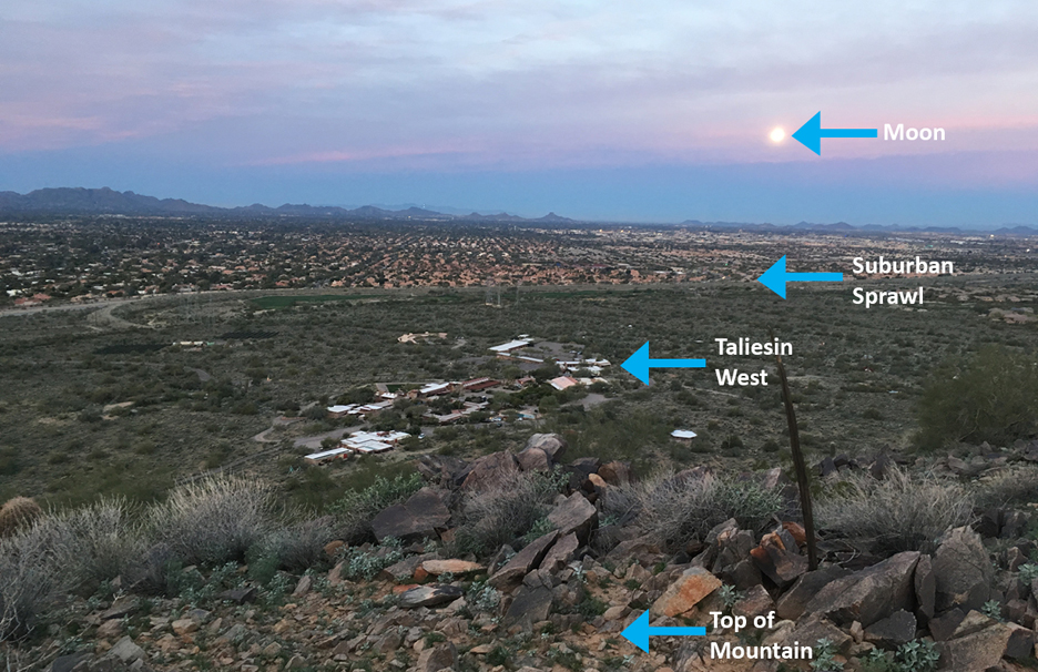
This landscape doesn’t exclusively favor history. A watchful eye can also find items of a more recent provenance. When Frank Lloyd Wright and his apprentices first came here, the site was more-or-less open desert. Now, the edge of the property is clearly visible with luxury developments pressed right up to the property line. Wind carries in detritus from the suburbs, like garishly shiny Mylar balloons. A big silvery number “3”, perhaps from a kid’s birthday party. A cyan glint that caught my eye through the scrub turned out to be a blue pentagonal balloon.
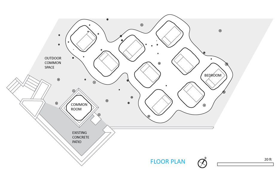
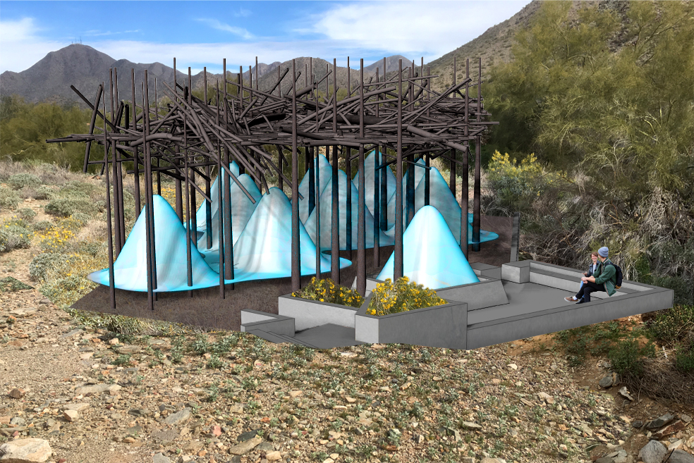
I’m interested in this space where old and new converge. To that end, I created a model for student housing based on the interaction of historical and contemporary elements. My proposal redevelops a site that formerly showcased a prototype of a mobile home. Because of this, there is power on site, and running water nearby, amenities that are nonexistent at other shelter sites. There’s also a large red concrete pad, and a Falling Water-esque concrete patio cantilevered over a deep wash. I’m proposing to demolish the concrete pad and create temporary housing for 10 students.
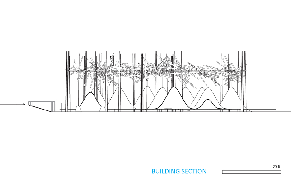
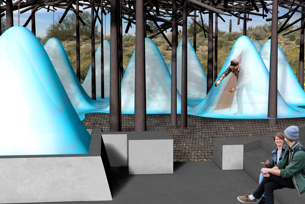
This housing structure would offer shade and physical protection, and contain flexible interior tents to shield occupants from wind and rain. The shade structure is made of steel pipes of varying sizes, arranged as if a giant emptied a bucket of nails into a big jumble. Some of the pipes simultaneously act as the foundation (as friction piles), the columns, and as vertical shade elements. Other smaller pipes provide shade and the infrastructure from which the tents are suspended. The canopy of pipes is as deep as it is wide, with all the pipes at different angles in order to provide shade no matter the angle of the sun. The effect is like a saguaro cactus housing the Gila woodpecker: a spiky uninviting exterior, with a hospitable interior.
In place of the red concrete pad, the floor would be a circular pattern metal grate, held several inches above the desert floor to allow for plant re-growth, and keep students protected from crawling critters. The occupiable interior space has a floor of the same material as the tent, over the metal grate. Future utilities could be fed from below, further increasing the flexibility of the space.
Ten bedrooms would be made from one piece of translucent PTFE membrane, suspended from the shade canopy above. The existing patio and tent site will be used as common space. The rooms themselves are the standard size shepherd’s tent, which provides just enough space for a twin-size bed, night-stand, and floor space to maneuver. SOAT students don’t need more than a place to sleep because all schoolwork happens in the studio, and locker rooms are provided for storage and bathing. The membrane could be blue to lull students to sleep, or white with varying levels of transparency in order to see a glimpse of sky through the lattice of the canopy.
The first shelters at Taliesin West provided a lasting stone and concrete infrastructure for canvas tents, which could be removed and replaced as needed. My proposal for new student housing takes the same idea a step further. By providing shade as part of the infrastructure, students can use their rooms even during the hottest part of the day. There’s also a greater level of flexibility because, when the immediate need for more housing is met, the single membrane can be re-tensioned to form space for the future needs of the school.
For more information about the School of Architecture at Taliesin West, visit: https://taliesin.edu/
Is More Meaningful Architecture Possible? A Reflection on Parrhasius’ Veil

One of my favorite parables is about two rival painters. It takes place in the first century, in Athens. Zeuxis and Parrhasius are each thought to be the greatest artist in the classical world. Yet, each is celebrated for very different reasons. Zeuxis is widely known for his consummate technical skill, while Parrhasius is known for his deep understanding of human nature. Eventually a duel is arranged to settle once and for all who is, in fact, the greater artist. When the day of the duel arrives, a large crowd gathers. Unabashedly, Zeuxis unveils a painting of grapes so realistic that birds began to swoop down from the sky and peck at them. The crowd cheers. And, confident of his victory, Zeuxis approaches Parrhasius’s painting to grab the veil covering it. Yet to everyone’s amazement, he touches only canvas. Parrhasius had in fact painted a veil. Bewildered, Zeuxis immediately admitted defeat.
The story of Parrhasius and his veil is memorable because it suggests the power and efficacy of an artist’s concern for the human being and human experience over technical novelty. Though Parrhasius must have painted with great skill to bluff Zeuxis so effectively, his work of art was not the painting itself. It was the human response. His work of art was not the physical paint and canvas, but Zeuxis reaching out to touch it. That experience is what created its meaning. That was the art. And that revelation, I think, is why Zeuxis so quickly admitted defeat.
There is a tendency for architects to believe that the buildings we design, like Zeuxis’s grapes, are an end to themselves. That they should capture people’s attention with their technical wizardry or formal novelty. That the spectacle of it all might somehow create meaning. Perhaps akin to looking through a kaleidoscope. You cannot help but be mesmerized by buildings like this, yet eventually realize beneath the surface there is little depth or substance. It is all rind, and no fruit.
The lesson Parrhasius offers is that more meaningful architecture is possible. And it does not begin with the fantasizing of spaces, but with a deeper awareness of human nature. Not with a formal imagination, but with an empathetic one. With an emotional intelligence, with ideas endorsed by feeling and lived experience. And an understanding of all the many human events and daily rituals of life (even the most mundane) that as a whole give richer meaning to our lives.
It is a way of thinking that requires constant discovery, to uncover not only the physical reality and history of a place, but also the multiplicity of people and experiences that might occupy it. Eventually, an architecture might emerge that is a more genuine expression of its inhabitants and its place. One that is not held together by its exterior figure, rather, by a rich and layered sequence of atmospheres. It is more meaningful and real, and like Parrhasius’s veil, that relies on each of us to reach out and experience it directly.
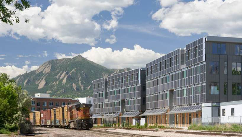
Designing for Sustainability at Boulder Commons
For the past 15 years my architecture firm, EHDD, has been advancing the concept of net zero energy buildings as a response commensurate with the scale of the challenge of climate change. Morgan Creek Ventures’ goals for Boulder Commons took the stakes up a notch and led to an innovative, unexpected solution. Until Boulder Commons our designs had been for committed clients who were developing their buildings for their own use. The projects, including the LEED Platinum and Net Zero Energy Certified David & Lucile Packard Foundation Headquarters topped out at two stories and were all located in California, a relatively mild heating climate.
In contrast Boulder Commons is a 4-story speculative office building. A speculative office building means that you don’t know who the building users are and how motivated they will be reduce energy use related to such things as lighting and plug loads – everything that is plugged into electrical outlets. The “green lease” that Morgan Creek developed for this project addresses this and could potentially have as much sustainability impact as any of the physical design elements.
Why do we care if it is a two-story or four-story building? With net zero energy you need to balance your energy use with the available renewable energy resources on site. Typically this is a function of roof area and other horizontal areas such as parking lots where conventional photovoltaic installations can be readily installed multiplied by the amount of solar insolation that falls on the site annually, and compared how low you can get your per square foot energy use. With a four-story building we either needed to cut our energy use in half from other net zero projects or find twice as much area for solar PV collection.
On the energy use front we worked very hard to develop an “envelope”, or window and wall, design that does an excellent job of keeping the cold out in winter and heat out in summer. We specified triple-element windows with a heat mirror film suspended between two panes of glass that serves to bounce heat back into the space in winter, and used fiberglass window frames that are far less conductive than aluminum frames. We supported our exterior cladding materials – metal panels and brick primarily – with fiberglass clips that reduce the “thermal bridging” that you typically see in conventional construction. While these elements looked at in isolation cost more than conventional elements, they also allow a downsizing of mechanical system elements so the net first cost is reduced, not to mention operating costs and the superior thermal comfort.
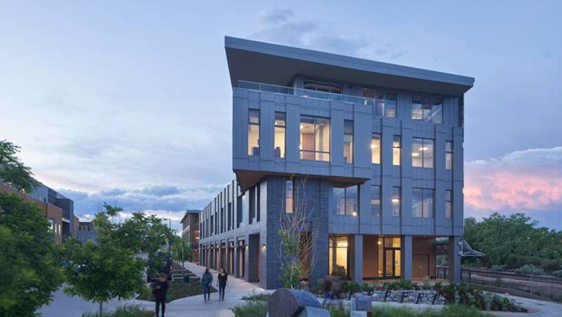
I arrived for a meeting at Boulder Commons this winter on a snowy, frigid day. I spent all morning in a conference room with full glass on three sides. The thermal comfort afforded by the special glass, frames, and walls was truly remarkable and completely unlike what our minds and bodies are used to in a such a open, glassy, well daylit room.
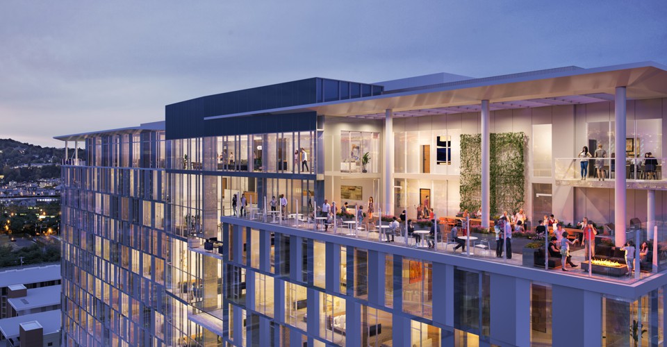
On the energy supply side we not only covered the roof in PVs but also integrated vertical PVs into the southeast facing, four-story façade. In Boulder you have very clear mornings usually with strong sun so that, combined with a rail right-of-way along that side ensuring a perpetual lack of shading, made it a great site for PVs and allowed us to get a four-story building to net zero. The key was designing these PVs not as add-ons but as the exterior cladding material itself. By replacing the metal panels, we found that on a net basis the vertical PV wall cost less per unit of energy produced than roof-mounted PVs. In addition we designed the southeast façade with clerestory daylight reflecting glass that bounces daylight up on the ceiling, and then clear glass for views below. We worked closely with the team to integrate this daylight glass, view glass, PVs, and ventilation for the VRF system that drastically reduced shaft space to increase rentable area.
Ultimately what most people experience is the way this building is scaled to its surroundings while wearing its innovative nature proudly. The view from the new Transit Center to the south of an exuberantly protruding window wall cantilevering over the building below is a move meant to excite the passerby, and connect people inside to the views of the city and Flatirons beyond. Sustainable design for us is truly about demonstrating a better quality of life for building occupants and better, more livable communities for all of us, and we are pleased to see how Boulder Commons is generating excitement both locally and across the country around the potential of net zero energy design.
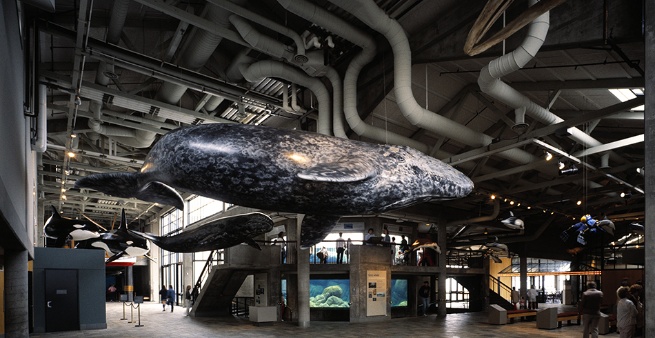
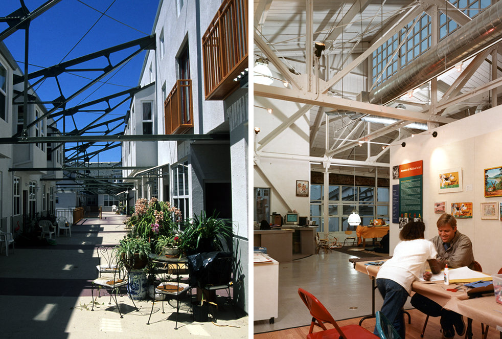
Buildings with Pipes

San Francisco Beer Week kicks off on February 10th and opens with a large gathering of makers and craftspeople and their brews, all eager to share them with each other and the public. EHDD has a long history of working with clients that are makers, and for decades we have been designing technically demanding buildings and spaces for specialized uses, including laboratories, aquariums, zoos, museums, and breweries.
We love buildings that expose their inner workings—the miles of pipes, conduits, ducts and raceways that form the circulatory system of the living building. A lot of pipes make up the circulatory system that delivers nutrients to keep fish alive at an aquarium, delivers flour and water to a bakery, and conveys ingredients and water to the brew house at a brewery.
Keeping Creatures Alive
The Monterey Bay Aquarium has been often imitated, but seldom replicated as successfully as it was on Cannery Row. The shark and the diminutive jellyfish, both residents of EHDD’s first aquarium, are somewhat akin to astronauts living in a space station. They are restrained by an artificial environment that keeps them alive by successfully recreating a self-contained and hospitable environment. Like a space station, an aquarium provides the good stuff to keep its residents alive, while keeping out or removing the bad stuff that would cause them harm. Many miles of pipes, conduits, cabling and tanks are required to make this work at an aquarium.
Monterey Bay Aquarium is a case study of specialized technical issues and the large network of pipes that define marine research facilities, including acquiring process water, stabilizing water temperatures, preventing algae growth, structurally sound display tanks, complicated filtration systems, animal husbandry areas, and associated labs and shop spaces.
If you Bake it, They will Come
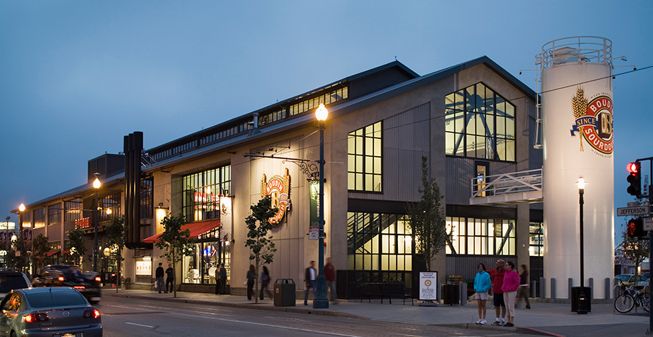
Like Cannery Row in Monterey, Fisherman’s Wharf in San Francisco oozes history and is packed year-round with hordes of visitors looking for crab, sourdough bread and an Alcatraz sweatshirt. Boudin is a legacy San Francisco business that has been making and selling sourdough bread with the same starter yeast since the California gold rush of 1849.
EHDD designed Boudin at the Wharf, a two-story, 25,500 sf building on the site of Boudin’s old bakery and café at Fisherman’s Wharf. The complex encompasses a working bakery, associated retail, a cafe, and a second floor bar and restaurant. The design showcases the baking process with views into the bakery, both from within the building and from outside on the sidewalk, and allows visitors to take a self-guided Bakery tour of exhibits and the chance to look down on the activity of the bakery below.
The working flour silo attached to the end of the building stands as the literal and functional symbol and sign post for the bakery, receiving the flour deliveries and conveying it through pipes into the bakery to make more baguettes.
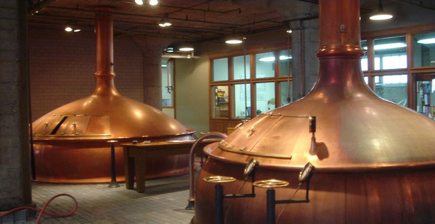
Beer Here
Breweries are all about moving large amounts of fresh, potable water through pipes into a building for making beer, and then moving large amounts of a finished liquid product to a cellar and on to a bottling line. Most breweries and bakeries (that are larger than a neighborhood shop) also receive daily deliveries of grain and/or flour. Beer is a living thing, and the pipes and plumbing that make the brewing process work are, in concept, not too dissimilar to the life-support plumbing that keeps the fish alive at the aquarium.
Anchor Brewing & Distilling, like Boudin, is another legacy “pre-quake” San Francisco business and EHDD client and neighbor. We have worked for big craft breweries like Anchor and New Belgium and for micro-brewers like Great Northern in Montana. For the most part, Anchor uses gravity to move things through their pipes and down the line, from the mash tun to the kettle, to the fermentation tanks to the cellar, and on to the bottling and keg lines.
As SF Beer Week approaches, we are excited to be working with Anchor Brewing again to help them create a smaller-scale brewing set-up that will allow their brewers and tinkerers to experiment with new recipes quickly and efficiently, and also enable them to share it with their neighbors and visitors more easily. More pipes and tanks will be involved!