Blog Archives
A Community Heartbeat

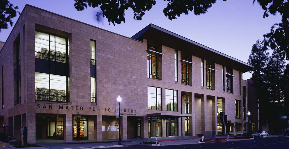
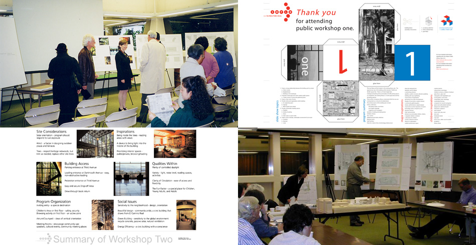
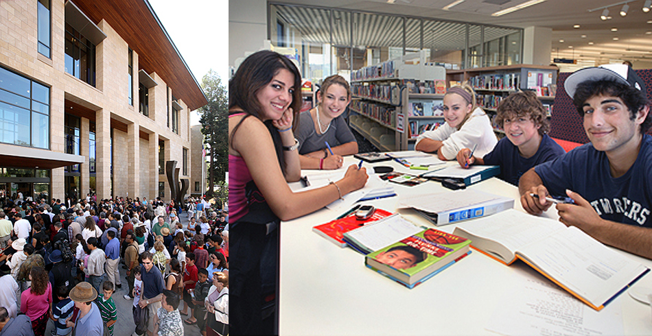
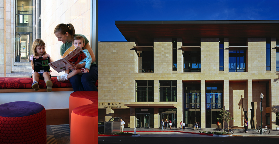
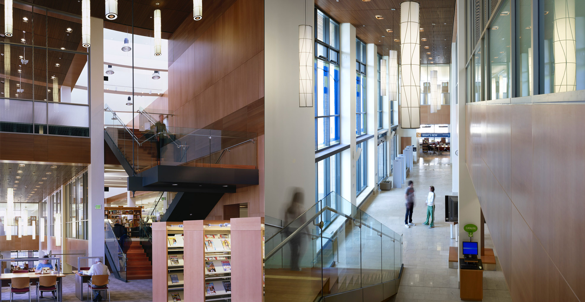
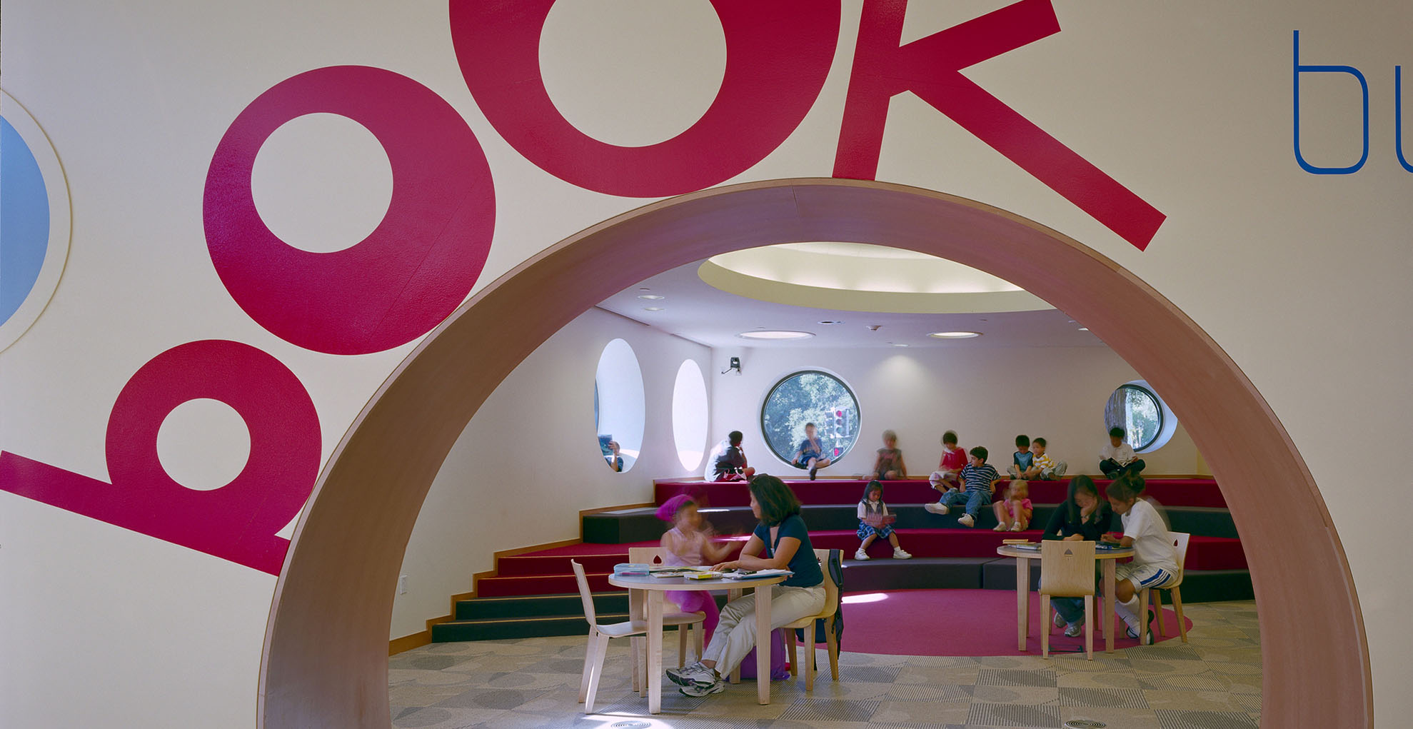
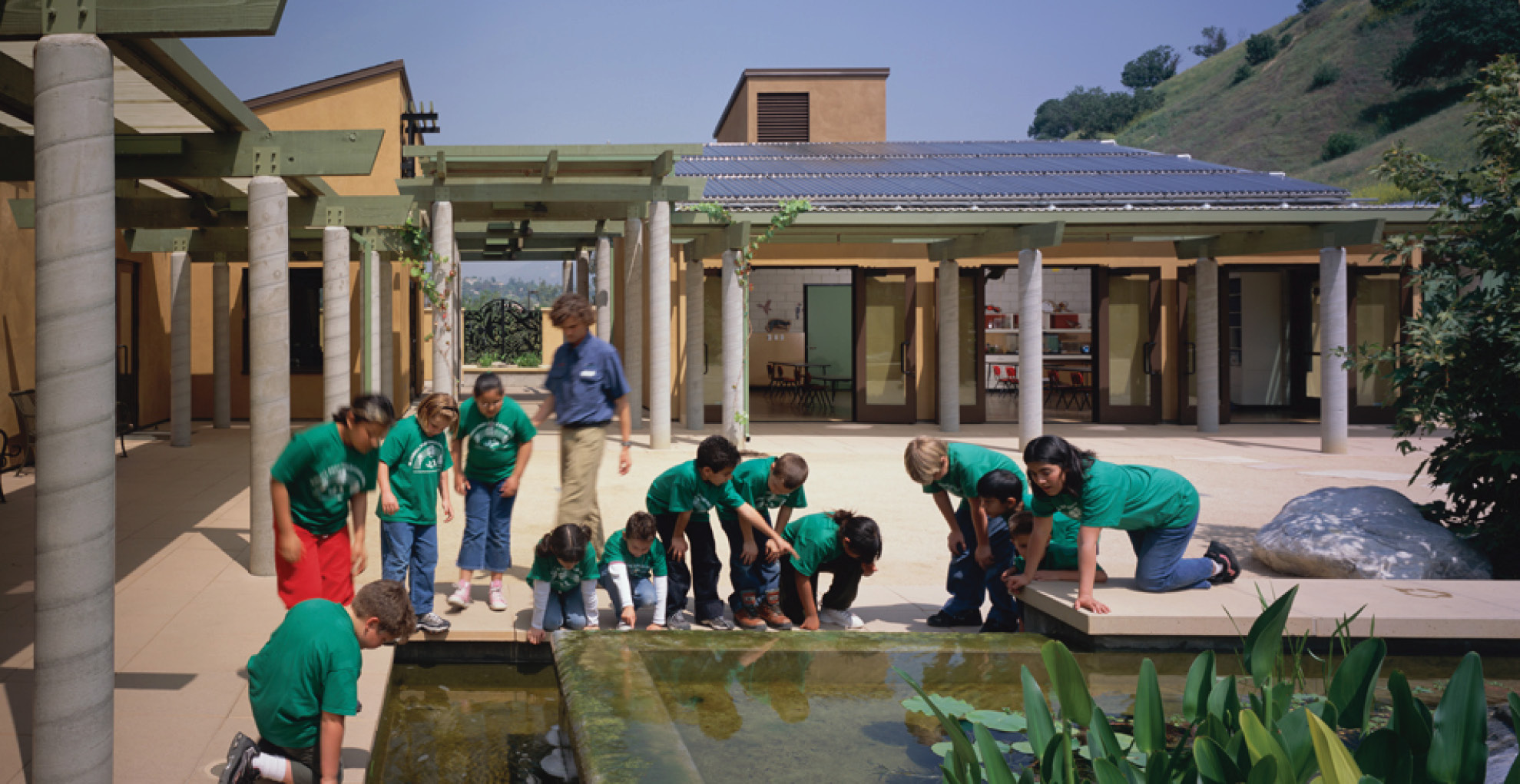
A decade ago, we completed a collaboration with the San Mateo community and the leaders of the San Mateo Public Library. It was a lengthy process that involved many stakeholders and community members, and the new library opened in 2006. Today, it is thriving-and evolving. Much has changed in 10 years but public libraries are still free places to go, to read, to dream. They are safe, open, and beautiful places in their communities.
On October 14, I spoke with donors and community members about the process of creating the San Mateo Public Library, a project that will always hold a special place in my own history. My passion is the process of engagement that precedes the creation of architecture, and in that, this was a perfect project for me. We met and met again, and we debated everything: the curves, the cafe, the trees, the daylight, the materials, and … the curves. The community, donors, and City had a profound desire for the library to be easy to navigate and modern in feel. During the design of SMPL, there were no LEED Certified buildings in the state, and few in the country. We sought to create a beautiful, elegant, warm, civic expression-a place that would stand the test of time. The client and donor focus was on what made this library uniquely San Mateo.
At a time when public funding for important institutions is dry, where commitments to our community serving institutions are coming more from the private sector that through public funds, the SMPL’s elegant public/private partnership for the greater public good is exemplary.
Ten years ago, this community designed a foundation for its next 50 years or more. SMPL was designed to have a future view by investing in:
- advanced technology book sorting;
- raised access floor for air distribution and spatial flexibility;
- an advanced seismic structural system; and
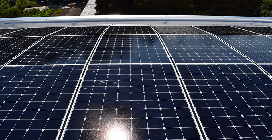
- infrastructure for solar panels, which were added in 2012 and provide witness and testament to the City’s commitment to sustainability and resilience.
Our libraries are the one constant institution that allows us to dream in a world that is all about change. This library was designed to anticipate the need for people to meet, collaborate and work in groups to help solve problems and form the companies of tomorrow. Even as online experiences grow, people seek human connections, too. The library is one of the only public places where these connections can happen. It’s what makes your city a community.
For perspective, we asked Amy Himes, who joined SMPL as Executive Director this year: “It’s easy to tell exciting stories about the positive impact of the library in this community,” she says. “A huge part of this is the way that the architecture make the place for all the activities of the library. This is a place where people feel welcome.” As Himes notes: “The collection is important, the services are important, but the place is enormously welcoming as a community center. There is a community heartbeat here.”
by Jennifer K. Devlin-Herbert, FAIA, LEED© AP BD+C
A Challenge for 2030 Leaders
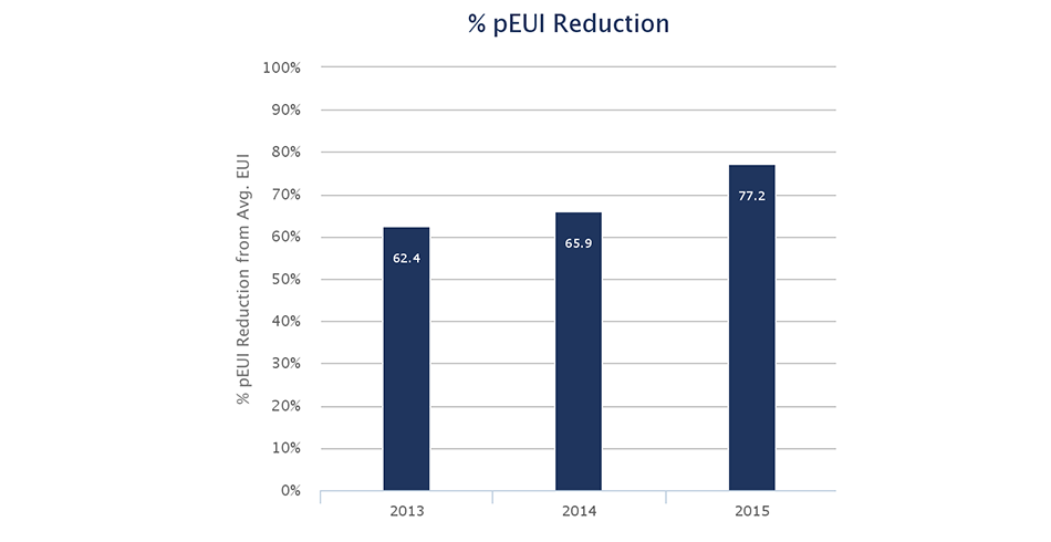
The latest AIA 2030 Commitment report was released early October (2016), and the results are sobering. The target for year 2015 is a 70% reduction in energy use across a firm’s portfolio as measured against an existing building baseline, a step up from 60% goal in 2014. Projects reported only an average savings of 38%, with 4% meeting the current savings target.
Why does this matter? Nearly all paths that keep global temperature rise below 2 degrees C require new construction to be carbon neutral by 2030. In addition, our existing building stock needs an equivalent retrofit effort. The AIA 2030 Commitment is a program based on Ed Mazria’s 2030 Challenge that enlists architecture firms to commit to stepping up their portfolio performance every 5 years until we reach the ultimate net zero goal in 2030.
The 2015 results confirm that the building industry is not moving fast enough to respond to the challenge posed by climate change.
At EHDD we are proud to have achieved the AIA Commitment targets each year since program inception, with a 77% performance savings in 2015 (see Figure 1). This aligns with our firm’s goal: to lead the industry in annual building performance as measured by the AIA 2030 Commitment. We want to leverage the AIA 2030 Commitment to push ourselves and our project partners towards achieving industry-leading energy performance in our buildings.
But just reaching the targets is a start. The leaders in the field—those top 4%, like EHDD, who are meeting the targets – need to be more active in sharing their expertise in order to clear a path for the industry to follow. Consider this blog our attempt to kick start this effort.
How is EHDD meeting its 2030 target?
It appears to me that there are three main factors that constrain or enable each firm’s ability to reach the 2030 targets: circumstance, project types, and process. Let’s examine how these factors play out for EHDD.
Circumstance:
85% of our projects in the last three years are located in California and Pacific Northwest, with a generally moderate climate, excellent energy codes (Title 24 in California), and favorable utility rates. As I described in my earlier post Net Zero 3.0, strengthening energy codes in particular has raised the bar on all projects, reducing the gap between standard and high-performance.
The biggest factor in our 77% reduction is our large proportion of net zero energy buildings featuring roof-mounted photovoltaics.. In our 2015 submittal, we reported six net zero energy projects out of a total of twenty projects. Two of these were 100,000 square foot office buildings, including Boulder Commons which is located in the not-so-temperate Colorado climate. The other four were K-12 schools, all of which are financing their PVs through third-party “power purchase agreements” with the option of zero up front costs, and savings on their utility bills from day one.
Project Types:
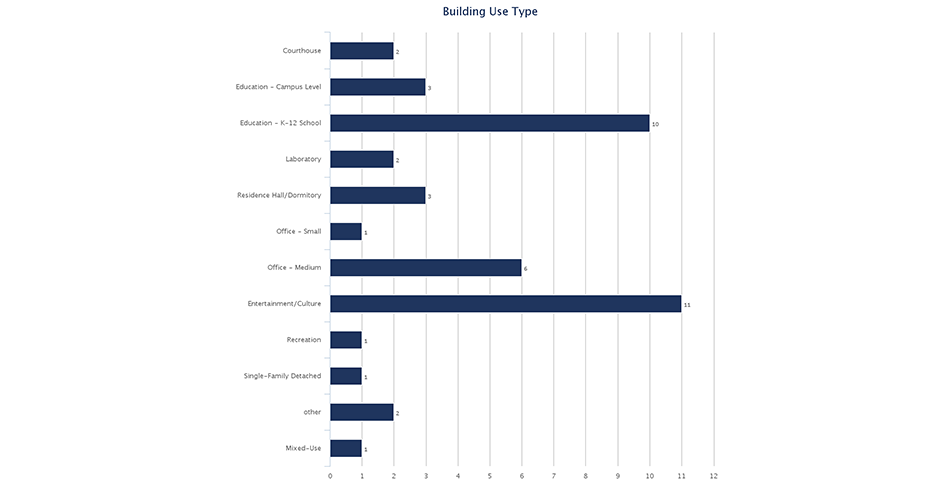
We work on an unusually wide range of project types, including university classroom buildings, developer-led offices, aquariums, and K-12 schools (see Figure 2). Our sites and building forms vary from high-rise urban to low-rise rural. Since the targets are based on relative performance to benchmarks, working on energy-intensive projects is a constraint but not a deal-breaker for us. The key is attacking the major energy uses head on. Labs and aquariums, for example, are process- or internal-load dominated so “circumstance” (climate) is not as important. As architects we need to get out of our comfort zone on these projects and focus as much as specifying the most efficient -80 degree lab freezer as we do on selecting window glazing.
Process:
The factor that architecture firms control most, of course, is their design processes. At EHDD, we begin by setting absolute energy performance goals at the earliest stages of a project, and then testing our design against those goals through performance energy models throughout design. We work closely with our energy modeling partners and base our collaborations around modeling protocols that we agree to when we establish project scope. As soon as project program and size are known, we enter the project into the 2030 ddx website in order to determine the correct baseline energy use and the appropriate Predicted Energy Use Intensity (PEUI) reduction target. We communicate this target to the full team and craft a project-appropriate design process. EHDD teams get rewarded if their projects exceedtheir targets by 10% during annual reporting in winter. This equates to a five-year advancement towards the 2030 goal and demonstrates true industry leadership.
Up to now, many firms have held back on committing to 2030 targets out of fear of not being able to meet their promises. Information on who is meeting their targets and why is carefully guarded. Meanwhile, nations make commitments to collective action on climate change that our profession is not yet meeting. It is time to up our game. I suggest that we start by sharing more within the profession to speed innovation—and hold ourselves accountable
Brad Jacobson, AIA, LEED AP BD+C
Associate Principal
National Park Service at 100

This week marks the Centennial of the National Park Service. For nearly four decades, EHDD has been collaborating with this organization, the stewards of sites visited by millions each year. Back in 1916, President Woodrow Wilson signed the agency into being in an effort to collectively preserve the ecological and historical integrity of the United States’ important resources. In the subsequent one hundred years, the NPS has grown into a network of 413 areas that have come to provide a national public service. These spaces are accessible to the people for use and enjoyment in perpetuity. This continued commitment to important public environments speaks directly to EHDD’s mission—dedication to public engagement and a responsibility to the future. With these common values, it is no surprise that our paths have crossed multiple times over the years; the collaborations have been robust and fruitful.
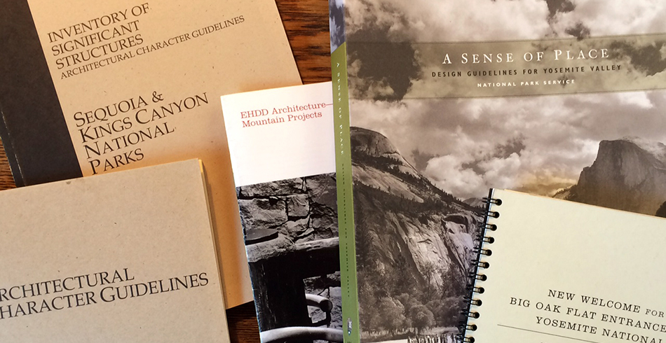
EHDD has a long history of designing for the mountain climate. This familiarity is embedded in the firm’s design of National Parks spaces, initiated by the development of design guidelines for Yosemite and Sequoia and Kings Canyon National Parks beginning in the 1980s. These frameworks, which influence hundreds of individual sites, were spearheaded by founding EHDD Principal George Homsey, who has had a lifelong fondness for the California alpine setting. Beginning with summers spent washing dishes at Yosemite’s Camp Curry, Homsey appreciated the mountains as an escape from city life and a playground for experimenting with new, vernacular approaches toward building. These guidelines were the culmination of exhaustive evaluation of existing resources and an acknowledgement of the unique character of each park. In the development of a framework for the consideration of future design, EHDD emphasized the distinctive qualities of each National Park and accentuated the primacy of the natural setting. After all, Homsey says, “People aren’t coming to the parks to see buildings.”
The Sequoia and Yosemite design guidelines offer an approach more than a prescriptive decree. While understanding, respecting, and responding to the existing language of the surrounding environmental elements, the documents provide thoughtful recommendations rather than dictating requirements—in Homsey’s words, they act as “a reference, not a cookbook.”
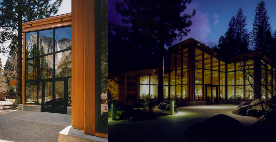
This early association with NPS architectural design focused on a large scale (yet park-specific) attitude toward contextual appropriateness. Specific projects emerged to better demonstrate these primary values. Along with planning and design work at Sequoia and Kings National Park, EHDD’s 1997 addition to the Yosemite Lodge restaurant capitalized on its dazzling settling—glazing at the dining room was designed to specifically frame complete views of Yosemite Falls.
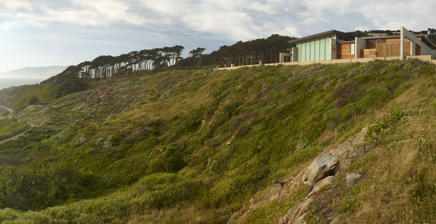
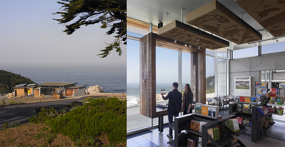
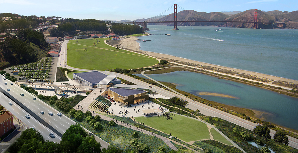
Recent EHDD projects for NPS have built upon the contextual richness of our existing approach. The award-winning Lands End Lookout, located within the Golden Gate National Recreation Area just above the ruins of Sutro Baths in San Francisco, was completed in 2012 and has become a much-loved site. This visitor center responds to the existing architectural character and situates its design in service of the overall site experience while addressing contemporary concerns of sustainability and community engagement. The Lookout provides the core elements to enrich the experiences of visitors embarking on journeys into the park—a space out of the wind, a bathroom, a cup of coffee, and a place to tell a story. Other projects, including the Presidio Exchange (PX) competition entry and the current New Presidio Parklands Project, continue this trend of local involvement in the National Parks environments while further embracing the rich possibilities for cultural engagement at the parks.
What’s next? What is the role of design in the future development of the parks? How might the built environment better contribute to the mission of the parks? Architectural interventions can act as tools for visitors to better understand the Parks. Elements that allow people to learn, contribute, or participate in park stewardship can make the processes and mission of conservation more tangible. America’s best idea is still powerful, and we anticipate that future approaches to design at the National Parks will maintain the thoughtful consideration for the continued enjoyment of public spaces EHDD has championed all along. Here’s to another 100 years!
By Ryan Metcalf, Designer
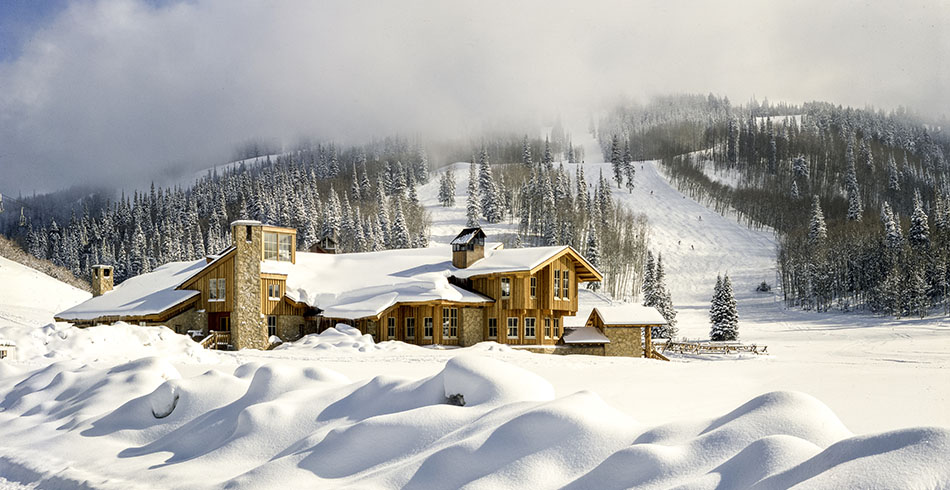
Summertime is Mountain Time
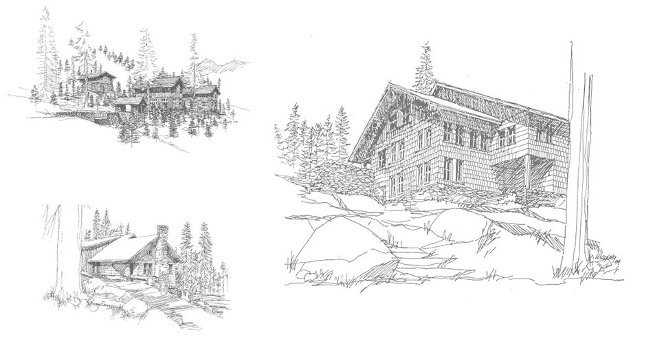
Founded in 1946, Joe Esherick’s early practice consisted mainly of single-family residences in the San Francisco Bay Area. In the giddiness of the early post-war years, many of Joe’s house clients came back to design a second home, and many of those homes were at Lake Tahoe. At 6,000 feet above sea level, the Tahoe basin offered a year-round playground for boaters, fishermen, campers, skiers, and families on vacation, all in a pristine alpine setting with mild summers and not too cold winters. The west and north shores of Lake Tahoe not only had the great beaches, but offered easy access to some of the early ski areas.
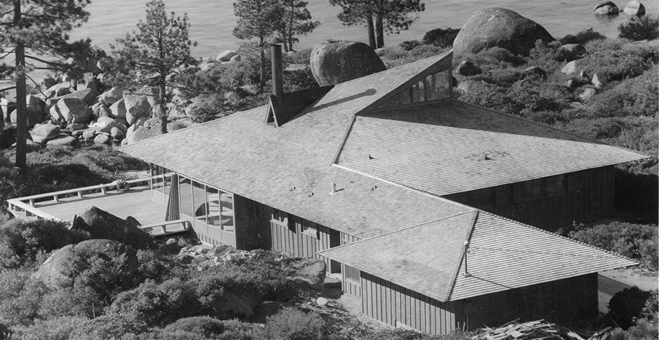
The design response to the climate and landscape of EHDD’s early alpine houses was reflected in the use of heavy timber, stone, steep roofs to shed the snow, and little, if any, landscaping at all. Built in the late 1940’s and early 1950’s, the Walker, Buck, Metcalfe and Bradley houses at Lake Tahoe are all great examples of this single-family design type. These lakeside houses also all had large decks which created an extra outdoor room for meals or star-gazing at night. These simple and appropriate architectural moves would all show up again decades later in the EHDD designs for the lodge and for the demonstration houses at The Sea Ranch, albeit adapted for thenorthern California coastline of Mendocino County.
In the early 1980s, EHDD designed two ski lodges in the mountains of Utah that took advantage of spectacular views and winter sun. The Snow Park Lodge and the mid-mountain Silver Lake Lodge, both at the Deer Valley Ski Resort, provided new lodges with food and service amenities for both long-term skiers and day-skiers alike. The use of heavy timbers, glass and stone, sloping roofs with dormers and big gables set the architectural vocabulary for the residential developments to follow.
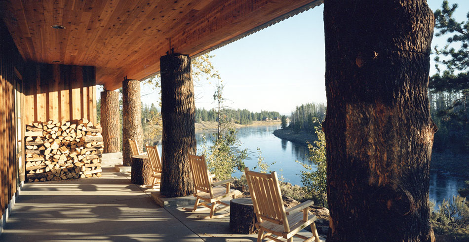
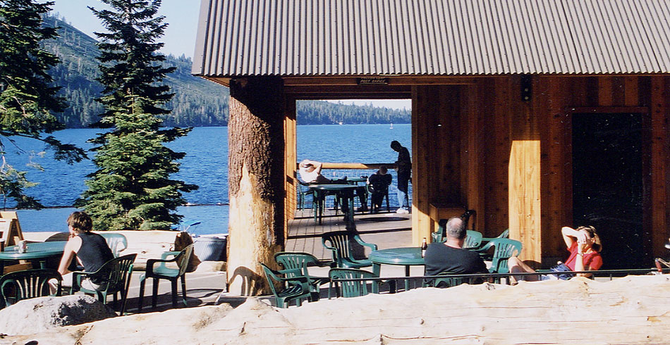
The Henry’s Fork Fishing Lodge, which opened in 1990, sits on the world-famous Henry’s Fork, a tributary of the Snake River in eastern Idaho and was designed to accommodate lodging and dining for one of the premier fly-fishing destinations in North America. The open spaces of the lodge was designed with warm wood and native stone, while a large expansive porch faces the river and the forests beyond, providing a memorable and comfortable outdoor space for relaxation and story-telling.
In 2016, The National Park Service is celebrating the Centennial of “America’s Best Idea,” and as far back as the 1980’s, the National Park Service recognized a need to come up with a unified park image that balanced the competing visitor experience of both the natural and man-made worlds of our national parks. Out of that mandate, EHDD helped develop the Architectural Character Guidelines for development and restoration efforts at Sequoia & Kings Canyon National Parks. Founding EHDD Principal George Homsey would later leverage the Kings Canyon experience and became part of the core team that developed the Design Guidelines for Yosemite National Park. In 1997, construction was completed on the EHDD-designed addition to the restaurant at the Yosemite Lodge Hotel, which emphasized and framed the spectacular views of Yosemite Falls.
In the 1990s, Homsey also designed the General Store at Fallen Leaf Lake, as well as several homes in the Fallen Leaf Lake area. Fallen Leaf offers pristine waters, native trout and views of Mount Tallac, and has always been a desirable place for mountain retreats, offering a smaller and quieter mountain lake experience than the nearby Lake Tahoe.
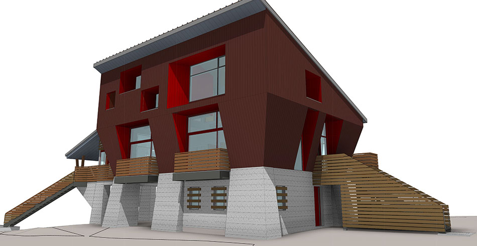
Not far from Lake Tahoe is Donner Summit, where the Sugar Bowl Ski Resort opened in 1939 with the first ski-lift in California. Sugar Bowl’s great snow and easy access from San Francisco attracted many San Francisco families who were riding the popular wave of skiing in America that resulted from the 1932 Winter Olympics in Lake Placid, New York.
EHDD has worked on several houses at the base of Sugar Bowl’s Mt. Lincoln over the years, and continues this tradition with a design for a new residence at Sugar Bowl for a member of one of the founding families of this historic ski resort. Scheduled to finish construction in late 2016, this new house melds lessons learned from over 60 years of experience in designing homes and other structures in the mountains, as well as our expertise in sustainable and energy-efficient building design. At EHDD, our clocks have always been set to Mountain Time.
Libraries: Evolving Knowledge & Community Hubs
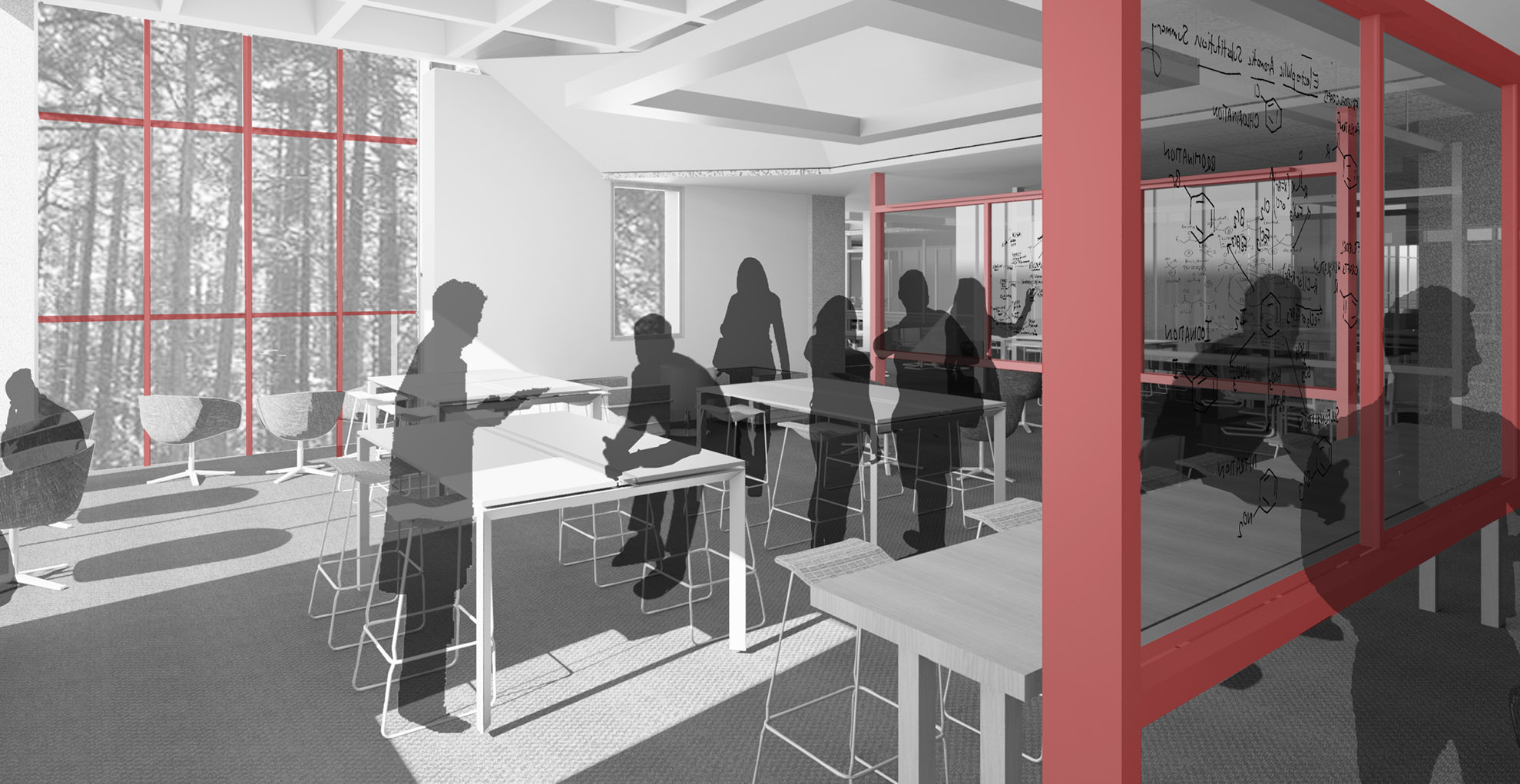
Last year around this time, more than 20,000 people attended the American Library Association’s annual conference in San Francisco. Across the library market, we see a few key themes, and with the 2016 conference right around the corner, we’re looking forward to checking out the ongoing evolution of these ideas in the year to come:Top Trends- Maker Spaces: like schools, universities, and workplaces, libraries see the new generation of inexpensive and accessible fabrication technology as a huge opportunity. They are testing out hands-on programs and spaces at a huge range of scales and for widely varied audiences. The most typical mental image of a maker space might include 3D printers and shop tools, and these are definitely present, but we also saw no-renovation-required programs for kids that involved making a terrarium and creating origami robots. Whether intended to provide a resource for upcoming entrepreneurs, or to engage families on the weekend, the desire for tactile, creative, and hands-on activities continues to grow—and libraries are figuring out how to meet it.
- Digital Access/support: The array of information available online presents libraries with both challenges and opportunities. For public libraries, ensuring widespread (and equitable) access to these resources continues to be a primary mission. Training, support and outreach for underserved groups (especially the elderly, job-seekers, and immigrants) was a focus of many programs. On the academic side, university libraries have a growing role to play in teaching students of all backgrounds how to navigate through an informational deluge, and how to extract meaning from all the data. – STEM/STEAM: Science Technology Engineering and Math (or STEAM, including “Arts”) is a critical driver of today’s economy. Both academic and public libraries are focusing efforts on preparing children and students for success in these fields. Many of the hands-on and digital initiatives described earlier emphasize the problem-solving and analytical skills required.
- Prototyping: Not only are libraries helping their patrons to make and test their ideas in new Maker Spaces, libraries themselves are using these strategies to help develop new services and refine existing programs. As budget continues to be a constraint for most libraries, it is more critical than ever to ensure that their investments (in equipment, space, and programs) are achieving their intended results. We saw examples of both high- and low-tech prototyping, as libraries test out new ideas “live” with their users.
- Play: Public libraries in particular are drawing upon new research showing the benefits of play on children’s learning, especially in early childhood. Several libraries described efforts to make libraries, and the children’s areas within them, more welcoming and conducive to playing.
- Community: Libraries continue to be central community facilities. Librarians described significant emotional engagement with libraries on the part of their users, which the libraries themselves work to enhance and maintain. However, even with widespread support, getting patrons both in the door, and more actively engaged in library events was an ongoing topic.Libraries occupy a unique place in the public sphere—they are the rare spaces andinstitutions that are both truly public and truly beloved. Despite dramatic changes in the nature of our communities, technologies, and culture, libraries remain vital parts of our democracy. We continue to be inspired by their ongoing transformations.
Libraries occupy a unique place in the public sphere—they are the rare spaces andinstitutions that are both truly public and truly beloved. Despite dramatic changes in the nature of our communities, technologies, and culture, libraries remain vital parts of our democracy. We continue to be inspired by their ongoing transformations.
Keep watching this space for further discussion of maker spaces in libraries as we prepare for a presentation at the California Library Association conference in November!
Relevant Projects:
San Mateo Public Library: With built-in flexibility and a diverse array of welcoming spaces, the San Mateo Public Library continues to evolve with its community, 10 years after it opened.
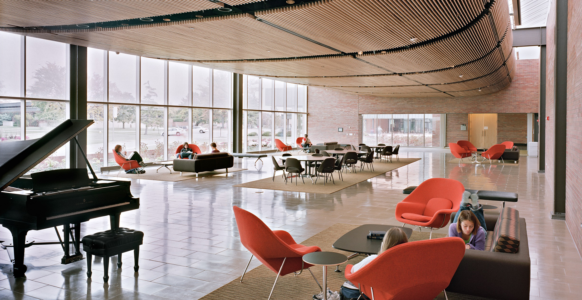
Valparaiso University Christopher Center for Library and information Resources: Both a campus hub and an academic resource, the Christopher Center gracefully combines these two critical functions of the academic library.
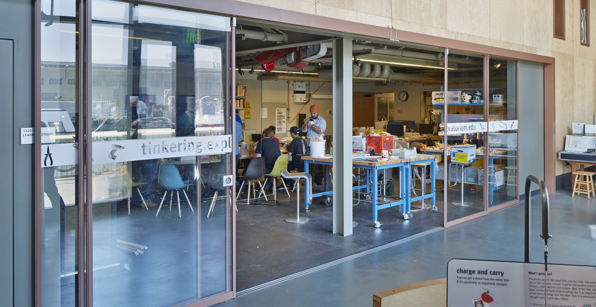
Exploratorium at Pier 15: An embedded Tinkering Lab brings making into the museum at the Exploratorium, emphasizing the hands-on nature of the surrounding exhibits.
UCSC Science and Engineering Library Active Learning Classroom: In this renovation of the beloved, but aging, Science and Engineering Library, the classroom is embedded into the library, so that it can support new types of both pedagogy and research.
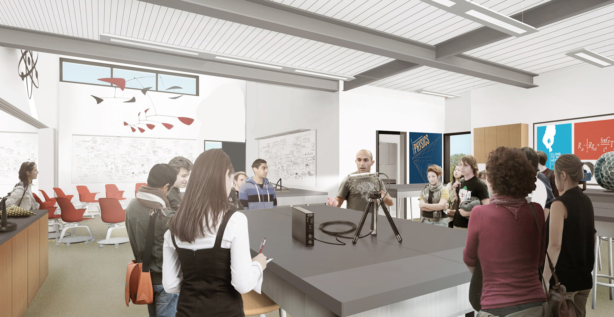
Marin Academy Science, Innovation and Learning Center: Hands-on, STEM focused learning is appearing across market sectors, from museums to schools—including a new Science Building for this Marin high school.
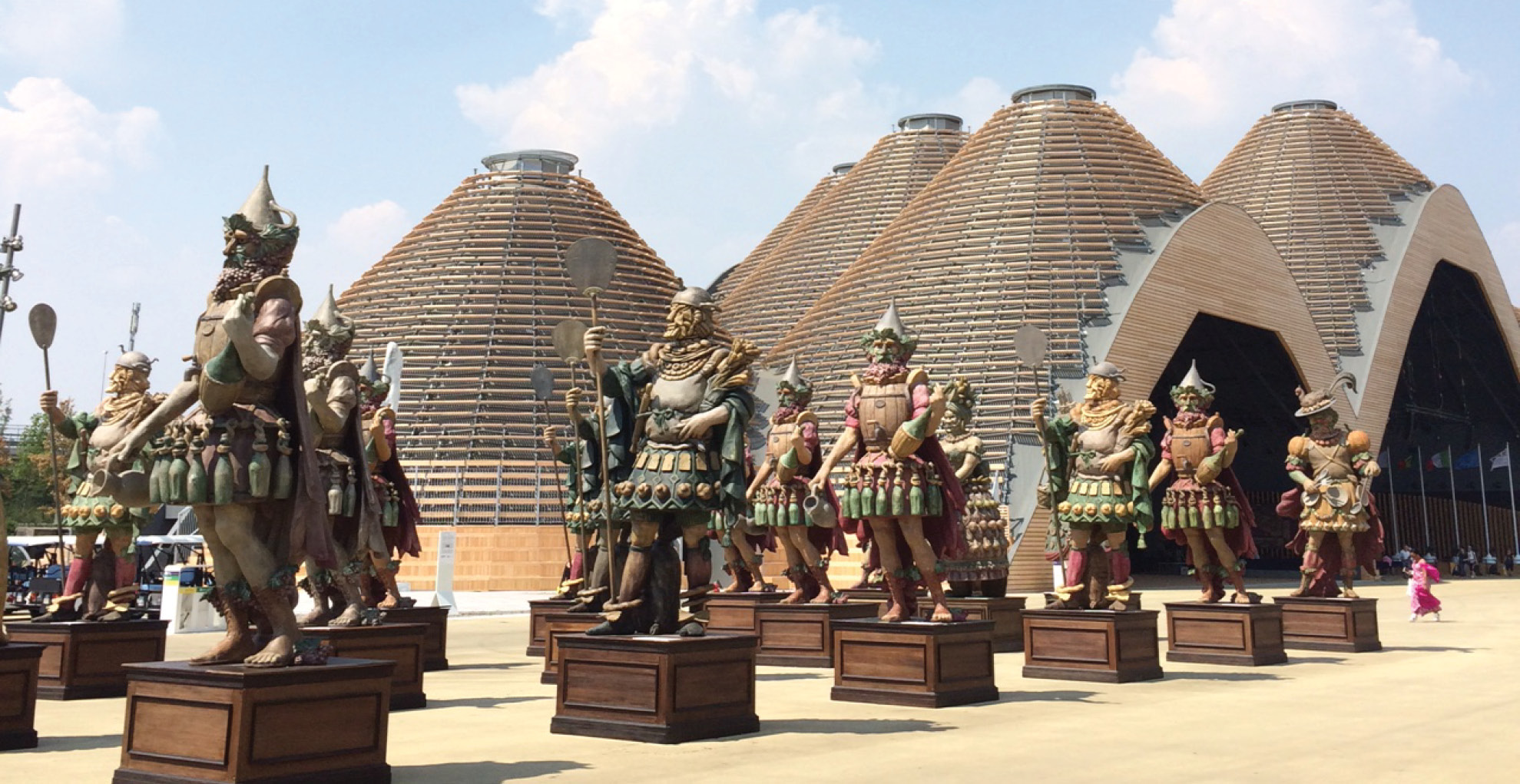
Milan—The City that Knows Wow
Milan Design Week: April, 2016 – Milan has always attracted young Italians and others from all over the world, drawn by the allure of a vibrant and cosmopolitan city that has long been a center for design, fashion and media. Every spring in the middle of April, Milano brings it with Milan Design week, eagerly anticipated by both the Milanese and by design junkies from all over the world. The Salone del Mobile, a huge furniture fair with over 2400 exhibitors and hundreds of related design events (and 400,000 visitors!), saturates the city for a week with the latest designs for chairs and lamps and desks and kitchens and—you get the idea. Design Week–which really creeps out to a couple of weeks–also includes “The Salone” (I Saloni), and is a mega-event of exhibits and design pavilions at the fairgrounds, but also spreads installations throughout the city neighborhoods, parks, streets and galleries.
The city of Milan is like one big living design museum, and the center of that would be the Triennale Design Museum, which opened the 21st Triennale International Design Exposition in early April. After a 20-year hiatus, the Triennale is back with a focus on design and architecture from all over the world, and will last for five months. Milan is also experiencing a building boom, with many new designer high-rise towers, both commercial and residential, which bear witness to Milan’s economic strength in finance, manufacturing and design. Rome bickers and Milan builds.
Last year, the center of design in Milan was the Expo Milano, a world’s fair that was headed up by Bepe Sala, a former city manager of Milan. The temporary fair lasted six months and exceeded all expectations by hosting over 20 million visitors. Needless to say, Bepe is running for mayor of Milan in June and is a good bet to win.
A World’s Fair: Expo Milano 2015 – This past summer, I was fortunate enough to visit the Expo Milano 2015 as part of a family vacation to northern Italy. As the old saying goes, for every church in Rome, there is a bank in Milan. If any Italian city could pull off a very large and very expensive undertaking like a World’s Fair during what has been a slow recovery from the deep economic funk that has gripped Italy and most of Europe since 2008, Milan would seem to be the logical choice.
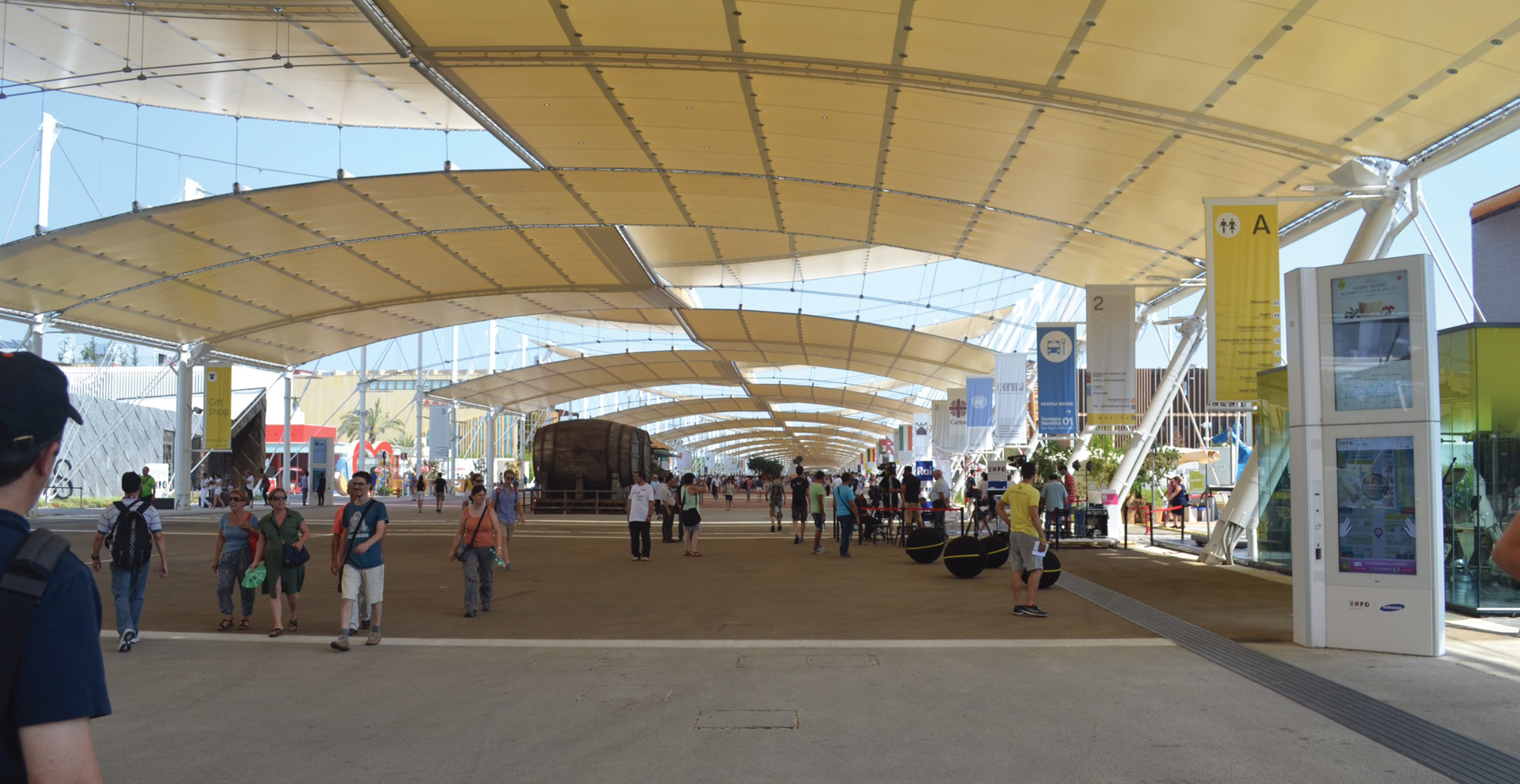
Did I mention the Expo was big? – The Expo was located in an industrial neighborhood outside of the historic city center along a rail line with a new station built to receive the throngs of visitors, including daily international trains direct from Germany, France and Switzerland. Situated on 490 acres, the fair accommodated pavilions for 145 countries, 17 International & Civil Organizations and 21 businesses & major sponsors. The layout organized most of the visiting pavilions along the 1.5 kilometer long Decumano (just shy of a mile) and the Italian Pavilions were laid out along the 350 meter Cardo (about a quarter of a mile long). Walking under the roman-scaled shaded concourse offered some protection from the summer sun, but like Disneyland, the Expo planners also included a perimeter transit system (shuttle buses) as an alternative to the death march with gelato.
Food and Italy is always a good idea – Expo Milano chose the theme “Feeding the Planet, Energy for Life.” Italy in July 2015 was very hot (upper 90’s hot), which added all kinds of drama to the talk about climate change and the precariousness of world food supplies. While many of the pavilions and exhibits addressed issues of food supply, water, diet and the emerging global scenarios of ocean-level rise and sustainable food production, all of those doom and gloom issues still had to compete with the carnival atmosphere of food, beer gardens and hourly parades of dancing fruit and vegetables.
Most of the national pavilions included a restaurant or café and offered visitors a chance to try a dish from an exotic land. Perhaps not such a big deal for someone from San Francisco (Honduran or Burmese takeout tonight?), but it was a very big deal for Italians who eat mostly, well….Italian food. The sheer scale of the fair and the carnival midway atmosphere made it hard to focus on water use and sustainable ranching practices, especially when the nice folks from Uruguay served me the BEST STEAK EVER for lunch.
There were also “pods” that highlighted food commodities like coffee and chocolate, which sounded great, but there were not a lot of takers for either of my two favorite Foods From The Gods when it was 98-degrees outside. Eataly (the Turin-based food emporium) presented pretty good food selections from all the different regions of Italy, but of course the American Pavilion had food trucks with burgers and fish tacos (sigh), and Coca Cola had a massive pavilion where people stood in line for an hour to get a free coke (bad flashbacks to the Atlanta Olympic Games in ’96).
And of course there was also a McDonald’s, which needless to say, raised the eyebrows of the Italy-based Slow Food Movement, and presented one of the weirder juxtapositions of the fair by being located next door to a large middle-eastern Arab country pavilion (pork breakfast patties, anyone?) The placement of the McDonald’s on the main concourse, while the biodiversity pavilions and demonstration gardens where shuffled off to side streets and cul-de-sacs was somewhat symbolic of the uphill fight that the slow food and sustainable farming movements are facing.
Brand-Named Design for Brand-Named Countries – The Design spectrum of the pavilions ranged from tradeshow boxes at one end to high-concept statements designed by the likes of Norman Foster, Herzog & de Meuron, Daniel Libeskind, and others. Most pavilions were more interesting on the outside, and many did not have enough money left over for a decent exhibit design on the inside, which were all over the map. Literally. Some of them had maps with thumb tacks.
Design matters when you are trying to tell a story, and a World’s Fair exhibit needs to go way beyond the Middle-School Science Fair level of design. I don’t care how big your natural gas reserves are–the wall map with thumb tacks and yarn does not cut it.
In the July heat of the Italian summer, anything with shade, water or cool drinks trumped architectural spectacle. Because of the sheer size of the Expo, there was no way to see even a fraction of the exhibits and pavilions in two days, but crowd favorites were promoted by word of mouth and social media, which was also very helpful to see how long the lines were before walking a mile only to find out it was a 90-minute wait.
My favorites included the Japan Pavilion, which had beautiful and fully immersive video environments and an over-the-top zany game-show like extravaganza with singing and clapping and kimono-clad hosts darting around on electric scooters.The Czech pavilion may have had some interesting things to see inside or on their roof deck, but I never saw them because they had a wading pool! The Czechs were the only ones that truly planned for a hot summer on a warming planet. Their pool was packed with kids and adults, and it included lounges and a poolside bar selling Czech beer, of course.
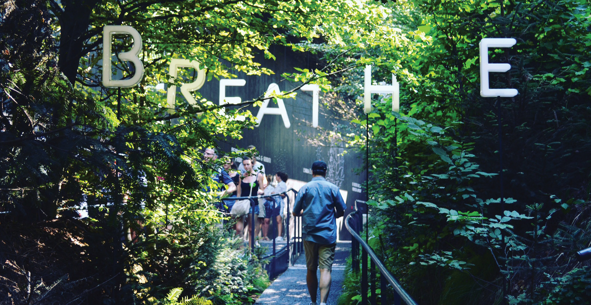
Austria created a large courtyard-type building with a forest in the middle that bathed visitors in oxygen, mist and shade. The message? Breathe, relax and remember how important these trees are. A true urban oasis in a big hot city. My choice for best of show.
Are World’s Fairs still relevant today? – If you invite the world to a big party, how do you plan for it without breaking the bank, and what do you do with it when the party is over? Governments are not spending much money on expositions and good design much these days, so expect large corporations to foot the majority of the bill to pay for the World Fairs, the Olympics and the restoration of world monuments, and maybe someday even national parks and marine preserves. And yes, they will want to stick their name on it somewhere. Get used to it.
Was the fair sustainable? – Sort of. Most of the structures were designed to be disassembled, and the deconstruction started almost immediately after the fair closed. Building materials and even trees were trucked off for use on other projects and locations. The overall fair site will most likely be used by the local university for a new campus and research park, but that remains to be seen.
I really enjoyed feasting on the design of the fair, but I mostly learned about food and the challenges of feeding our planet—all things I could have read or viewed on my phone. The best experience of the fair, in my opinion, was the opportunity to meet in person both visitors and workers from all over the world (and all over Italy), and the chance to chat with them and hear about their lives, their big plans and their favorite foods. I learned that many young and highly educated Italians, Poles, and Argentines (to name a few), frustrated by the lack of opportunities for nurses, veterinarians, coders and architects, are heading in droves to the States, to Canada, to Australia and to opportunities outside of their native lands where their population continues to age and the birthrate drops. Those stories mean a lot more when the person telling the story is looking at you eye to eye, so yes, I think that a World’s Fair still has a role to serve in the 21st century.
While Expo Milano came with the obligatory stories of corruption and rigged bids that seem to be a national sport in Italy, I would say that overall it was a big success considering the odds that were stacked against it. I think the Italians did a pretty good job of showing the world that if the planet is going to hell in a hand-basket, let’s do something about it now AND let’s eat well and make sure we can always share it with our family, friends, and neighbors.
Seismic Shifts
Exploiting Opportunities in Retrofit Projects
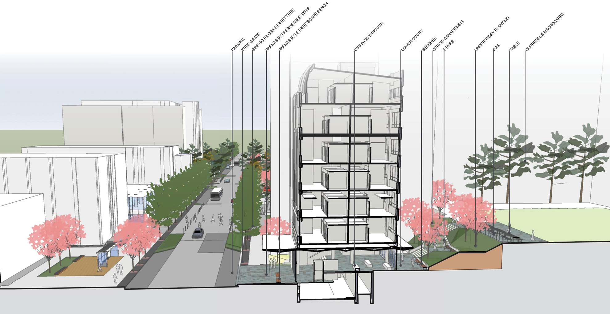
While seismic renovation projects may be thrilling to structural engineers, they don’t typically get an architect’s heart racing. But they should. Our current experience at University of California, San Francisco’s (UCSF) Parnassus campus shows that a major seismic renovation can open the door to a range of opportunities to explore design, sustainability and planning improvements in a campus environment. Anytime campus leadership is spending major time and money on a capital improvement project we feel it is our responsibility to look beyond the narrow brief and find the leverage points to elevate the project into something transformative for that institution.
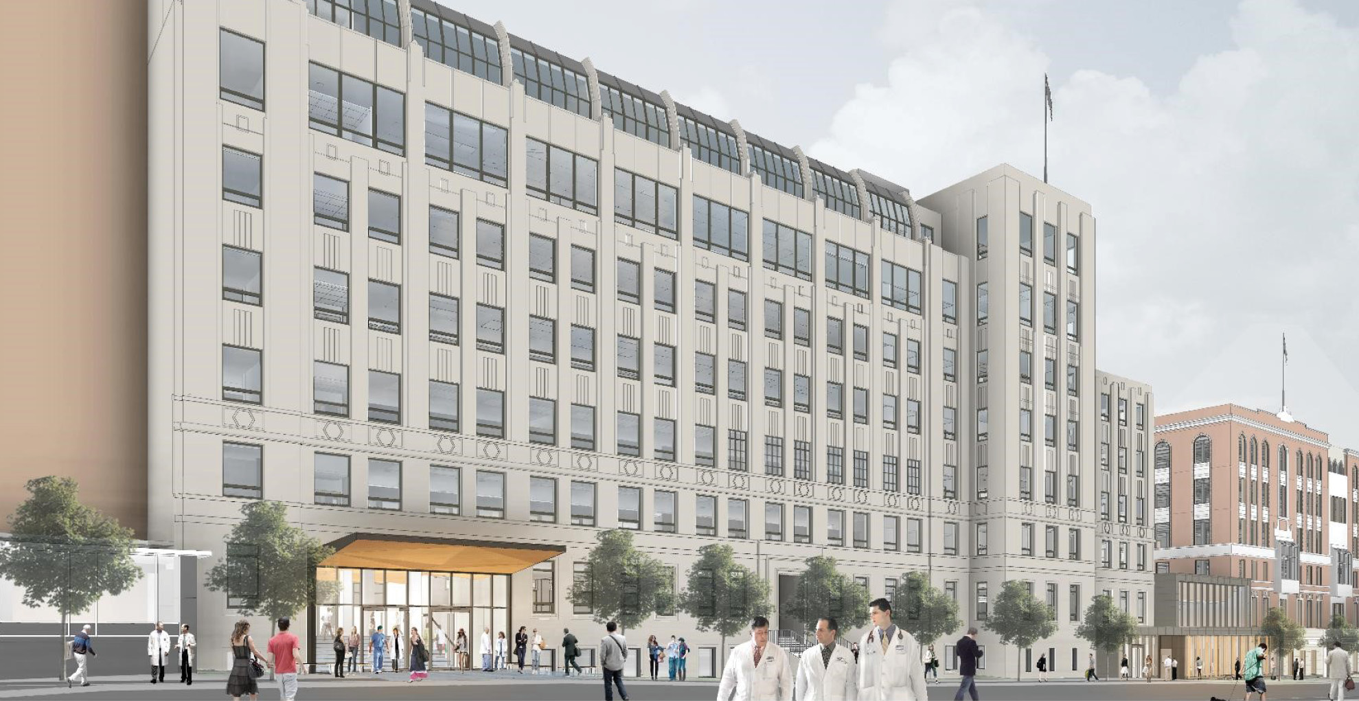
UCSF’s Clinical Sciences Building, a seven-story structure built in 1932, is one of two remaining original buildings on their Parnassus Heights campus. A structural analysis scored the building to be at the highest risk for earthquake damage, triggering the need for a retrofit to comply with University of California policy. Our enhanced seismic design utilizes post-tensioned shear walls that rock and restore to their vertical position after an event, rather than absorbing stresses and permanently deforming as code-complaint shear walls do. A seismically-resilient design of non-structural systems, such as partitions and pipework, safeguards systems that typically represent the largest proportion of earthquake related damage for small to moderate earthquakes. The result is a building that promises to be operational after even major earthquakes and can operate as a resilient resource to the UCSF community when it completes construction in 2017.
The need for seismic safety served as a trigger to rethink the role of this building in the broader context of space utilization at UCSF. In place of the labs and research spaces that accreted in the building over time, a new program of clinical office space and classrooms serves essential campus needs while maximizing the building’s inherent features of narrow floorplates and modest floor-to-ceiling heights.
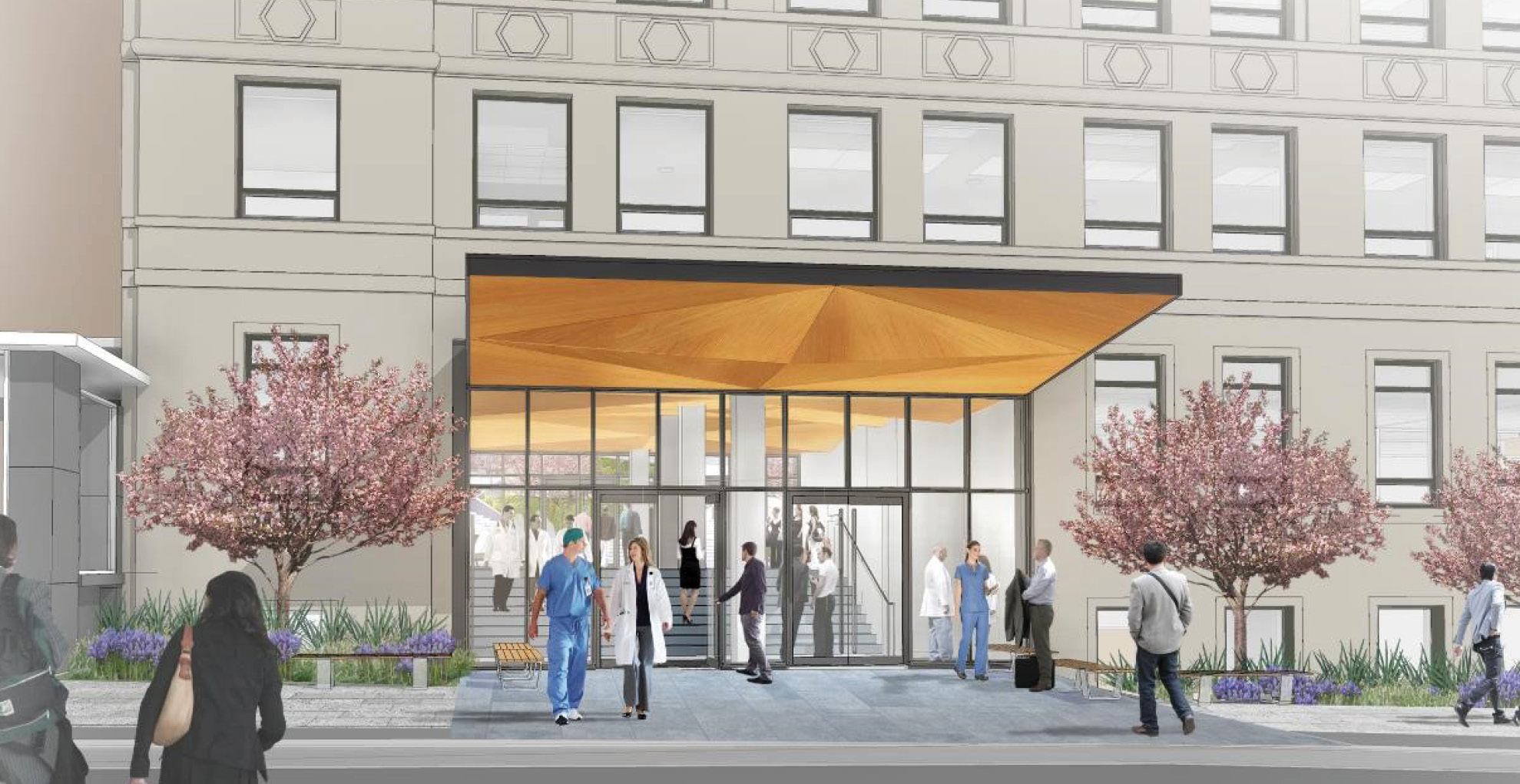
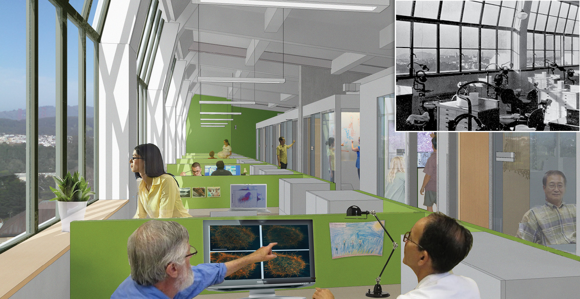
A historic photo of the original, north-facing dentistry clinic is revealing. In the early 20th century, there was no better way to achieve the high footcandle levels needed for oral surgery than to utilize the bright and even light found in the consistently-foggy Parnassus campus environment. Today high-octane dentist lights are a flexible but energy-intensive substitute.
Open floor plans and thoughtful zoning makes the most out of the inherent, passive features that served the building in an era before modern mechanical and electrical systems. The programming and layout re-establishes cross ventilation and daylighting as the primary means for thermal comfort and daytime lighting. The narrow building footprint runs east/west, which allows the majority of spaces to be glare-free and naturally daylit, reducing electric lighting demand and improving indoor environmental quality. Breathtaking views of San Francisco and the Bay are opened up to all occupants by locating enclosed spaces generally towards the interior. Thermally-massive concrete walls can retain heat through the night, evening out the diurnal swings characteristic of the local climate. The result is an energy use intensity (EUI) of 21 kBtu/sf/yr, roughly 75% less than a typical existing office building today.
The newly retrofit building will include office and instructional space, as well as a long-needed north-south connection between the two primary outdoor spaces on campus, Parnassus Avenue and Saunders Court. The team used an innovative Hybrid Activity-Based Working (ABW) model to support different work styles by providing defined spaces for privacy, meetings, collaboration and community in addition to an assigned workstation. Open floor plans adjacent to exterior walls improves daylighting, allows for cross-ventilation and provides open access to breathtaking views of San Francisco and the Bay. Beyond typical programming, the team undertook a deeper analysis of future trends in the workplace, increasing technology, mobility and changes in the workplace culture.
A final opportunity addresses campus planning. The character of urban campuses like UCSF are defined by the spaces in between their buildings. Decades of infill development at UCSF has resulted in an opaque campus with poor connectivity between outdoor spaces. A surgical cut through the Clinical Sciences building creates an inviting north-south connection between the two primary outdoor spaces on campus, Parnassus Avenue and Saunders Court. This new campus connector was not in the project program; it was an opportunity that revealed itself when we looked holistically at how this project could improve the campus more broadly.
Each project has its leverage points. At UCSF’s Clinical Sciences Building we feel that we’ve extended an EHDD tradition of exploiting the potential of a specific site and program to create something that is more than the sum of its parts.

Net Zero 3.0
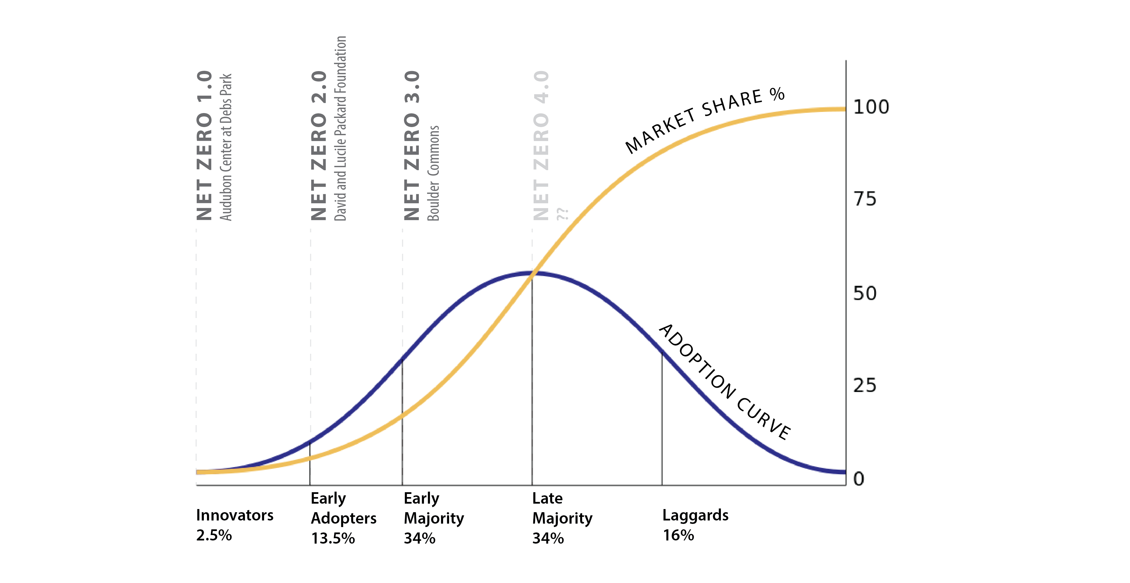
In the classic “diffusion of innovation” diagram, a bell curve describes the path of an innovation from early adoption through market dominance. We all know this path from experience: remember your first friend with a smart phone? Or the first time you saw the Prius? You were intrigued, and perhaps thought them futuristic. Now you can’t imagine your world without them.
We just entered the year 2016. In signing the COP21 treaty, 195 nations agreed to limit greenhouse gas emissions levels to aim to keep global temperature rise under 2°C. Now for the harder part: how? According to the best climate science, programs such as Architecture 2030, and strategic plans of the state of California and others, all new buildings need to be designed to net zero energy (NZE) standards by year 2030 in order for us to avoid the worst impacts of climate change. So where are we today, less than 15 years from 2030, on the NZE “diffusion of innovation” path?
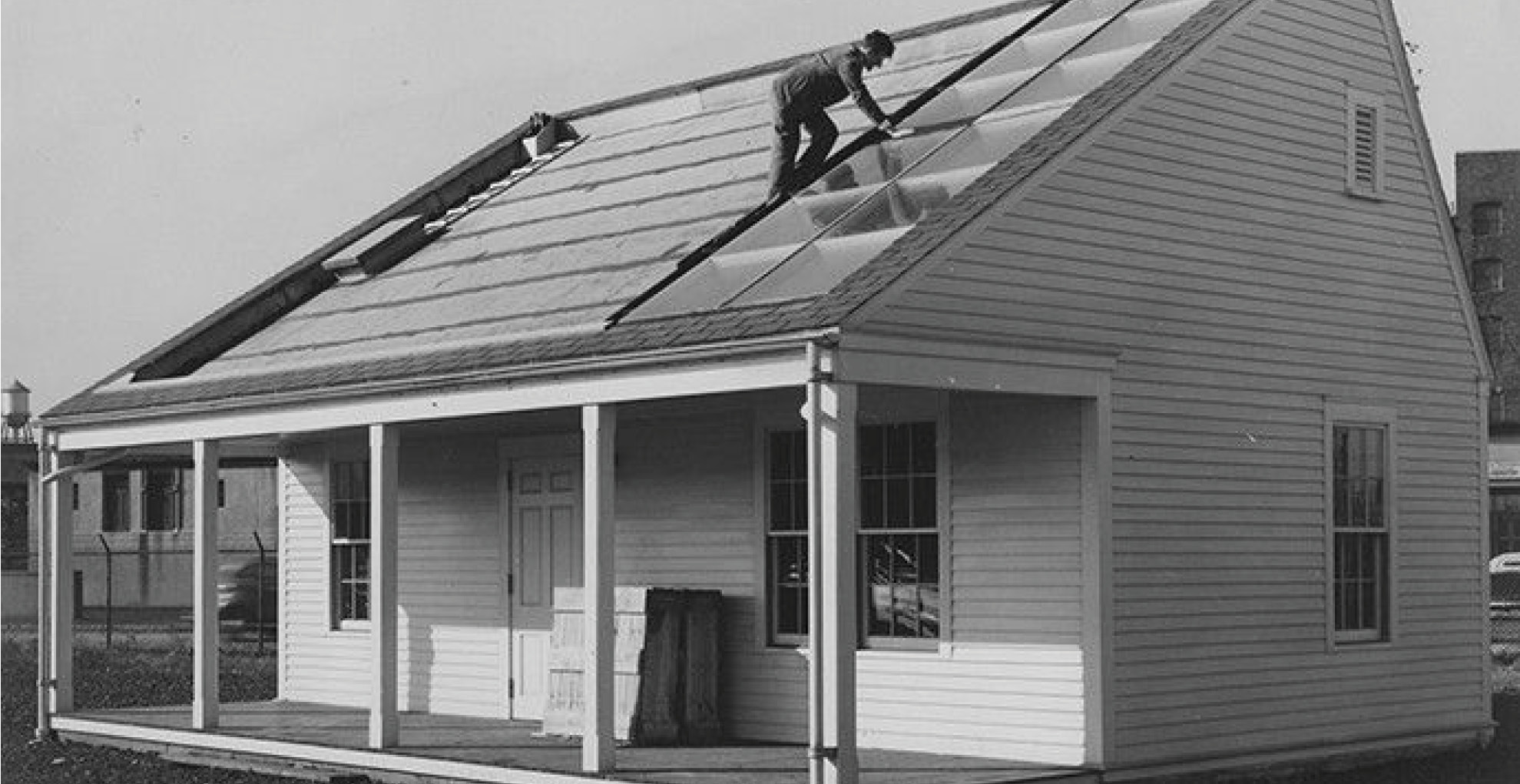
First, let’s quickly put today’s efforts in historical context. As far back as 1939, with the MIT Solar House #1 project, architects and engineers have been experimenting with homes powered by photovoltaics. In the late 20th century these experiments took off in the US Southwest, Japan and Germany in particular. Let’s call this era Net Zero 1.0. The “innovators” responsible for these projects were answering the question, “What if?” EHDD’s first foray into NZE design began in 2001 with the Audubon Center at Debs Park. This nature center in Los Angeles uses a battery array and an improvised load shedding strategy to function without a grid connection.
Further experimentation in non-residential projects such as Chartwell School (2005) led us to design the first NZE office building in the country for David Kaneda’s IDeAs electrical engineering office in 2007. This in turn gave us the confidence to propose a net zero design for the David & Lucile Packard Foundation headquarters. In 2013, this 50,000 SF building operated for its first year at net positive energy, and was certified as the largest NZE building in the country by the International Living Futures Institute. This period, Net Zero 2.0, was driven by “early adopters” who were demonstrating proof-of-concept. At Packard, our goal was “replicability”, which we defined as identifying strategies that could transform the building industry within the next decade. Financial viability was important but there was an understanding that innovation is not easy.
Today we are at an inflection point where innovation reaches critical mass. This is Net Zero 3.0. The “early majority” are leveraging a happy confluence of factors that make NZE good business. Some of these enabling factors include:
Low Photovoltaic (PV) Prices: In 2008, the estimated PV cost for a +300 kw system at our Packard NZE project was at $8.50/watt. This past year we received three bids for a Power Purchase Agreement (PPA) for a similar sized PV array at a private school in Marin County at $3/watt. This PPA will cost 20%-38% LESS than PG&E with no upfront capital cost. It saves money from day one. The upshot: If you have the space to put the PVs, a zero energy building can be cheaper than a conventional building powered solely by the utility company.
Energy Codes are raising the baseline: California’s latest Title 24 energy code requires many of the energy efficiency measures that were considered unusual in Net Zero 2.0 buildings. External insulation, air-tightness requirements, LED lighting, and spectrally-selective low-e glass are among the measures now standard in new buildings in California and many other states. The upshot: The incremental cost to exceed code-mandated efficiency in many states is minimal.
LED lighting is finally here: LED lighting is no longer just beyond the horizon. The technology has matured to provide excellent color, ease of control and dimming, and good optics. When you consider the life-cycle benefits of low maintenance, combined with reduced energy bills, they are the obvious choice for thoughtful building owners. The upshot: Low lighting energy use is achievable without sacrificing quality or affordability.
Plug Loads are trending down: Plug loads for IT have been falling, driven by the desire for longer battery life on our mobile devices, and a new generation of low power consuming chips. In a mobile world governed by battery performance, efficiency is driven by economics not environmentalism. The upshot: The 10-ton gorilla of “uncontrollable” plug loads may be less of a problem as time goes on.
Commissioning is now common: This signals a recognition that buildings need to be operated properly in order to perform properly. The required NZE upgrade to ongoing energy monitoring and diagnostics is the logical next step. The upshot: Owners are engaged in ensuring proper operation so that buildings can achieve the design performance goals.
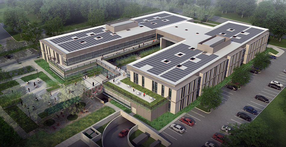
So what does Net Zero 3.0 look like? One of our projects nearing start of construction is instructive: a 100,000 SF speculative NZE office building in Boulder, CO. The client, a mission-focused investment company, intends to own and operate this building at NZE for the long term, thereby offering a new model of speculative mixed-use infill development that yields triple-bottom line returns. The design process is an interplay between the cost budget, the renewable energy potential of building surfaces, and the resultant energy budget that we have to work with to get to NZE. Our target Energy Use Intensity (EUI) of 28 kBTU/sf is calibrated to the available PV area on the roof and on the southeast-facing façade. Integrating vertically-oriented PVs into that façade promises to be an economically-rational approach since we can subtract out the cost of the avoided cladding material to offset the reduced production efficiency associated with the vertical application. The overall leasing and marketing strategy is geared to take full economic advantage of the life-cycle benefits; for example, tenants will adopt plug load budgets in their lease agreements. Therefore, the overall pro-forma requires a holistic approach to valuing the asset differently than conventional development. Design, operations, and property management are integrated from the start.
We are just at the start of Net Zero 3.0. Yet recent legislation like California’s SB 350, which authorizes state energy authorities to seek 50% increase in energy efficiency by 2030, and implementation of COP21 will drive us towards Net Zero 4.0. During that phase the “late majority” will make NZE buildings into the new business-as-usual. The real question is no longer, “What if?” or “How exactly?” but “Why?”
Brad Jacobson, AIA LEED® AP BD+C
Associate Principal
Greenbuild 2015: Reflections
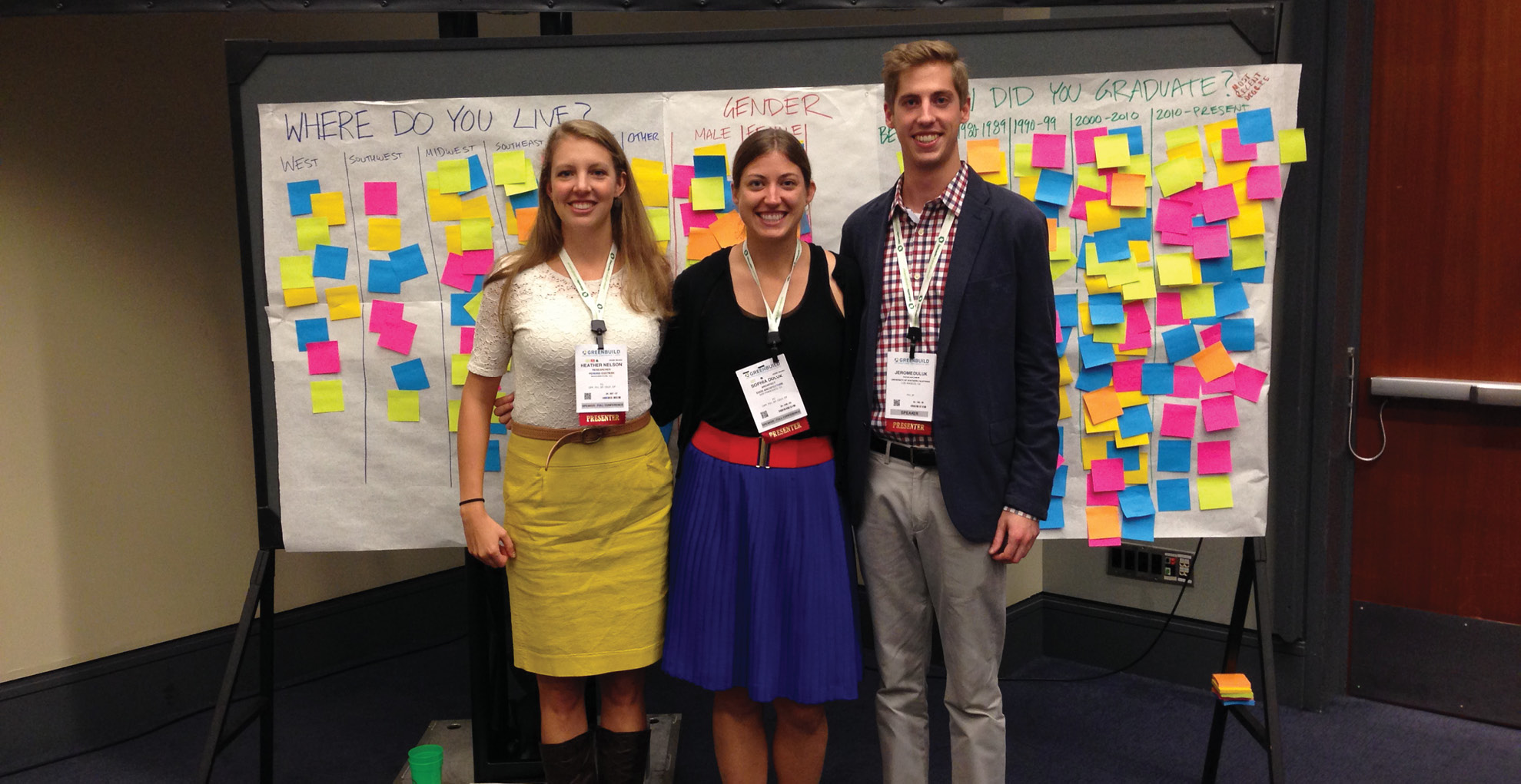
I had the fortune of spending the week of November 16 in Washington D.C. at the 2015 Greenbuild Conference. My research group was accepted to present our session, How Age and Gender Effect the Path to Carbon Neutrality, and we were very excited to share our research. I have been working on this project with my co-presenter, Heather Nelson, for about two years now, and my brother, Jerome Duluk, who is excellent with statistical data analysis, joined our team a few months ago to help us with an in-depth analysis. We applied to present at Greenbuild about a year ago, and after the three tier review system, we got our notification that of the only 18% of sessions that were accepted, we were one of them! Once we got this notification, the real work began to extract the most interesting nuggets from our study.
When Heather and I both graduated with our Master’s degrees from the University of Oregon, we left our sustainability bubble of a school and entered into the real world. We were quickly struck by the lofty goals of Net Zero Energy (NZE), and the ambition of the 2030 Challenge, but were disheartened by the overall lack of progress towards these goals. We began to ask why this was happening. Are architects blaming cost and lack of interest from clients? Do architects have the knowledge they need to reach these goals?
To begin to answer these questions, we launched a national survey with two parts:
1. A knowledge section to test architect’s knowledge of basic passive design strategies.
2. An implementation section where we gleaned how they both gained and applied this knowledge.
The results were compelling, with a mixture of confirming and disproving our hypotheses. We worked over the course of a few months to determine what was significant and what was insignificant, and what would interest attendees at our session.
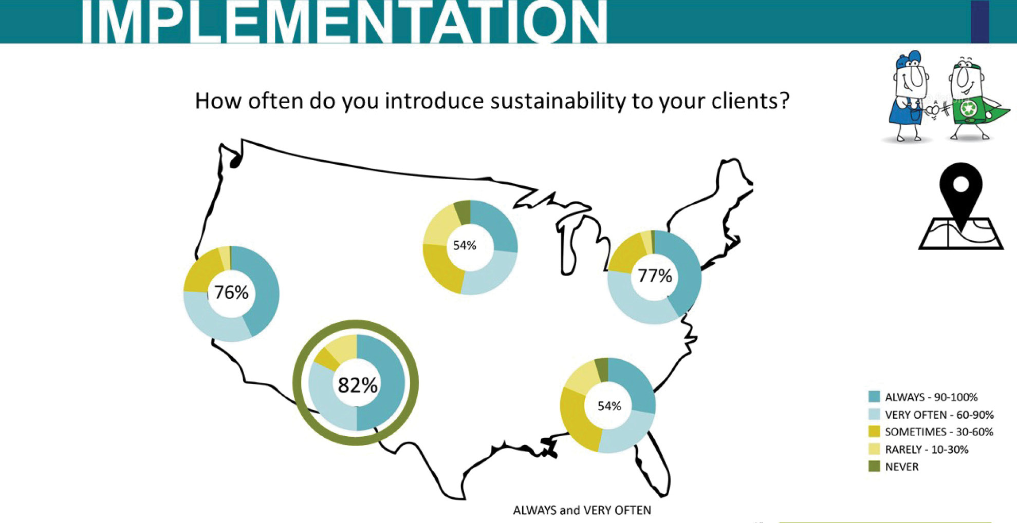
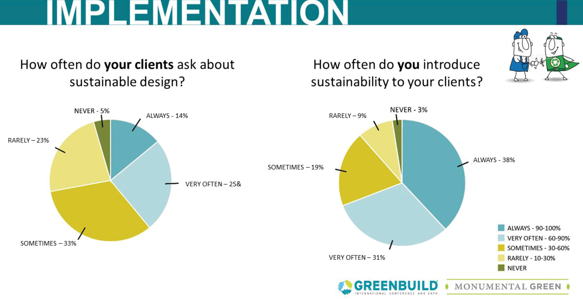
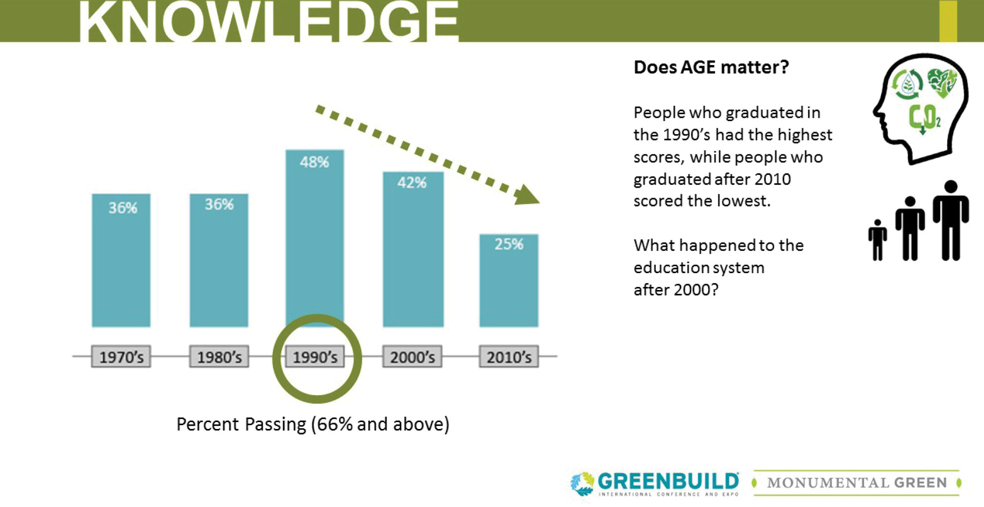
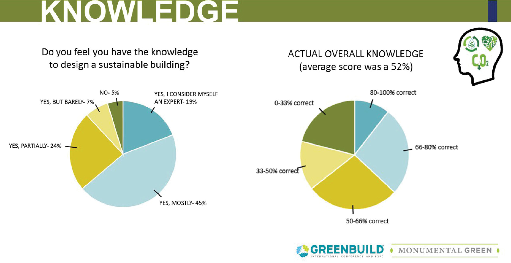
The day of our session finally arrived. We were in a special set room, which meant we had multiple screens, a collaboration style table arrangement, and a dynamic central stage that would lend itself well to the three of us moving during our session. When we got through the methods and the raw data, we led a quick activity to see who in the room would have, according to our data, gotten the highest scores on our knowledge section. In our survey the average score was a 52%, a failing score at most universities. We first asked everyone in the room to stand up, and then proceeded to ask all the women to sit down. Then, the people who live in the Midwest and Southeast were asked to sit, followed by those who had not graduated in the 1990s. We were left with less than 15 of our 150+ attendees still standing.
This was an impactful activity, but what we learned from our knowledge section is that gender, age, and location do not have a statistically significant impact on your actual knowledge. So being a man, or from the West Coast, or graduating in the 1990s, does not inherently make you smarter. What makes you smarter, which we learned from our implementation section, is where you get your information, and how often you get it.
We found that people who regularly connect with colleagues about sustainability via conferences, lunch–and-learns, and webinars, not only had higher scores, but also were far more likely to introduce sustainability to clients. From our survey we learned that more than ¼ of architects introduce sustainability less than half the time, and that 12% of architects report they introduce sustainability to less than ¼ of clients. We also saw that working on a NZE building, which only 29% of respondents have done, and measuring building performance post-occupancy, which only 4% of architects are regularly doing, had a huge effect on both knowledge level and how often knowledge was shared with clients and other architects. Working on a NZE building forces architects to push the limits of design, while doing post-occupancy studies can teach us what was successful and unsuccessful in our projects, which we can carry into future projects. When we looked at the age breakdown from our survey, we found that people who had graduated between 2010 and the present had the lowest scores on the knowledge section, and they felt that education was the biggest problem in our field.
We finished our presentation with a discussion, which caused our session to run over due to the attendees being so deep into the discussions taking place. We spurred some great questions about what people are currently doing in their practice to share knowledge, and reflect on how often they bring up sustainable design practices to clients. I have presented at four other conferences, including the American Solar Energy Society Conference and the Gulf Coast Green, and this was my favorite presentation that I have been a part of. Hearing people ask more questions and want to know what they could be doing better was inspiring, and many people came up to us afterwards commenting on how our presentation was their favorite session.
Overall, Greenbuild was an amazing experience. There’s nothing like presenting your hard work in front of 150+ people. I am grateful that I had the opportunity to present, and to anyone that has something they are passionate and knowledgeable about – do not be afraid to share it with the world.
Design Month at EHDD
The “maker” trend is a catch phrase heard outside the confines of our office, and even outside the architecture profession. While you might find a maker space in our clients’ buildings or a tool for learning in our clients’ programs, it can also be a brand distinction for an artisan cheese, a DIY (Do It Yourself) YouTube video, or handmade card. “Maker Culture” even has its own Wikipedia page. It has gained popularity across the country and in many different fields.
At EHDD, making is something beyond a trend or a catch phrase, it is at the core of many of our personalities and ambitions. We are makers. We have musicians, chefs, DIY home-renovators, furniture makers, painters, photographers, videographers, writers, and more amongst our midst. Many of our designers, architects and technical staff have deep passions and personal ambitions for making things.
Every year we dedicate a month (or so) to celebrate design in a series of lunchtime and evening events that get the office talking and thinking about design beyond our usual project-based work. This year our design month title was EHDD Makes. It was just one of the many ways our enthusiasm for making informs our office culture. While it was the inspiration for a month long event, I see it as the essence of most of the people that work here.
As architects at EHDD, much of our time is spent documenting the design for something someone else will make. EHDD Makes is a theme centered on the act of making with a goal to learn about and engage in craft and fabrication, and to tap into our local maker network. This year we visited local maker studios, got out and sketched, and had hands on demonstrations and discussions.
Check out some of the highlights from this year:
Mixology Kickoff Event with Method Brewing: Robert Schiemann is a computer scientist and mixologist, he came in and wowed us with a tasty selection of margarita cocktails. Each drink tasted notably different with just one or two ingredients slightly altered or swapped out. Finding the right combination of ingredients in any design, edible or otherwise, is an art.
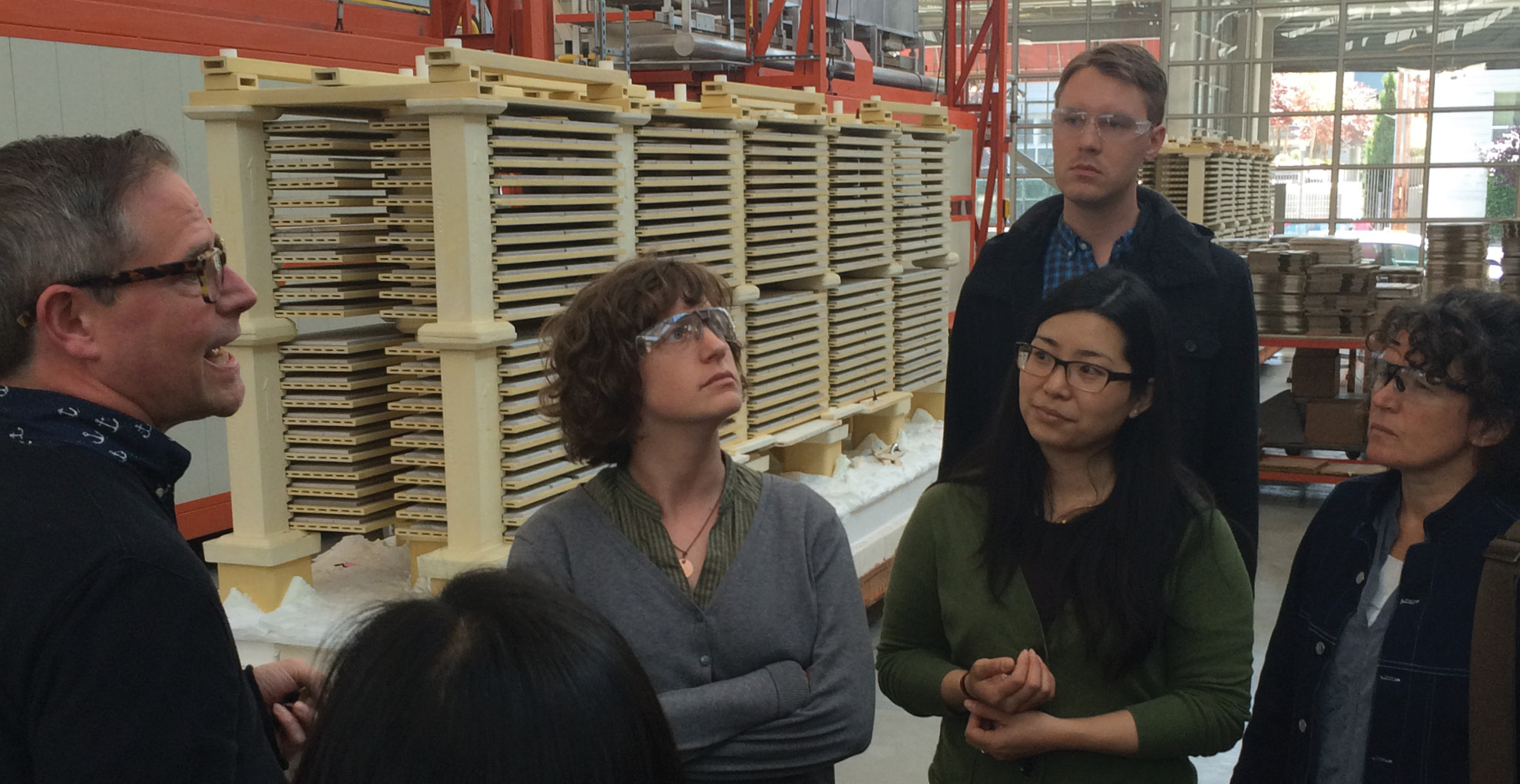
Heath Ceramics Factory Tour: We toured the Heath factory on 18th Street,which is around the corner from our office. We got a historical narrative of Heath, as well as a peek into the secrets of how their beautiful tiles and other ceramic products are made. We witnessed enormous kilns and ceramics being made and glazed by hand.
It’s a Sketchy Neighborhood Tour: Our own Kevin Killen, director of the residential studio at EHDD, lead a group of us through the Mission and talked about the history of the area, including buildings that were once used to house factories, breweries, and auto manufacturing. He has continued this tradition beyond design month, weaving it in to short lunch trips.
Gemmitti Model Art Tour: Gemmitti is a local model maker around the corner from our office. They gave us a tour of their space and talked about their work.
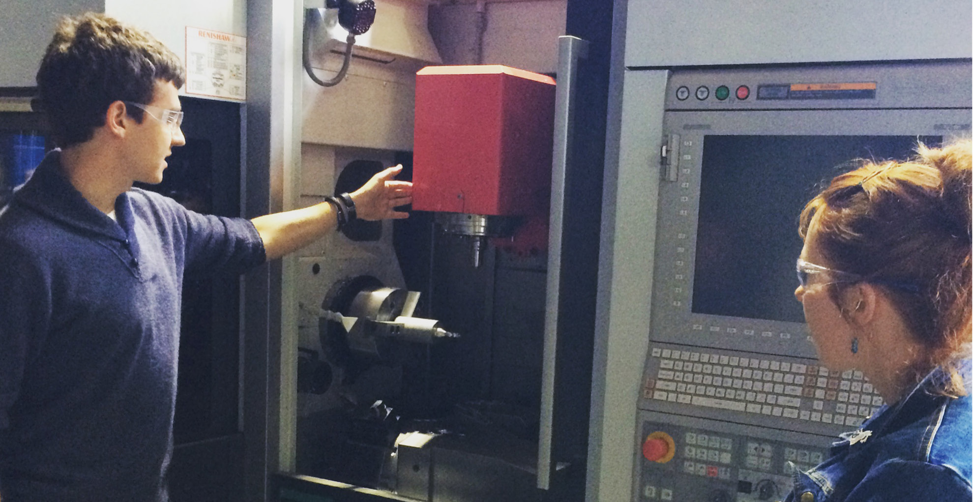
3D Print Workshop: Matt Bowles, a designer at our office, is also rehearsed in the art of 3D printing. He did a demo on how to create a 3D model from our in-house machine to a group of us itching to learn.
Pier 9 Autodesk Artists in Residence Tour: We toured the Artist in Residence workshops at Pier 9. This is a program run by Autodesk (whose name is on a lot of the software we use). They have nifty machinery in their workshops, including a plethora of 3D printers, top of the line wood machines, and super precise metal fabrication machines.